Ah, the ubiquitous visual metaphor becomes very clear as it builds equity by creating a common reference point between two or more seemingly unrelated subjects.
Consumer decisions are made based on the five senses, but it is the visual associations that we respond to much more rapidly, such as icons, logos, identities, symbols, shapes, colors—all manner of visual imagery.
And, with metaphors having the ability to straddle two or more modalities, such as language, visuals, sound, and gestures, the myriad of options are endless. They allow a brand to cross over into new categories and bring the consumer along with them through the use of commonly recognized elements. They allow a brand the freedom and flexibility to develop a platform for consumers to think beyond the original/typical lexicon and offer a range of possibilities previously not considered as a conscious reference point.
All the usual suspects that come to mind that we closely identify with global brands can be deemed visual metaphors. For example, consider Nike’s swoosh, Target’s bulls-eye, Apple’s… apple, McDonald’s arches, the Jolly Green Giant, Starbuck’s siren, Pepsi’s globe, and Budweiser’s Clydesdale horses.
In packaging design, visual metaphors are used for illustrating ideas and are the basis of creating a mood, theme, character, or personality for the brand. Think about Godiva’s Lady Godiva, which also uses a gold/foil color for this purpose.
Sometimes the metaphors are also locked up with a tagline, as in Origins Cosmetics’ tagline, “Powered by Nature. Proven by Science,” and McDonald’s “I’m lovin it.” These metaphors enhance the brand to expedite the consumer connection to complement a brand’s communications hierarchy and not complicate it.
There needs to be strategic reason for each essential equity element to reside on a package, otherwise it is not just perceived, but considered visual “clutter.”
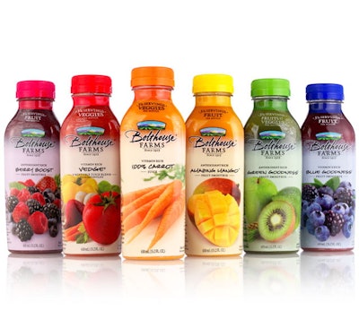
Visual metaphors reinforce freshness for juice
Bolthouse Farms is a fourth-generation family-owned farm located in the picturesque, historic, fertile San Joaquin Valley of California. (That descriptor alone should conjure up visual metaphors in one’s mind.)
For more than 90 years, they have been growing and harvesting premium, fresh produce. And, as the first name in carrots for more than 50 years, they built a beverage division by entering the premium refrigerated juice market.
Their juices—and all products—are crafted from the finest fruits, vegetables, and other 100% natural ingredients that are a nutritious and delicious expression of their continued commitment to responsible farming and natural health.
The face panel of Bolthouse’s juice packaging visually depicts luscious fruit or vegetable imagery to reinforce that what is inside the bottle is “good for you” and to resonate with consumers that the product in their hands is all about the freshest ingredients from the farm. The logo is a hand-colored farm scene to depict the source of the brand and again, it reinforces the premium goodness inside each bottle of juice or dressing.
Now, can fruit and vegetables be considered a visual metaphor? Absolutely, yes!
Take a look at the side panels, which are commonly used as a catch basin for all manner of information that does not fit on the front label. There you will find the ingredients showcased as visual metaphors for the number of servings per bottle.
And, while words enhance the 100% pure nature of the product—gluten-free, no preservatives, no artificial colors, no genetically engineered ingredients—it is the photography that speaks to the taste buds to create appetite appeal with the eyes!
Burt’s Bees highlights pure ingredients
Burt’s Bees creates truly natural personal care products from the purest ingredients that have a positive effect on their consumer’s wellbeing and impact of the environment. Over half of their 150-plus products are 100% natural, and only natural colors are used in them. Their products are also packaged to protect the environment, and the company has trimmed excess packaging from many of their products by approximately 50%.
Cleverly, packages are designed to hold just enough product before expiration date, so half-used tubes and jars are not tossed out into the waste stream. This also allows consumers the opportunity to shop their favorite store to purchase more product.
Early on, the iconic face of co-founder Burt was on all packaging. It was hard to miss at retail, with the deep yellow background, bold lettering, and an illustration of swirling honey bees, as a visual metaphor for the primary product ingredient. As the products have taken off and gained fame, Burt’s image can still be found on the lip tins. And the product line has expanded to now include lip, face, body, hair, baby, throat drop, and toothpaste products.
Newer packaging is now following a more “elegant” format, still utilizing the trademark yellow but either as a highlight or as a softer palette in the background. Ingredients are visually more literal depending upon the product category, with botanicals and fruits depicted as the metaphor for the goodness of what is inside.
(But where are the honey bees?!)
Packaging speaks in visual language
Our cultural vernacular is to communicate in “shorthand,” as we have become a society of visual resonance much more so than meaningful conversation based on real words, to communicate or convey an idea.
We expect immediate responses, and our brands expect us to respond immediately.
Thus, the visual form of “expression” has become necessary because we live in a tech-savvy world of “simulated” reality, with constant connectivity and synthetic communications.
Visual metaphors work as a device for encouraging insights, or a tool to think with. The actual image itself poses food for thought, without stating an actual proposition.
It is up to the consumer to connect with, and translate the imagery, into insights and thoughts…in other words, to make decisions once the new “language” is learned.
When shopping, we have become conditioned to look for the visual cues that represent our brands, almost without thinking on a conscious level. Our packaging “speaks” to us in a visual language our brains instantaneously understand, within a few flash seconds.
This form of imagery is a powerful decision-making tool for over-saturated, over-stimulated minds at retail, to build brand resonance.
Jackie DeLise is vice president of HMSDesign.