Beverage packaging—including bottles, cans, cartons, and “cuboids”—is the focus of the Shelf Impact!/Dragon Rouge Innovation Survey of package design for the first quarter of 2012. Consistent with the results gleaned from previous surveys, our latest innovation survey rewards those products that have approached innovation from a holistic perspective. These products share the basic “table-stakes” of innovation and then some—where the same amount of focus and dedication is put forth throughout the entire process, from ideation to commercialization.
Innovation of concept, structure, and graphics builds a brand story
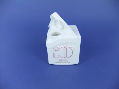
With composite scores ranging from 3.4 to 3.9 on a five-point scale, the leading innovations in the spirits and beverage industry are Ceethree’s iO Natural Energy Drink in a cuboid container, Glacia’s new Icebox water carton, a new limited-edition bottle for DANZKA vodka, and Diageo’s QREAM WITH A Q™ cream liqueur bottle. (See complete package descriptions and images.) While all scored high across the board, they fared exceptionally well in relation to conceptual idea, structure, and graphics.
With the highest overall composite score, as well as the highest scores in both concept and structure, Ceethree’s iO is a new all-natural energy drink set to shake up the functional drink market through the use of a convention-defying and eye-catching cube-shaped pack. The drink itself, based on green coffee and guarana, contains a variety of fruits and herbs resulting in a fresh, fruity beverage that provides caffeine (the equivalent of a cup of regular coffee), antioxidants, and vitamins in their purest form. The highly unusual cuboid bottle takes innovation to a new level, inviting consumers to engage in a different way with a bottle and ensuring differentiation at shelf.
In a category with longstanding packaging norms, the distinctive shape of the structure also makes it highly efficient from a retail and logistics viewpoint, as the bottles are easily stackable and optimize space, unlike conventional cylindrical bottles, where much space is wasted around the pack. In fact, most respondents who commented positively on the iO pack noted these logistical advantages. Remarked one respondent, “Excellent combination of design, convenience, cube utilization, and stackability.” Said another, “The minimalist design with sophisticated curves and triangular flip top adds to the easy stacking.” While another said that “any drink in a non-round rigid package is innovative,” adding, “it would be efficient in transport and display.”
Criticism of the pack mostly centered on its similarity to a household cleaner package, with comments like, “interesting structure, however, I’m not sure if I’m supposed to drink it or pour it into my wash machine”; its lack of descriptive graphics and copy; and concerns about its ease of use. The question, “How do I drink from it?” was echoed by more than one respondent.
The key points of sustainability and efficiency that drew respondents to Ceethree’s iO package are also the main points of differentiation for Glacia’s Icebox water. Recyclability and sustainability are ongoing topics of conversation for the bottled water category, which struggles with consumer reactions to PET bottles. Glacia’s Icebox Norwegian spring water in a box contains water pumped directly from the Rustad Spring in Norway. After pumping, the water is micro-filtered and cleansed with UV light before being packaged in paperboard cartons and in a bag-in-box configuration.
The company says that its goal is to use the most sustainable and nontoxic packaging available. The 5-L Icebox package is said to take up less space than occupied by the five 1-L bottles it replaces, resulting in reduced storage and shipping, and a corresponding reduction in energy consumption. According to the company, the carbon footprint of the box is only 24% of that of a comparable-size plastic bottle, even when transport from Norway is included.
Comments from consumers on the sustainability aspects of the package include observations such as, “Love the concept of not having those plastic water bottles to take back to the store,” “Will fit well in fridge. Like the idea that package is recyclable and printed with water based-ink,” and “A very good idea; the ‘greeness’ of the carton is a plus.”
On the downside, some saw Glacia’s environmental claims as “weak,” “pure bunk,” and “misleading.” As with the iO package, respondents also remarked that graphics for Icebox water could communicate more effectively, saying “the brand message is not obvious on the package.”
A fine balance: from ‘minimalist’ to ‘over-the-top’
Following the theme of significant differentiation at shelf along with functionality, the vodka brand DANZKA created a limited-edition bottle to reinforce the brand’s Danish roots, spark new interest around the brand, and arouse curiosity and desire. Well-known for its aluminum packaging and minimalistic design approach, DANZKA has become an easily recognizable style icon among the Bélvèdere portfolio of brands.
In acknowledgement of the brand’s strong local heritage, design for the limited-edition bottle concentrates on the image of the Danish flag, and expresses the brand’s iconic Danish style through design values such as simplicity, minimalism, and functionality. Respondents agree with the elegance conveyed by this simple design, saying: “I like the clean sleek lines. I like the simplicity,” “Clean lines emphasize connection with Danish design tradition,” “I appreciate the elegant design aspect,” and “Clean-looking bottle implies clean taste.”
The design also retains the best functionalities that the DANZKA aluminum bottle is known for: It chills the vodka faster, is lightweight and shatterproof, and reinforces the pleasure of drinking vodka cold. “It’s a very unique design and material concept for vodka,” says one respondent. “I would encourage drinking it cold.”
While each of the three top-scoring innovations were seen as serving a distinct purpose, respondents reported that Diageo’s QREAM WITH A Q™, or “Qream,” misses the mark, even though they scored it as the fourth highest-rated design. Says one respondent, “Yes, it makes me look at liqueur differently, but not really in a good way.”
Qream is an ultra-premium cream liqueur that was conceived and developed in collaboration with musician and style visionary Pharrell Williams. It focuses on an ethos that encourages women to “live deliciously,” inviting them to treat themselves royally. With Qream, says Diageo, every detail was crafted to celebrate women—from the elegant design of the bottle, inspired by royalty, to the delicious flavor and silky lightness of the liquid, to how the brand is marketed. However our respondents felt otherwise, indicating that the package misses the mark on properly connecting to the consumer benefits and need states.
The majority of the criticism centered on the bottle’s resemblance to a perfume container, causing one respondent to question, “I wonder if it tastes like perfume.” Another respondent provided this mixed review: “Great design elements and over-the-top brand filled with sexual innuendos grab attention, but it still looks like a big perfume bottle or a 2012 version of Barbara Eden’s Jeanie condo.”
Those who were impressed by the feminine design of the cream liqueur bottle spared no exclamation points in their evaluations. Said one respondent, “Love the colors, bottle, and the jewel-like cap! Elegant, should certainly appeal to women!” Enthused another, “I love the name, the package, the ‘sell story’ behind it!! It all comes together—‘dream, cream, queen’—love it!!”
Owning one tenet of innovation is not enough to stay in the game
Within the spirits and beverage category, those that fared the worst appear to be lacking the fundamental principles key to successful innovation.
In November, Coca-Cola and the World Wildlife Fund joined forces in a new campaign to help protect the polar bear's Arctic home. For the first time ever, Coca-Cola turned its iconic red cans white in celebration of the polar bear. The familiar red can background was replaced with an all-white panorama, highlighted by the Coca-Cola script printed in red, and featured the image of a mother bear and her two cubs making their way across the Arctic. The concept, which was lacking in intrigue, was also the subject of much confusion when many consumers mistakenly identified the white polar bear can for the Diet Coke-brand can. As a result, Coca-Cola pulled the cans two months early, replacing them with a similar design utilizing a red background.
The 70 survey respondents who commented on the Coca-Cola polar bear can lauded the brand’s tie-in with WWF, but overwhelmingly agreed on the confusion caused by the white can. Many offered suggestions on how the situation could have been avoided. These included the use of a white bear against a red background; larger letters; an identifier to create more brand loyalty, such as “The Original leads the way,” with “Original” emphasized; or another line of copy under the graphics that explained the concept.
Overall, the switch in can color was viewed by many as “the kiss of death” for the limited-edition can. Says one respondent, “Coke is defined by its red cans and shouldn’t move away from branding that has been generations in the making.”
Also lacking a “wow” factor, Cyrus Noble Small Batch Bourbon Whiskey, a Kentucky spirit, also fell short with its new package design. With the recent resurgence in bourbon drinking, the bottler was inspired to reactivate the brand while retaining the feel of the original packaging but providing an updated look. While the color scheme harkens back to the colors used on the original label, and bottle decorations include embossing among other stylistic elements, respondents’ comments suggested the package lacked differentiation, blending in with other bourbon brands on shelf. “Bland,” “boring,” “conventional,” and “very simple” were among the words used by respondents to describe the design.
Other respondents appreciated the bottle’s simplicity. “Nice simple feel,” said one. “Makes me think of red plaid, a wood-paneled den, and fox hounds barking outside.”
At the bottom of the list is a design that respondents felt was similarly lacking in concept and graphics—a new design for Budweiser, seen in its can and secondary packaging. The focal point of the new design is Budweiser's iconic bow tie, complemented by the time-honored Budweiser creed and Anheuser-Busch medallion. The pack averaged a composite score of 2.4 and scored the lowest overall in terms of graphics. Respondents’ comments were unfavorable, noting that the new design appears “dated” and lacks “that eye-catching element.” Questioned one respondent, “What is different?”
New year, new mission
As you move forward in 2012, employ a new mission when it comes to packaging innovation:
• Don’t skimp where it matters most. Conceptual ideation is key to a successful end result.
• Have a purpose—innovating for the sake of innovation isn’t purposeful. Fill the gap with a consumer benefit that directly correlates to a specific consumer need state.
• Finally, remember that basic innovation today is “table-stakes.” Resolve to go beyond.
Eric Zeitoun is president of Dragon Rouge USA, an international brand and design consultancy. Contact him at [email protected] or at 212/367-8800.
The survey process
For the past four years, Shelf Impact! and Dragon Rouge have partnered in inviting readers to comment on current packaging innovation through a quarterly survey that probes the value and level of innovation of a selection of packages. Participants are asked to evaluate 20 recent product introductions through the lens of five distinct criteria:
• The concept’s ability to provoke new ways of thinking about a category.
• The structure’s ability to present new ways of interacting with a product type.
• The packaging graphics’ innovative cues that help bring the product positioning to life.
• The use of innovative materials.
• The relative effectiveness of the packaging production process.
In 2012, we decided for the first time to shift our focus toward reporting our findings by industry type in order to help benchmark innovation practices within and across categories. As a result, this quarterly survey’s focus is on the beverage and spirits categories. Note that questions focus on the direct impact of packaging to the brand, and do not address consumer benefits or needs.
We look forward to reporting in the second quarter on our next series of high-performing package innovations, in the food category. If you have not already done so, please join the mailing list for Shelf Impact!, to participate in this ongoing survey.
The author, Eric Zeitoun, is president of Dragon Rouge USA, an international brand and design consultancy. Contact him at [email protected] or at 212/367-8800.