In a retail environment where shoppers decide what to buy in under three seconds, craft beer brands don’t have the luxury of subtlety. That’s one of the big takeaways from Quad’s 2024 "Craft Beer Design Trends Study," which set out to decode what catches consumer attention and drives purchases in the bustling world of beer aisles.
Using eye-tracking technology and real-world shopping behavior, Quad’s Accelerated Marketing Insights (AMI) team wanted to understand how design influences the split-second decisions consumers make at the shelf. For packaging designers, especially those working in highly competitive and visual categories like craft beer, the results offer both creative inspiration and practical guidance.
 The study took place at Ray’s Wine & Spirits in Wauwatosa, Wis., where participants shopped for craft beer. Four-hundred seventy four different products from 124 craft beer brands were tested. Participants wore eye tracking tech to measure which designs grabbed attention, and which didn’t. Above (top) is one of two beer walls. A heat map (bottom) shows which products shoppers’ eyes lingered on.Quad
Quad, a marketing experience company with roots in print and packaging, launched the study to help beer brands (and their designers) better understand how consumers shop. The goal wasn’t just to ask people what they like, but to observe how they actually behave. To do that, AMI went beyond surveys and into behavioral science.
At the heart of the research was a simple premise: if you want to know what makes a product stand out, measure how people look at it.
“If a product isn’t seen, it isn’t sold,” says Shannon Anderson, director of research for Accelerated Marketing Insights by Quad. “That’s especially true in the craft beer category, where shoppers see hundreds of SKUs in one aisle along with seasonal or limited-time releases. Eye-tracking lets us measure exactly what captures attention.”
Following the gaze to the can
The study took place at Ray’s Wine & Spirits in Wauwatosa, Wis., where more than 61 beer drinkers—most of them frequent craft buyers but not loyal to a single brand—shopped like they normally would. Participants wore Tobii 3 eye-tracking glasses, which recorded exactly where and how long their eyes lingered on each package.
 | Read this related article, “Package Design Plants a Flag for Non-Alcoholic Craft Beer” |
A total of 474 products across 124 craft beer brands were part of the experiment. Researchers measured three key visual engagement metrics:
- Total Fixation Duration (TFD): How long the shopper looked at the can
- Time to First Fixation (TTFF): How quickly the shopper looked at it
- Fixation Count (FC): How often the shopper returned to look again
After shopping, participants were asked what they bought and why, providing context to the eye-tracking data and uncovering additional decision-making cues.
Key learnings for packaging designers
The results of the study painted a clear picture of what works on the shelf and why. For designers, three key takeaways stood out:
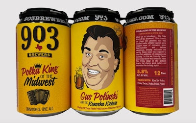
1. Bold illustrations command attention: Cans with heavily illustrated designs performed best across all visual metrics. The product with the longest visual hold time (1.37 seconds on average) was Gus Polinski and the Kenosha Kickers by 903 Brewers, which featured a large, illustrated face that anchored the design. (Gus Polinski is the movie character made famous by John Candy in the 1990 Christmas Classic, "Home Alone.") This type of visual storytelling—especially when centered on faces or characters—consistently stopped shoppers in their tracks.
 The ‘Polka King of the Midwest’ from 903 Brewers took top honors in Quad’s eye-tracking study, thanks to its bold illustrated face and playful packaging—proving that character-driven visuals can stop shoppers in their tracks and boost shelf appeal.Quad, with permission from 903 Brewers
Importantly, these illustrative styles also had minimal branding, letting the art itself do the talking. Consumers were drawn to novelty and detail, not necessarily brand consistency.
“There’s something incredibly effective about a large, central illustration—mascots or quirky icons—that spark curiosity,” says Anderson. “In this study, we saw shoppers gravitate toward playful visuals like a hot dog or a familiar face from pop culture. These images create emotional hooks.”
2. Descriptive, thematic names work harder: Names that clearly described flavor profiles or evoked sensory cues helped shoppers quickly understand what the beer was all about. Take Maple Coffee Porter by Lion’s Tail Brewing Co., which combined a flavor-forward name with an engaging illustration. The name alone told shoppers exactly what they’d get. The tactic paid off, as it became the most purchased product in the study.
 In Quad’s craft beer design study, Lion’s Tail Brewing’s Maple Coffee Porter and Explorium’s Hot Dog Lager stood out by using bold, thematic names and eye-catching illustrations—proving that sensory cues and playful nostalgia can help shoppers quickly connect with what’s in the can.Quad
In another example, Hot Dog Lager by Explorium Brewing leaned into novelty and nostalgia, tapping into backyard cookout culture. These types of thematic names gave shoppers a reason to pause and engage, even if they were just browsing.
3. Pressure-sensitive labels are a smart choice
Six of the 13 top-selling brewers used pressure-sensitive labels, and four of the five most eye-catching designs (as measured by total fixation duration) featured them. Noted the report, p-s labels offer design flexibility and lower production costs, both of which align with the often nimble operations of craft breweries.
Critically, p-s labels didn’t negatively affect consumer perception. There was no indication they were seen as less premium than printed cans.
“Pressure-sensitive labels give small brewers more freedom. They can order blank cans in bulk, then print shorter runs for labels and respond faster to seasonal or one-time releases,” explains Anderson. “What surprised us was how neutral shoppers were about them. The pressure-sensitive labels didn’t impact perceived quality.”
However, the report cautioned that designers should be aware of the sustainability tradeoffs, since some p-s labels can complicate recycling.
The role of packaging in purchase decisions
Survey data backed up the behavioral findings. While flavor and price were still the top two factors in purchase decisions, 72% of participants said packaging design made them more likely to buy. That’s especially meaningful in a category where 84% of shoppers said they came in to browse, not to buy a specific brand.
Even more telling was how much information shoppers wanted the packaging to provide. They looked for tasting notes, ingredients, and brand stories, reinforcing the importance of using every inch of the label to communicate value.
What this means for packaging teams
For designers, marketers, and brand owners in the craft beer space—or any category where products compete for attention on crowded shelves—Quad’s study reinforces a few critical lessons:
- Make packaging that pops, not just with color but with story and personality
- Use names that give consumers immediate context and emotional connection
- Choose formats and materials that support flexibility without compromising appeal
As one participant put it when explaining their purchase, “The red packaging caught my eye... the flavor being cherry.” That blend of visual interest and sensory promise is exactly where packaging should live. PW


