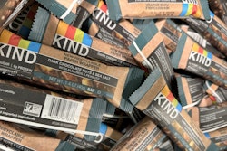
Snack producer Kind is betting a little change can go a long way with its brand identity.
The brand in May started a visual refresh including its first ever logo design evolution, aiming to stand out more online and on the crowded snack aisle shelf, while carrying over the iconic brand assets customers know.
“We knew we had to land a design that would appeal to both our long-time loyal followers and to bar customer who weren’t yet buying Kind,” explains John Olsen, senior brand director at Kind. “That’s why, in addressing the need to look more modern and delicious at shelf, we leaned into the iconic visuals our customers already know and love: our four-color banner, our brand logo, and our gorgeous products themselves.”
Kind worked with two external agencies to help design and implement its new visual identity; branding agency Jones Knowles Ritchie led design artwork, while global packaging and brand experience company SGK supported technical design production.
Leaning on familiar elements in the new design
One of the key findings in the brand’s consumer insights testing was that its four-color bars were one of its strongest and most recognizable assets.
In the new logo, the color bars fully surround the white Kind lettering, which is now enclosed in a black rectangle. The result a slightly more prominent four-bar colorway in the overall design.
“The colors have resonated with consumers for so long because, outside of our iconic, category-first transparent window on our wrappers, the colors are the clear, distinguishing factor for Kind,” says Olsen. “These two factors are what made us first pop out on shelves, at the airport, at the checkout line, etc…, and our new look is an evolution that builds upon these key assets.”
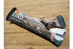
The new logo first appeared on the store shelf with the launch of Kind’s new Healthy Grains Energy Bars in spring 2025, on both the product's primary packaging wrappers and secondary cartons. The company also began an update to its overall package design with the launch of the new product. The new package design includes an unwrapped bar and functional benefits, along with the new logo.Kind
The new design includes an unwrapped bar, highlighting the ingredients and flavors included in each bar, “whereas the previous packaging only showed a portion of the bar, limiting consumers’ visibility not only to taste, but also to texture,” says Olsen.
Functional benefits are also prominently featured, drawing consumers in as they make quick shopping decisions. “Consumers make decisions at shelf in under one second,” says Olsen. “They want to quickly and easily understand if the snacks they pick up are for them.”
A little change makes a big splash
Kind shared about its new logo on social media on May 1 with an unveiling video at its corporate office, and consumers and fellow brands alike poked some fun at the seemingly minor change.
“Is this play about us,” commented Walmart, likely nodding to the retailer’s similarly minimal branding change earlier in 2025.
“These spot the difference games are getting harder,” commented olive oil brand Graza.
Kind stands by its change as a modernization of its visual identity, while staying recognizable. It even joined the fun with its following video, explains Olsen. “Our team members read and reacted to the most outrageous, funniest comments from the original unveiling video, and clapped back, playfully, to keep up the engagement with our consumers and even other brands that jumped into our comments.”
Kind’s next chapter as a brand
Kind swapped to its new logo across owned channels on May 1 and plans to update its packaging over the next several months, into 2026. Its next product to get the refreshed packaging will be its classic nut bars in the second half of 2025.
This is the second major announcement from Kind in 2025, with the brand having piloted curbside recyclable paper wrappers at Whole Foods Markets in the U.S. earlier this year.
 Kind is expanding its fruit flavored offerings as it launches its newHealthy Grain Energy bars.Kind
These changes in packaging material and product offerings, along with the new package design for greater shelf appeal, point to a focus on serving Kind’s consumer base.
“Kind is a consumer-obsessed brand,” says Olsen. “Our innovations, from product to packaging, always put the consumer first. We’ll continue to innovate our brand to what matters most to them while still delivering nutritious and delicious snacks.”