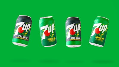
The original lemon-lime soda 7UP recently revealed its first total brand design refresh since 2014. The new packaging design spotlights some of 7UP’s signature visual elements, including bubbles, the red dot in the logo, and the color pallet. The brand says that updates to these elements, taken together, represent 7UP’s crisp, clean lemon-lime taste and fun personality while providing a foundational visual experience for the consumer across the brand’s portfolio.
The new look is being applied consistently between primary packaging in aluminum cans and labels on PET bottles, and cartonboard multipack secondary packaging. The full portfolio of 7UP products in North America will feature this refreshed design, including Regular and Zero Sugar Lemon Lime flavor, and Regular and Zero Sugar Cherry flavor. While no physical packaging changes occurred as part of the refresh, it wasn’t simply a matter of aesthetics—it had purpose, stakeholders say.
Allison Kapp, senior brand manager, Keurig Dr Pepper, oversaw the project alongside Minneapolis-based design agency CBX, who supported the graphics refresh by performing tests of the new packaging across various formats to ensure that we could achieve the desired look. The brand and agency kicked off the project early in 2023 and began seeing the graphics transition in market by June 2024.
This 7UP refresh is yet another data point in recent spate of packaging redesigns for longstanding, even iconic brands, many of which are in the beverage aisle. So why a redesign now for 7UP?
“Packaging is an important asset, especially in a highly competitive category like carbonated soft drinks, given its role to effectively capture consumer attention, drive conversion and represent the brand,” Kapp says. “The recent focus on redesigns highlights the importance of maximizing brand presence at retail.
“The brand recognized an opportunity to improve its on-shelf presence, specifically focused on the ownability of the graphics to better communicate the brand’s equities and personality,” Kapp continues. “We aimed to establish ownership of the emotional and functional qualities that define the brand and convey its value to consumers.”
Iconic elements remain, but receive modern updates
As is the case with any brand refresh, some elements of the legacy design were retained, and others were scuttled. The new packaging certainly didn’t drop the brand’s iconic visual elements like bubble patterns, the 70 or so years of brand equity in the red dot, and the familiar red, white, and green color pallet.
But if you look more closely, Kapp says these signature red and green colors take a fresher and brighter approach while maintaining familiarity. New 7UP design elements (right) include a flatter, less cluttered logo, icons instead of photo-realistic lemon-lime wedges, and equal descriptive messaging between classic Lemon-Lime and newer Zero Sugar flavors.
“The previous swirl that rose vertically behind the brand logo has been replaced with fun and flavorful effervescence and flavor notes that move upward and burst off the package,” she says. “With the new look, we feel that we are better capturing the brand’s personality and the uplifting experience of consuming 7UP.”
The hypothesis was that using a brighter color palette would help the brand stand out at retail and better convey the brand's personality. The company conducted research that confirmed this.
Another noticeable change is the reduced dimensionality in the logo—for instance, no longer is shadowing used in the 2D red dot to simulate a 3D red sphere. The outline or bordering effect around the letters in 7UP was also eschewed. Many brands have been moving towards flatter, and less cluttered logos over the years, and making this move kept 7UP in line with a more modern look and feel. The redesign, as reflected here on labels applied to PET bottles, presents the two varieties--Lemon-Lime (left) and Zero Sugar--on equal footing, rather than Zero Sugar being a subset of the original. Messaging is aligned, logos are identical, and the color gradients distinguish the two visually at a distance.
Speaking of modern, 7UP’s redesign also employs the very 2020s practice of replacing realistic or cartoonish images with more abstract iconography. In this case, the near photo-real rendering of lemon and lime wedges on the legacy pack is abstracted out into a simpler, representative icon that remains immediately recognizable as symbolizing lemon and lime wedges.
“We talked to thousands of consumers and worked with them to present a wide spectrum of ideas to learn how far was too far. This helped us to understand what the table stakes were and where there was room to be bolder in our design,” Kapp says, noting, “There have been a lot of CPG case studies over the years of brands that took a redesign too far. Those cautionary tales are always in your mind. Getting the voice of the consumer is so critical. We were very consumer-centric in our approach to ensure each decision we made was supported by real consumer testing, insights and data.”
Kapp identified the most challenging part of the redesign as its approach 7UP Zero Sugar packaging. Since 7UP is a longstanding legacy brand, it never needed much by way of identification as a lemon-lime-flavored soda; that was its entire identity. The more recent addition of Zero Sugar required strong messaging to differentiate it, creating an imbalance between the two flavor’s respective packaging designs. This redesign brings them onto equal footing, aligning them with similar flavor designation either as Lemon-Lime, or Zero Sugar.
“7UP Zero Sugar was complex because consumers have come to look for the color black when shopping for Zero Sugar soda, and 7UP Zero Sugar has historically been in white and green packaging. As we approached the redesign, we were mindful of the need to shift to category norms while balancing the importance of the brand’s core color green. We decided to use a gradient approach that introduces a black-like color blended into a brighter color. However, the gradient approach posed some complexities in the production process,” she says. “Our partners at CBX and our internal Liquid Sunshine agency team, who led production with suppliers, were invaluable in ensuring both consumer centricity and production feasibility.”
So far, 7UP says that the consumer feedback on its social media platforms has been very positive. PW

