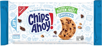
Chips Ahoy has redesigned its packaging with a modern logo, updated cookie photography, and prominent graffiti graphics to appeal to consumers and improve shelf visibility. The gluten-free variant uses reversed light blue and white colors to make it instantly distinguishable from the original recipe.
- Chips Ahoy introduced new packaging designs featuring an updated logo, improved cookie imagery, and matte finish with vibrant graffiti elements
- The redesign aims to evolve visual language for target consumers while emphasizing taste appeal and product improvements
- Gluten-free variant uses reversed color scheme (light blue on white instead of white and light blue on darker blue) for immediate shelf recognition
- Packaging uses rotogravure printing with matte lacquer overlay to create differentiation and complement new graphics
- Mondelēz updated original cookie recipe alongside launching first certified gluten-free chocolate chip cookie option
Mondelēz International stalwart brand Chips Ahoy! has been launching some new recipes lately, including an update to its original cookie recipe alongside its first certified gluten-free chocolate chip cookie. A pair of new packaging designs with a combination of improvements including updates to the logo, an updated image of the cookies themselves, and more prominent background graffiti reflecting the brand personality with a matte packaging finish that all together makes it a more modern and fun design, the company says.
“The overall objective of the Chips Ahoy pack redesign was to evolve the visual language to be relevant with the target consumer, double down on the taste appeal of the cookie and to communicate the product improvements. We crafted the logo to ensure modernity and boldness against the backdrop. We amped up the graffiti to add personality and visual texture. We photographed our product as the hero on pack to drive the yum-factor. All of these elements work together to deliver an iconic experience at shelf for our Chips Ahoy consumers,” says Samantha Zellefrow, Global Design Excellence lead at Mondelēz.  On the new original recipe pack, a combination of improvements include updates to the logo, an updated image of the cookies themselves, and more prominent background graffiti reflecting the brand personality with a matte packaging finish.
Specific to the even more recent gluten-free launch, packaging colors are reversed to light blue on a white background instead of the white and light blue on darker blue. This will help to make it immediately obvious which cookies are gluten free, and which are not, by a simple glance at the shelf.
“For the packaging, this is the existing adhesive laminated peel and reseal film structure with a rotogravure print method. Utilizing the existing printing technology, a matte over lacquer is applied to create differentiation on shelf and complement the new graphics. The metalized film layer provides the barrier required to achieve the appropriate shelf life of the new cookie formula,” adds Andy Clark, North American Biscuit Packaging lead, Mondelēz.