In a time of overwhelming choice, labels aren’t just practical packaging components, they’re like the physical thumbnails of your brand. The right label in the right place can help consumers stop the “shelf-scroll,” where hundreds of items visually bombard them in a single glance.
The most effective label designs are recognizable, functional, and reflective of a brand’s personality, but they also need to play nicely with your packaging format, retail environment, and customer expectations. And more than that, they need to be suited to your industry. So here are some tips on how to shift your label design according to your sector.
Beauty and haircare: Standing out in a crowded aisle
The beauty industry is one of the most competitive design spaces. Here, labels have one job: to make people pause and pay attention. Haircare brand Hair Syrup recently rebranded with a bolder label design, including larger fonts, higher contrast, and a more eye-catching palette.
While some customers were initially confused by the rebrand, Hair Syrup leaned into the conversation on social media, showing how the new design stood out more clearly in-store on crowded drugstore shelves. While there’s nothing inherently wrong with the original design, it’s easy to see where the original fell short when compared with the reimagined label: Fonts often need to be more prominent than you think if you want them to pop out from the shelf.
 | Read this related packaging design article, “The Power of ‘Chaos’ Packaging” |
The new label also fits in with one of the top typography trends for 2025, which involves unexpected lettering combinations. Mixing serif and sans-serif, condensed and oversized fonts help draw the eye to your label and break up the sea of sameness.
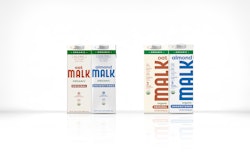
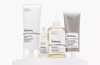
In beauty branding, this sameness has often translated to quite bland minimalism across the board. The popularity of the “clean girl aesthetic” has resulted in many brands looking nearly identical. That said, brands like The Ordinary prove that minimalism still works when it’s crafted intentionally. Their labels use small lettering, clinical language, and a monochrome palette that mimics pharmaceutical design, reinforcing scientific credibility. It’s proof that subtle consistency, when executed in a smart way, can be just as powerful as boldness.
On a practical level, the format for labels matters more than most in beauty in terms of space for ingredients and materials. Opt for oil- or water-resistant materials, especially for items stored in steamy bathrooms or tossed into makeup bags, to ensure longevity. These labels need staying power!
Food and beverage: Communicating taste, quality, and trust
In the supermarket, labels have milliseconds to do a lot: spark appetite, build trust, and deliver key nutritional information. Graza, the olive oil brand, reinvented expectations with a squeezable bottle and a minimal, color-rich label with playful illustrations. The vibrant yellow and green play off the bottle’s shape and signal freshness and fun, making it an effective departure from the usual glass-and-gold tradition of olive oils.
 Graza’s playful, color-rich labels break convention in the olive oil aisle, using bold typography, squeezable bottles, and whimsical illustrations to instantly signal freshness and fun. Image credit: Graza
Botivo, a non-alcoholic aperitif, embraces maximalism in a different way. Its yellow label sits against a dark bottle and features playful, hand-drawn illustrations that recall “Where’s Waldo” or the drawings of children’s author Richard Scarry. This isn’t decoration for decoration’s sake: It adds narrative and personality to everyday ingredients in a way that demands attention.
For both of these examples, the labels work with the respective format, as glass jars, cartons and squeezable bottles all come with different surface and adhesive requirements. Oil and condensation can interfere with adhesion, so flexible or laminated options can help. After all, it’s hard to stay memorable if your eye-catching label is nowhere to be seen.
Household and utility: Labels that spark joy (even when the product probably doesn’t)
Household products often face the “boring but necessary” branding challenge, but great design can inject personality into these everyday items. In this category, labels can make the difference between something that hides under the sink and something you’re happy to leave on the counter.
For example, Puracy leans into gentle sophistication. Its adhesive labels feature delicate botanical illustrations and soft, muted tones, reinforcing the brand’s clean, non-toxic message. In many ways it looks more like a skincare product than a surface cleaner, which is exactly the point.
Eco-cleaning brand Ecover takes a different approach, but still manages to get the balance right. Their labels are functional and fresh, pairing bold typography with crisp color blocking. Each product variant (like limescale remover or oven cleaner) is color-coded with calm, natural tones like sage green or berry purple, making it easy for the user to know exactly which product they’re picking up without having to read the fine print. The generous use of white space and transparent bottles keep things feeling clean and uncluttered—much like your home—while the bright logotype with its leafy “V” cues sustainability without looking too earthy. Plus, the labels are minimal enough to stay attractive over time and durable enough to withstand use. When you’re promoting refill systems, as Ecover does, consider using recyclable or compostable labels and packaging to add integrity.
Label function and placement: Not just what it says, but where
When designing a label, every side of your packaging can be your canvas. Little’s Coffee offers a clever example: The lid label of their instant coffee jar includes brand messaging and fun copy. It’s a small touch, but one that creates memorability and delight in an unexpected place.
Peel-off or layered labels are also trending, which allow brands to include extra information, stories, or loyalty rewards without cluttering the main packaging design. Every surface on your product is an opportunity, so think about how a customer experiences your product and capitalize on where their focus lies.
| | Read another article from Patrick Llewellyn, “Four Trends Shaping Beer and Wine Design in 2025” |
What makes a label great, not just good, is that it combines purpose and great aesthetics. A top label stands out in the right way, aligns with your brand and your product format, and elevates the overall user experience. Whether you’re embracing bold maximalism, technical minimalism, or something entirely your own, make sure your label is doing more than keeping up with trends. It should tell your story, spark a connection and—ultimately—stop the scroll. PW
Patrick Llewellyn is CEO at 99designs By Vista