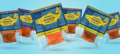
“Life at full flavor.” That’s the Point of View that drove the redesign for Honey Smoked Fish Co.’s fish packaging, a POV developed by design agency LRXD after extensive research with the brand’s current and prospective customers. The redesign, which included packaging for the company’s Original Honey Smoked Fish and five other flavors, delivers more product information to shoppers than its predecessor in a look that LRXD says better captures attention and represents the brand’s personality, which the agency says is “bold, modern, health-conscious, convenient, caring, authentic, and a little bit weird.”
 A box for Honey Smoked Fish Co.'s salmon products complements the graphics used on the primary packaging.
The strategy of giving a brand a packaging facelift while retaining elements of its heritage that have made it a consumer favorite is one that has been proven successful for many brands, including some covered by Packaging World in 2019. Among them are a redesign for cannabis edibles brand incredibles, which mimicked the feel of its original “old school” packaging, featuring bold, bright, and fun graphics (see “Cannabis brand incredibles grows up, but keeps its cool”); a new bottle for Pickers Vodka that uses a unique shape and embossed details to connect the brand with its Nashville music scene origins (see “Guitar neck-embossed bottle pays tribute to vodka’s roots”); a specialty tin for new powdered milk flavorings from Shatto Milk that complements the time-tested glass bottle format used for its liquid milk (see “Milk ‘flavorizer’ in tin evokes brand’s nostalgic positioning”); and new packaging for Bertolli Olive Oil that pays homage to its city of origin, Lucca, Italy (see “Olive oil’s provenance drives bottle redesign”).
For the Honey Smoked Fish redesign, LRXD’s research found that consumers valued the brand for its quality, healthy, taste, and company values. Full flavor was a strong brand driver and differentiator, and people also cited factors such as fresh from the ocean, never frozen, boneless, full of omega 3s, and committed to ethical/best practices as reasons they bought it.
 Since research showed relaying information was essential, it was treated as key art, with bold pronouncements about flavor, freshness, convenience, health benefits, and sustainable practices gracing both sides of the package.
“Freshness is our main ingredient,” each horizontally-oriented package reads. “Well, that and cooked salmon,” they go on to explain. Lower down: “Fully cooked and ready to dive in.”
And right smack in the middle is the sole illustration: a smiling salmon that represents the big, iconic, bold personality of the brand.
The Honey Smoked Fish line flavors include Original, Garlic & Herb Salmon, Mango Habanero Salmon, Orange Ginger Salmon, Cracked Pepper Salmon, and Chipotle & Lime Salmon. The new design hit store shelves in September 2019.