Black Poetry, an India-based coffee company, launched a line of carbonated, no-milk sparkling coffees in 2026 with innovative packaging called 'Beautiful Vandalism' that combines classical portraiture with street-art graphics and torn-paper effects to communicate that the product breaks from traditional coffee conventions while remaining accessible and memorable.
- Product Launch: Black Poetry introduced three sparkling coffee varieties in 185-mL slim cans, targeting younger consumers seeking alternatives to traditional hot coffee in India's tropical climate.
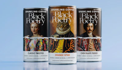
- Beautiful Vandalism Concept: The packaging design uses classical portraiture in the upper section, a torn-paper dividing line representing carbonation, and street-art graphics below to signal disruption while keeping the product category immediately recognizable.
- Design Strategy: Each can features a distinct portrait (woman, man, and Elizabethan cat) with unique color palettes and illustration styles to create family recognition while maintaining individual personality for each flavor.
- Product Specifications: All three varieties are no-milk, low in sugar, carbonated with gentle fizz, and contain roughly one espresso's worth of caffeine per can, designed for quick consumption between activities.
- Market Positioning: The packaging bridges the gap between traditional hot coffee and cold beverages, appealing to students, professionals, and busy homemakers seeking lighter, vegan-friendly, refreshing caffeine options.
An Elizabethan cat in a ruff is not an obvious way to sell a can of coffee. Yet the unexpected portrait helps define a new sparkling coffee line, where classical imagery, street-art graphics, and torn-paper effects signal that what’s inside is also a departure from the usual coffee experience.
Founded in 2025, India-based Black Poetry spent its first year building an identity around premium, artisanal coffee, offering specialty coffee beans and ground coffee for home brewing. In August 2026, it expanded into ready-to-drink beverages with three carbonated, no-milk coffees: Classic Twisted, Orange Spike, and Chocolate Fused, each in a 185-mL slim can.
Moving into RTD meant reaching a broader, younger audience with a product outside familiar coffee conventions. That made the package essential for explaining sparkling coffee while giving the new line a personality distinct from Black Poetry’s existing products.
“We realized that a product as unconventional as sparkling coffee needed branding that was equally disruptive,” says Black Poetry founder Rahul Goel. “The packaging had to break away from traditional coffee cues, feel accessible rather than overtly luxurious, and immediately communicate that this was something out of the ordinary.”
Building a different kind of coffee
While sparkling coffee remains a small category in India, Black Poetry saw an opening between traditional hot coffee and the cold beverages consumers already reach for in the country’s warm climate.
“A no-milk or vegan coffee is already the go-to choice for a large and growing segment of regular caffeine consumers,” says Goel. “In a largely tropical country like India, hot coffee isn’t always what you reach for, sometimes you simply want your caffeine chilled, refreshing, and sparkling.”
Goel sees a broad potential audience. It could be “a student looking for a quick pick-me-up, a corporate professional between meetings, or a homemaker taking a break in the middle of a busy day,” he says.
Consumer preferences for lighter drinks also influenced the decision to leave out dairy. Goel says Black Poetry has seen palates shift toward “less sugary, lighter and cleaner flavors” rather than heavy, creamy drinks. Removing milk kept the ingredient list relatively simple, reduced the need for preservatives, and helped the company achieve a longer shelf life.
 Black Poetry presents its sparkling coffees in both product and serving contexts, reinforcing the line’s positioning as a chilled coffee alternative for different occasions.Open Strategy & Design/Black Poetry
Developing the product still took several months of trial and error. Black Poetry experimented with different beans to find the coffee profile it wanted, tested flavors and sweetness levels, and worked through the added processing considerations that come with combining pasteurization and carbonation while retaining the character of cold brew.
“We also deliberately kept the carbonation gentle, so the drink feels light and refreshing rather than overly fizzy,” Goel says. “Sparkling, not bubbly.”
The company also worked through what Goel describes as “the whole gamut of flavors” before settling on three launch varieties designed to cover distinctly different preferences. Classic Twisted is aimed at coffee drinkers who want a straightforward coffee profile. Orange Spike adds a subtle citrus note, and Chocolate Fused brings together chocolate with hints of vanilla and hazelnut for a richer flavor. All three are intentionally low in sweetness.
The 185-mL can was chosen with the caffeine occasion in mind. According to Goel, it provides roughly the caffeine hit of a single espresso in a portion that feels appropriate for one sitting.
Where the product belongs at retail is less straightforward. Black Poetry does not see it as an energy drink because of its lower caffeine content, yet its lack of milk and carbonation also separate it from conventional canned lattes and flavored RTD coffees. ”Sparkling coffee made with real coffee is still a very small category in India,” Goel says, “so ideally, it deserves a shelf space of its own.”
That lack of an established category language gave Open Strategy & Design both a challenge and an opportunity when Black Poetry brought the consultancy in to develop the positioning, visual identity, packaging, and communication system for the line.
A pack built around disruption
Open approached the can as more than a surface for arranging branding and required information. With a product consumers might be seeing for the first time, the package needed to introduce the brand idea on its own.
“When you treat packaging as media, the first design question becomes: What is the one thing people should notice, remember, and recognize again?” says Radhika Dhuru, executive creative director at Open Strategy & Design. “The pack has to carry the brand idea on its own. It cannot depend on advertising, celebrity, context, or a campaign to explain what the brand stands for.”
In the case of Black Poetry, that idea became “Beautiful Vandalism,” a design concept built around altering something familiar to give it a different meaning. Open drew inspiration from détournement, the practice of reworking existing images or messages to create new meanings, and from artists such as Jean-Michel Basquiat and Keith Haring, whose work incorporates intervention, graffiti, and appropriation.
“The juxtaposition of the familiar and the new was the very foundation of everything, right from the product itself,” says Dhuru.
The design begins with what Open calls the “Revered” layer, where classical portraiture occupies the upper portion of the package and evokes the craft and seriousness traditionally associated with coffee. A ragged, torn-paper edge then slices horizontally through the portrait, creating the “Rupture.” Below it, the same subject continues in the “Rebellious” layer through illustration, graffiti, marker-like drawing, and street-art textures.
 Lifestyle imagery extends the packaging’s irreverent personality beyond the shelf, positioning the slim cans as portable, contemporary coffee choices. Open Strategy & Design/Black Poetry
The tear is more than a decorative divide. Open designed it as the visual equivalent of carbonation breaking through still coffee, making the product proposition visible without literally illustrating bubbles or carbonation.
The portraits also give each SKU a distinct personality within the same visual system. Classic Twisted features a woman, Chocolate Fused a man, and Orange Spike a cat in elaborate period dress. The feline subject adds a note of humor to the otherwise formal portraiture, helping the range feel irreverent rather than simply premium.
“The cat was important because it stopped the classical world from becoming too polite,” Dhuru says.
Its pose, lighting, costume, and composition follow the same conventions as the human portraits, but the subject introduces an unexpected absurdity. That contrast is especially useful for Orange Spike, whose flavor profile is lighter and more playful than the richer Chocolate Fused. Dhuru describes the cat’s “slightly absurd formality” as a way to heighten the tension between the refined portrait above and the street-art treatment below.
Keeping the unfamiliar understandable
For all the disruption in the imagery, Open deliberately kept the information hierarchy much more conventional. “Sparkling Coffee” appears prominently near the top, while a clean white band at the base provides a consistent place for the flavor name, product descriptor, and claims, including “No Milk,” calorie information, and “Low in Sugar.”
“We chose to break the cultural codes around coffee rather than the basic codes that help someone understand what they are buying,” explains Dhuru.
That division gives different elements of the pack different jobs. The portraits, tearing, and graffiti carry the brand attitude, while the functional information tells shoppers what the unfamiliar product actually is.
The structure extends around the full circumference of the can. Rather than treating the torn edge as a front-panel graphic, Open continued it around the package so the relationship between the classical upper section and vandalized lower section remains visible from multiple angles. On the back, required copy and nutrition information are organized into defined areas while the tear continues through the design.
Black Poetry uses imported cans decorated with digitally printed shrink sleeves rather than direct can printing. The sleeves are made from 40-micron PETG and allow full-circumference artwork across all three variants. The drinks are filled and packed in Bangalore by Black Poetry partner Mahaveer Inc.
One design system, three distinct personalities
Open wanted the three cans to read immediately as a family without falling back on the common approach of repeating the same image in different colors. “We built recognition through architecture and variation through character,” says Dhuru.
Within the shared design system, each flavor gets its own portrait, background atmosphere, color accents, illustration style, and density of graphic intervention. Classic Twisted is brighter and more expressive, Orange Spike uses a warmer palette and more graphic treatment around the cat, and Chocolate Fused moves into a darker, richer visual world.
“The important point was that variation could happen inside a fixed grammar,” Dhuru says. “We did not need to repeat one image three times in different colors. Each flavor could develop its own personality while the range remained recognizable at a glance.”
Open also studied chiller shelves in major supermarkets to see how beverage packages compete in dense retail environments. Using basic eye-tracking principles, the team considered what shoppers see first, what holds their attention from a distance, and which elements remain recognizable when packages are repeated across a shelf.
The research reinforced the decision to use the large portrait as a focal point while retaining the dark palette, typography, and crafted visual language associated with premium coffee. The torn transition and vandalized artwork could then provide the disruption.
“For a new format, the pack has to earn curiosity without creating confusion,” Dhuru says. “We wanted someone to register that this was coffee, recognize that it was behaving differently, and then understand what was inside the can within a few seconds.” PW