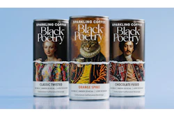
This episode digs into how Indian brand Black Poetry and consultancy OPEN Strategy & Design solved that problem on the can itself, using a design concept called beautiful vandalism that splits classical portraiture from street-art graffiti with a ragged torn-paper edge.
Along the way: why abstract disruption communicates carbonation better than literal bubbles, how a rigid information hierarchy keeps the chaos legible, why the shrink sleeve spec is what lets the effect run 360 degrees around the can, and what an Elizabethan cat is doing on a premium coffee SKU.
Follow this podcast on your favorite streaming platform - links can be found by clicking here.