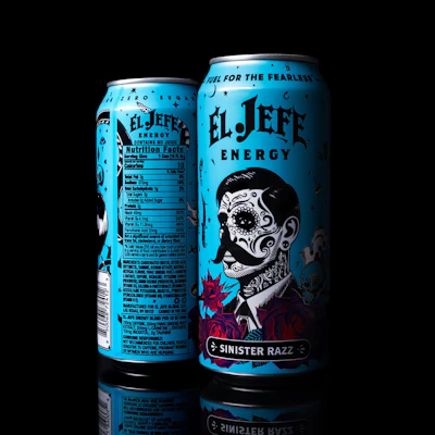
El Jefe Energy differentiates itself in a crowded market by treating aluminum cans as collectible art pieces with detailed illustrations and custom ink colors, rather than following standard industry design formulas. The brand's Sinister Razz flavor can, featuring a tattooed sugar-skull design with custom rose shades, won the Colored by INX Can Design Contest and demonstrates how premium packaging and close collaboration between brands and manufacturers can create standout products that drive retail success and consumer engagement.
- Rapid Growth: El Jefe Energy launched in 2024 and expanded to six countries including the U.S., Canada, Mexico, Chile, Australia, and the U.K.
- Design Philosophy: The brand rejects standard energy drink design formulas (large color blocking, simple graphics) in favor of detailed artwork and layered graphics that make cans instantly recognizable.
- Custom Color Process: The Sinister Razz can required custom rose ink formulations developed by INX's Charlotte lab, with samples provided pre-drawn on metal for consistency.
- Technical Innovation: Can-One USA reduced standard trapping by half to accommodate fine linework, requiring perfect press registration for the five-color label design.
- Measurable Success: The brand measures packaging success through retailer demand for shelf space, consumer photography, organic social media engagement, and sales velocity.
Since launching in 2024, El Jefe Energy has grown from an independent startup into an international energy drink brand with distribution across the U.S., Canada, Mexico, Chile, Australia, and the U.K. Along the way, founder and CEO Ryan Marsh has treated packaging as a primary marketing vehicle, with every new flavor designed to stand apart in a crowded cooler door at retail or convenience stores.
For the brand’s Sinister Razz flavor, that meant an unusually ambitious can portraying a tattooed, sugar-skulled gentleman in a suit, rendered in fine linework and surrounded by deep red roses, all floating on a field of bright turquoise.
“Sinister Razz started with one objective: create a can that people would instantly recognize from across the aisle,” Marsh says.
That objective was shaped by what Marsh sees as a sameness problem in the energy set.
“Most brands in our category aren’t actually black. What many of them have in common is that they follow the same design formula—large color blocking, simple graphics, or turning the word logo sideways and calling it innovation. We intentionally chose not to do any of that,” he says. “Instead, we created a package that feels like a piece of art, with detailed illustration and layered graphics. We wanted consumers to stop, pick up the can, and spend a few extra seconds looking at it.”
Physical swatches over screens
Getting that artwork onto metal fell to Can-One USA, the New Hampshire-based U.S. division of global packaging manufacturer Can-One Berhad, which produces El Jefe’s two-piece aluminum cans. Rather than approving colors from a monitor, Marsh and his designer sat down with the Can-One USA team and physical swatches from the INX Color Catalog, the standardized color system from ink maker INX International Ink Co.
“We sat down with our designer and the Can-One USA team using physical INX swatches rather than computer screens because I wanted to approve real colors on real material,” Marsh says. “We refined every important element until it matched the vision. The roses, turquoise, and background tones received the most attention because they define the El Jefe identity.”
Aric Leighton, prepress and design lead at Can-One USA, says having the brand owner work from the same physical reference changes the entire approvals stage. “It makes it so much easier to discuss potential colors and the things we can achieve when both parties are able to look at the exact same color at the same time,” he says. “It cuts out a lot of the guesswork and back-and-forth that comes with trying to describe or approximate a color remotely.”
That mattered because the two teams worked from opposite sides of the country. “When working with El Jefe’s designer, Chance, our team set up meetings to discuss artwork placement, trapping sizes on each design element, comparisons to other El Jefe cans, and, of course, INX colors,” Leighton says. “Because we were communicating throughout the process—and working from a shared, standardized color reference—we were able to catch potential issues early instead of discovering them at a press check, which meant far fewer rounds of proofs and ship-backs than a traditional workflow would require.”
“The standardized catalog reduced unnecessary back-and-forth because everyone was referencing the same physical colors instead of different monitors,” Marsh adds. “That let us focus on perfecting the design rather than debating color accuracy.”
Custom inks for the roses
Not every color the brand wanted existed in the catalog. The roses, one of the defining elements of the brand identity, required custom ink formulations. “We ultimately developed multiple custom rose shades to achieve the richness and depth we wanted,” Marsh says. “We weren’t interested in getting close—we wanted it to be right.”
For custom work, Can-One USA turns to the INX lab in Charlotte, N.C. “Our color requests are generally in-hand in under two weeks, and we very rarely need to iterate,” Leighton says. “There’s no need to validate the color on metal separately, since the custom formulations are sent to us already drawn down on metal from the lab.
“The biggest hurdle I've run into is when customers compare Pantone swatches printed on bright white paper to what's achievable on a two-piece can—the substrate itself changes how a color reads,” he says. The lab's drawdown samples reference the Pantone match, giving the plant a recorded standard it can hit consistently from run to run.
“Watching the custom color process gave me an appreciation for the level of craftsmanship involved,” Marsh says. “Multiple test samples were reviewed until the finished colors accurately reflected the artwork we wanted on the final can.”
Five colors, tighter trapping
The finished Sinister Razz can is a five-color label that leans on layering rather than color blocking, and the fine linework in the sugar-skull illustration pushed Can-One USA off its standard prepress parameters.
“We worked directly with El Jefe’s designer to discuss things like trapping, or stay-away, on the fine linework. We normally use a standard line weight for this, but with El Jefe we knew the art needed finer attention to detail to really shine,” Leighton says. “We reduced the trapping by about half, and our press staff worked hard to make sure registration was perfect, even in that tighter area.”
Shelf impact that shows up in the numbers
The can went on to win the seventh annual Colored by INX Can Design Contest this spring—recognition Marsh welcomes, but the brand measures the package’s success in more commercial terms. Members of the Can-One USA team celebrate the company's Colored by INX Can Design Contest win, from left: Nick Hanna, former Head of Creative & Branding; Jeff Fontaine, Plant Superintendent/CTS Manager; Aric Leighton, Prepress & Design Lead; Eko Aprianto, Engineering Assistant Manager; Darith Em, General Production Maintainer; Chaidir Umar, Plant Manager; Anna Pichico, Graphic Designer; and CEO Giovanni Di Mambro.Can-One USA
“We measure success by retailer excitement, repeat purchases, consumer engagement, organic social media posts, and sales velocity,” Marsh says. “When retailers ask for more shelf space and consumers start photographing the can, we know the packaging is working.”
With distribution in six countries, color consistency has become a scaling concern. “Consumers should receive the same El Jefe experience whether they buy the product in the United States, Mexico, Canada, or any future market,” Marsh says. “Consistent color standards protect the brand as we continue expanding globally.”
"Sinister Razz is now a go-to example when we're talking to prospective customers about what's possible on a two-piece can," Leighton says. "It's proof that with the INX Color Catalog, close collaboration with a brand's designer, and attention to detail on things like trapping and registration, we can hit ambitious, vibrant color work at a level that used to seem out of reach for this substrate."
Marsh sees the same lesson from his brand owner side of the table. “The biggest lesson I learned is that exceptional packaging comes from collaboration. When the brand owner and manufacturer work together early in the process and both care about the finished product, the results are dramatically better,” he says.
“The recognition validated our philosophy that investing in premium packaging is worthwhile," Marsh concludes. "I hope it encourages other independent brands to think bigger, because outstanding packaging can absolutely compete with the largest companies in the world.”