Fresh Market redesigned over 700 private label SKUs across three quality tiers to bring its distinctive in-store experience to product packaging. The redesign used a shared architecture with flexible category personalities, allowing each product to tell its own story while maintaining cohesive brand recognition.
- Fresh Market partnered with U.K.-based Equator Design to overhaul packaging for 700+ SKUs across three quality tiers: Extraordinary Everyday, Premium, and Uber Premium
- The design system uses a recurring conversation panel, consistent typography, and the signature sign-off "Loved By Us" to create unity while allowing category-specific personality
- Notable designs include a Chocolate Library collection with five distinct illustrated bars and a custom coffee cup featuring a whimsical storybook world that has become iconic to the brand
- The bakery redesign replaced white boxes with blush-pink luxury packaging, shifting the perception from grocery store to French patisserie and driving immediate sales impact
- The rollout began in 2023 with final artwork completed in September 2025; approximately 75-80% of redesigned products have reached store shelves, with seasonal programs expanding the system beyond original scope
Walk into one of The Fresh Market's stores, and the design brief writes itself. Florals at the entrance bloom into produce. Produce gives way to a butcher’s case of hand-cut kebobs and chicken roulades. The scent of fresh bread leads shoppers toward the bakery, and from there the store unfolds further into a candy island, a prepared-foods section, and an extensive whole-bean coffee selection.
“We are taste first and experiential,” explains Michelle Beck, director of merchandising, private label, at The Fresh Market. “What makes us unique is the size of our store, the layouts of our store, and really how we think about food and the journey we create for our guests.”
 The Fresh Market’s expansive whole-bean coffee section and in-store coffee station are central to the retailer’s sensory, discovery-driven shopping experience, an atmosphere the grocer sought to extend into its redesigned own-brand packaging.The Fresh Market
Unfortunately, for years the packaging failed to carry that same sense of discovery into the aisle. “The Fresh Market’s own-brand packaging was functional, but it had grown piece by piece over years and didn’t carry the sensorial conversation happening elsewhere in the store. As the retailer modernized nearly every other touchpoint of the brand, the gap between the in-store experience and the packaging became harder to ignore.
To bring the store experience to its product packaging, the Greensboro, N.C.-based specialty grocer embarked on a redesign of its private brand spanning more than 700 SKUs across three quality tiers, executed in partnership with U.K.-based Equator Design, not because something was broken, but because it could be better.
A refresh from a position of strength
It was rising ambitions, not softening sales, that drove the decision to overhaul the packaging for The Fresh Market’s full portfolio of products. The grocer is in the middle of a broader brand evolution that has already touched the store environment, signage, and merchandising. Beck saw packaging as the final layer.
“Because we are so experiential, our packaging plays a very large part in creating that atmosphere,” she says. “It’s crucial for us to stay ahead. Plus, we are at a time where we are beginning to aspire to attract a new guest. This rebrand of our packaging was the final touch to refresh who we were and who we were looking to attract.”
The brand had also worked itself into a strategic pendulum. Years earlier, The Fresh Market’s own brand had leaned into a “treasure-hunt” aesthetic, with packaging varying wildly from category to category. The variety created excitement, but it also made it harder for shoppers to immediately recognize what belonged to The Fresh Market.
Concerns about brand recognition eventually pushed the team in the opposite direction, toward a highly uniform system that, in Beck’s words, “sucked every bit of personality out” of the range. “We were missing the story element, we were missing the things that make us special,” she says. “We were missing the 100%-satisfaction-guaranteed promise. Those things needed to come back, and they needed to tell the story of the product.”
Restoring that story meant rethinking the entire private-label architecture from the ground up, across three distinct tiers.
Designing for three tiers, one brand world
Internally, The Fresh Market’s own-brand portfolio is organized into three tiers: Extraordinary Everyday, the workhorse “better” tier in good-better-best parlance; a Premium tier representing the brand’s “best” everyday SKUs; and an aspirational Uber Premium tier reserved for the most epicurean, highly curated items in the assortment. None of those labels appear on-pack; the tier system is a design and merchandising tool, not a consumer-facing claim.
The design brief Equator received was demanding. Make the three tiers visually distinct enough that a shopper navigating the salsa aisle, comparing olive oils, or choosing between coffee blends understands the step-up from Extraordinary Everyday to Premium without reading a single line of copy, while keeping all three legibly part of one brand family across produce, dairy, grocery, bakery, deli, and seasonal LTOs.
 Deep burgundy tones, dramatic food photography, and restrained typography give The Fresh Market’s chef-inspired meal kits a more elevated, restaurant-quality feel aligned with the retailer’s Premium and aspirational Uber Premium positioning.Equator Design
The project began with a three-day immersion of the Equator team into The Fresh Market in Greensboro. Beck and her colleagues walked the agency through every section of the store, plied them with product samples, and put faces and stories to the SKUs.
“I felt like I had The Fresh Market running through my veins,” Robinson recalls. “It made our job easy because we got to soak up the loveliness, the character, and the conversation. But when we reached the packaging, the conversation stopped. So our initial ambition was: How do we replicate the amazingness of The Fresh Market store and inject it into the packaging itself?”
Consistency with character
The packaging design system Equator built treats the previous question of consistency or character as a false choice. A shared architecture supplies the backbone, built around a recurring conversation panel that tells a short story about each product, a consistent typographic system, and a signature sign-off, “Loved By Us,” that closes every pack.
That structure gave the design team freedom to build much more expressive category personalities without losing cohesion across the broader portfolio.
Inside that frame, each category and each tier flexes hard. Olive oil reads as olive oil. Cookies read as cookies. Premium red and dark green colors give the upper tier weight and richness, while lighter pastels and brights animate the Extraordinary Everyday range so that a wall of canned tomatoes or beans pops in a continuous rainbow.
“There’s nothing I love more than just lining up all the products and seeing a consistency that you recognize is obviously from The Fresh Market, yet each pack has been given its own individual bit of love and attention,” says Robinson.
On select packs, hand-drawn illustrations serve as connective tissue. So do tactile substrates, a generous use of negative space on the Premium tier, and specialty finishings reserved for flagship products.
What made the redesign especially unusual was how collaboratively it unfolded. Rather than disappearing for months and returning with finished concepts, Equator and The Fresh Market worked through the system together in weekly conversations, reviewing mood boards, positioning ideas, and evolving concepts in real time.
The operational structure behind the project proved equally important. Beck and her marketing counterpart led most design decisions directly with Equator, while senior leadership gave the team broad autonomy to move quickly. The result was a remarkably streamlined process for a redesign of this scale.
“We were so aligned on the approach with them that when they presented a concept, it was, boom, that one. Let’s move,” Beck says.
The redesign began in 2023, and final artwork wrapped in September 2025, with hundreds of pieces of artwork moving through a surprisingly small decision-making group.
When the pack becomes the story
Two designs in particular show just how far that system can stretch.
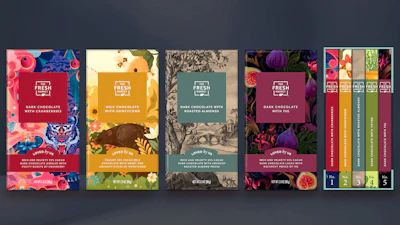
The first is the redesign for The Fresh Market’s premium chocolate bars. In considering the design, Equator reframed the project entirely, reasoning that a bar of chocolate is a small gift to yourself and should be presented like one.
 Rather than applying a single visual treatment across the line, The Fresh Market and Equator Design gave each chocolate flavor its own distinct artistic identity, using illustration styles and color palettes tailored to the product while maintaining a cohesive premium architecture.Equator Design
The result is a five-bar collection in which each flavor gets its own boldly colored background and distinct illustration style. The fig bar is a deep, moody close-up of the fruit, almost photographic in its richness. The roasted almond bar takes a classical etching approach, with delicate crosshatched landscape figures that feel antique. The cranberry bar blazes with jewel-toned reds and purples. The thyme bar is awash in deep green botanicals, while the honeycomb bar shimmers with warm golden florals.
Lined up together, the chocolate bars read as a library in the truest sense: a collection of individual volumes, each with its own cover and story, unified by format and the Loved By Us sign-off. The boxed set doubles as a giftable SKU that cross-merchandises naturally with wine and cheese.
“It was taking what could have been, ‘Yep, let’s redesign the chocolate bars, they look great, move on’ and turning it into something we were all incredibly proud of,” Robinson says.
The Chocolate Library has since picked up top honors at the Vertex Awards, alongside several other packs in the program.
 Designed as an extension of The Fresh Market’s experiential store atmosphere, the retailer’s redesigned coffee cup uses whimsical illustration and hidden visual details to turn a simple grab-and-go cup into a storytelling vehicle for the brand.Equator Design
Another example is the custom coffee cup. Coffee is one of the store’s signature categories, anchored by an in-store coffee station where shoppers can pour a fresh cup to take through the store or out the door.
Where the previous disposable café-style cup was merely functional, the new design wraps the cup in a continuous storybook world rendered in black, white, and teal. Whimsical characters populate every inch, including a sailor riding an octopus, a man flying on a paper airplane delivering baguettes, and a surfboarding cat in sunglasses balancing a triangle of cheese on a plate on the tip of its tail. A charming storefront marked “Est. 1982” anchors the scene, surrounded by croissants, cyclists, and swooping organic shapes, with hidden details for repeat customers to discover.
“We knew what we were doing, we knew we had the tone of voice, so let’s flex and have some fun,” Robinson says. “This is from The Fresh Market, but it’s a lovely café-culture, super-cool coffee cup that nobody else has had the guts to do.”
The cup has become, in Beck’s words, “iconic,” a symbol of the personality shift the brand has been working toward.
Pink boxes and beautiful beans
Two more categories show how far the design thinking reaches, from the bakery to the grocery aisle.
In the bakery, Equator replaced the legacy white box with a blush-pink design that feels closer to a luxury gift box than a grocery store purchase. A debossed octagonal frame on the lid, a navy ribbon closure, and a gold foil seal that reads, “From Our Expert Bakers Cakery” give it the kind of quiet elegance that stops shoppers in their tracks.
The redesign extended beyond the box itself into the merchandising experience. Mixed with clamshell packages across the bakery tables, the pink boxes create what Beck describes as a patchwork effect that makes the entire section feel more like a French patisserie than a traditional grocery bakery.
When the boxes hit the store, Beck says, the impact was immediate. “We had one guest pick up five and tell our team, ‘These are so giftable, I’m just going to buy these and give them to people.’ We kept seeing that. We shifted the bakery into more of a patisserie experience, and shoppers caught on right away.”
In grocery, where shoppers expect canned beans and tomatoes to disappear into the shelf, the new designs refuse to. A soft lavender cannellini bean can, with “Organic” in flowing script and fresh bean pod illustrations, feels more like a farmers market find than a pantry staple. Across the range, vibrant pastels and saturated brights pull aisle traffic in a way the category rarely achieves.
“Even a canned tomato looks good,” Beck says. “I walk into my pantry and just seeing this can brings me joy.”
That emotional connection was intentional. The redesign was meant not only to create shelf impact at the point of purchase, but also to extend The Fresh Market experience into customers’ kitchens, pantries, refrigerators, and gift exchanges long after the shopping trip ended.
“It’s the power of own-brand packaging these days,” Robinson says. “In the bad old days, private label was a second-choice purchase. Now own-brand packaging is the new superhero of the aisle, because you can speak in that very heartfelt and authentic way that some of the brands can’t anymore.”
Building on the momentum
The rollout is now entering its final stages, with The Fresh Market estimating that 75% to 80% of the redesigned system has reached the shelf, with the remainder cycling through as legacy inventory clears. Early consumer response, measured anecdotally through floor staff and incremental basket build in giftable categories, has been strong.
The redesign has also expanded well beyond core grocery SKUs. Seasonal packaging has become its own recurring design occasion, with refreshed graphics rolling out across reusable bags and holiday programs. Beck says some seasonal reusable bags sold out almost immediately, with shoppers repurposing them as gift bags because the graphics felt too beautiful to discard.
 Botanical illustrations, soft pastel backgrounds, and refined typography give The Fresh Market’s flavored tea cookie line a more artisanal, giftable feel while allowing each flavor to maintain its own distinct personality within the broader packaging system.Equator Design
The refresh carries a lesson many own-brand retailers are still learning. The time to invest in design is when the brand is healthy enough to do it on its own terms. It is equally a reminder that an own-brand system need not merely unify a planogram but can carry the same emotional voice that defines the rest of the store.
The partnership between The Fresh Market and Equator continues, growing into new SKUs and seasonal programs that stretch well beyond the original brief. For Beck, the experience redefined what a creative collaboration could be.
“They nailed it,” she says. “They made us want to be better than we were, which I think was really the uniqueness of the partnership.” PW