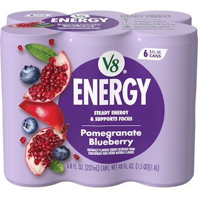
V8 Energy is giving its package design a jolt to better stand out on the shelf and highlight its health-conscious positioning, the Campbell’s Company brand says.
“V8 Energy refreshed its branding and packaging to better align with consumers’ expectations for a better-for-you energy drink that delivers steady energy and supports focus. The redesign highlights the brand’s delicious, fruit-forward flavors with bold colors and mouthwatering fruit imagery, while also reinforcing key product benefits through easy-to-navigate icons,” says Cory Brookes, senior design manager at The Campbell’s Company.
V8 Energy’s eye-catching and product-forward design
V8 Energy initially worked with an external design agency to drive development for its new package design, but the company later shifted course.
 A new "Steady Energy & Supports Focus" claim signal's the product's health-conscious positioning.The Campbell's Company
Centering the design around V8 Energy’s “better-for-you” appeal during design development, the team aimed for a more modern look that showcased the product’s key differentiators.
That included the newly added claims, “Steady Energy & Supports Focus,” which the company says speaks directly to a top desired benefit among consumers.
The team also focused on clarifying expectations for the product’s flavor and improving taste appeal.
“By simplifying fruit visuals and removing vegetable imagery, the new design emphasizes the fruit-forward taste that consumers love, making the packaging as appetizing as the product inside,” Brookes says.
 The outgoing package design featured a grey background and different fruit imagery.The Campbell's Company
An eye catching and product-forward result
V8 Energy’s resulting new package design includes simplified and focused ingredient imagery prominently displayed on the pack, with the flavor-specific colors further solidifying the product’s visual impact and navigability for consumers.
 The grey of the old design is now replaced with flavor-specific coloring.The Campbell's Company
The product’s cans are printed with 6-color dry offset lithography, while the multipack’s pre-printed shrink film is printed using 10 color flexography, the brand says.
“The design updates tested extremely well in consumer packaging design research, especially on metrics of likeability and relevance,” Brookes says. “The packaging delivers better shelf stand-out, more flavorful and refreshing design cues, and establishes a livelier visual identity brand world for this relevant V8 product line.”
The new design is flowing through now in most major retailers, the brand says.