Back in the 1960s, the acronym “KISS”—”Keep it simple, stupid”—began showing up on bumper stickers, billboards, and t-shirts across the country. A design principle first used by the U.S. Navy, “Keep it simple, stupid” is defined by the belief that most systems work best if they are kept simple rather than made complex.
Throughout history, this sentiment has been championed by many esteemed artists and thinkers, among them Leonardo da Vinci (“Simplicity is the ultimate sophistication”) and Mies Van Der Rohe (“Less is more”). And in the decades since it became a cultural touchstone, everyone from software designers to animators has hopped on the KISS bandwagon.
Today, simple is still better, and now consumers have caught the KISS fever as well. After all, everyone today wants their lives to be simple—especially busy moms and dads who want to give their families simple, healthy, wholesome meals without all the fuss. Simple is now mainstream, not alternative, and it has become synonymous with imperfect and raw, not perfect and quiet. So it’s no surprise that consumer packaged goods companies have taken notice of this fact and are forging emotional connections with consumers through products that contain minimal ingredients and streamlined packaging.
Most significantly, “simple” brands are showcasing their simplicity on pack, putting their single most important idea front-and-center through photography and copy. Brands such as Simply juice, Simplait yogurt, Simple Skincare, Wellness Simple dog food, and Lay’s Simply Natural Potato Chips wear their simple pride on their chests with packaging that is minimal, elegant, and free of all the fuss.
Here are five “ingredients” that brands can use to communicate the simple ethos on-pack:
1. Put your simplicity front-and-center.
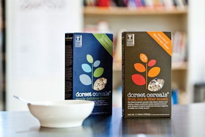
“Simple” and “simply” are being used both in product names and in their subheads. Pillsbury Simply touts its simple status right there in the title, while Dorset Cereals modifies its brand name by calling itself “simply delicious muesli.” Simple is becoming mainstream consumer language now, and can be found on more products than you may realize.
2. List your ingredients.
Simple products usually contain just a handful of ingredients, which they put front-and-center on their packaging. For example, Simplait from Yoplait has “just 6 simple ingredients,” as indicated in copy sandwiched between the brand name and a large product illustration. Lay’s Simply Natural Potato Chips lists just three ingredients—potatoes, expeller-pressed sunflower oil, and sea salt—on its bag…although that still doesn’t exactly make them good for you!
3. Show your product.
To cue appetite appeal, simple brands are literally and figuratively showing their products on their packaging. Simply Juice from Simply Orange Juice Co. uses fruit photography on its labels to convey that there’s not much more inside their bottles than the purest form of the product. Dorset Farms cereal boxes feature peek-a-boo windows that let you see the all-natural granola inside…and not much else.
4. Go heavy on the white space.
Nothing conveys simple like a whole lot of white space. Many brands try to pack a lot of claims and visuals on their products, but simple brands make it clear that they are really just about offering the good stuff—no misleading claims or unnecessary graphics to bog them down. Ceres All-Natural Juices takes this approach, and as a result, really makes the product the star.
5. Stress your single most-important message.
Simple products focus their brands on one concise message and then drive that message home. Simple Skincare products from Unilever put the copy, “No perfume, no colour” on its packaging, telling you what’s not inside, as opposed to what is. Wellness Simple Dog Food puts its “SIMPLE” moniker in large, capital letters, and also adds “Limited Ingredient Diet” directly underneath, to make it known that Fido is getting only the very best, curated ingredients in his food.
And while we agree that simple is often better, we do think that using as many of these suggestions together (which isn’t exactly minimal) will help you leverage your brand in this trendy new category. So go ahead and give your brand a KISS—nobody will dare call you “stupid” for doing so in today’s market.
Nancy Brown is managing partner of brand agency CBX.