Packaging is the most tangible representation of a brand. Consumers can touch it, pick it up, read its brand communication, and determine whether they wish to purchase the product. But first, they have to be attracted by the packaging, or they won’t engage with it at all.
The stakes are high; it’s win or lose at the retail shelf. Studies show that when consumers shop, they make choices in as little as 20 seconds. They also ignore up to two-thirds of category products in retail environments. These statistics explain why so many products fail.
What persuades consumers to gravitate to a specific branded product in a store aisle? What is it about packaging that piques interest? Is it unusual structural design? Bold graphics? Contemporary lifestyle imagery? A distinctive brand identity? Chances are color attracts people first.
Ownable color
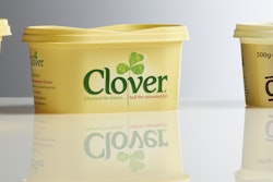
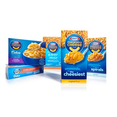
A color palette, distinctive graphics, and brand identity work synergistically and can eventually become iconic if consistently maintained. Imagine seeing a soft drink can in signature red with a white swirl, but without its brand mark of “Coca-Cola.” Would people still recognize the product and immediately call the brand to mind? Surely just about everyone, the world over, would. Many brands are instantly recognized because of their signature colors. Ditto for the red-and-white Campbell’s Soup can label, and for the Kraft Macaroni and Cheese blue box.
Think about Garnier Fructis’ signature lime green on hair and skin-care products and what it signifies to consumers about natural botanical blends. Cadbury’s identifying purple is so important to the brand, the company sought to trademark it. Hot Wheels’ red and yellow-flame brand mark speaks to generations of fans.
The iconic big red “K” on Kellogg’s Special K brand has been leveraged on products in new categories other than cereal—how effective a brand identifier is that to loyal consumers? Tropicana’s signature visual on its juice cartons—a straw plugged into a fresh orange—is an incredible mnemonic device. Consumers look for this icon among myriad choices packaged in orange and green. Ben & Jerry’s multicolored visuals always point to the brand’s ever-evolving ice cream flavors inside. Yet its packaging is dominated by its logo, featuring legendary chunky lettering seemingly rendered by hand within a black and yellow cartouche. This ever-hip, eco-friendly brand speaks to fans everywhere.
When a brand “owns” a strong color, it should be carried into its packaging as its calling card.
Besides signature color, unique icons, package structure, imagery, typography, and perhaps tactile packaging substrates along with a strongly placed brand mark all combine to create “ownable,” one-of-a-kind packaging within a category. In well-executed packaging, it is this very synergy that prompts the “buy” response from consumers.
Category colors become stale
Because color has psychological implications, companies often choose “category colors” in a deliberate manner as a tool to relay information and to elicit an emotional response.
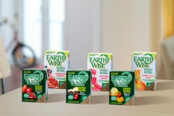
• Many natural and organic products end up packaged in unbleached paperboard with plenty of green and rich earth tones.
• Black, gold, or silver are used alone or in combination for luxury brands.
• High-tech products are often deliberately packaged in minimalist black.
• Simple, clean products with fewer ingredients tend to be packaged in white.
• Kids’ toys are packaged in bright, primary colors: yellows, blues, and reds. Girls’ toys are packaged in a range of pinks.
• Lavenders are often used for women’s and New Age products that evoke spiritualism.
• Bright colors used with black evoke sophistication and edgy brands.
So what ends up happening, as a result? Whole categories wind up with unremarkable, hard-to-differentiate packaging.
The value of the unexpected color palette
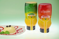
Think about the value of doing the unexpected. Choosing an uncharacteristic color to stand apart from the expected within a product category is a consideration. Even in a case where signature color is a strong brand identifier, it can be combined with additional color to make a unique statement. This helps to establish brand differentiation.
TRESemmé hair care is a good example. How effective is stark black packaging with bright color caps and brand communication to segment varieties that really pop in the process? Especially when visualized by consumers in a sea of category products in predominantly white packaging?
Packaging cannot be successfully developed without looking at its retail context; it doesn’t exist in a vacuum, but among a multitude of offerings. A full category analysis should be conducted and mock-ups tested. Consumer focus groups and eye tracking can target potential problems with packaging before going into production. Social media platforms offer another largely untapped tool. Insights from customers (read: brand devotees) on proposed new packaging are invaluable.
It takes courage to break new ground, but if executed correctly and tested, packaging that breaks the color mold within categories, bringing a new structural element, icon, or delivery system into the marketplace can succeed brilliantly.
Before executing design and color choices in packaging, ask yourself:
• What does the brand stand for?
• Who is the customer?
• What about the brand, color included, prompts a “buy” response from the targeted consumer?
• When products are packaged for a global audience, what meanings are ascribed to the colors used? How should they be modified?
• Can a unique color be developed to support the brand, one that is unusual in its category? Or can the brand’s signature color be combined with another color to achieve a distinctive look and feel?
• How does the chosen package color or color combination make the consumer respond (feel) during the testing phase?
• Lastly, if the retailer shelves a few items from the product line, how effective will it be when blocked on the shelf set? Will it have a strong enough presence, if say three items are merchandised in a particular store set from the six available?
Effectively executed packaging leads to the consumer “seeing” the product and being motivated to buy in a few precious seconds. Ultimately, packaging has to be judged on how it affects consumer purchasing behavior. If packaging doesn’t leverage the brand successfully by selling the product and cementing loyalty, it simply isn’t effective, no matter how unique or colorful it is.
Ted Mininni is president of Design Force, Inc., a leading package and licensing program design consultancy to the consumer product and entertainment industries. He can be reached at 856/810-2277.