Nesquik was first introduced as a chocolate powder mix in 1948, with the ready-to-drink formula following in 1983. Its famous bunny brand mascot, Quiky, made his television debut in 1973 and since then has played a big role in making chocolate milk synonynous with Nestlé . Recent competitive pressures in the RTD category, including the rise of coffee, energy, and other protein drinks, drove Nestlé to decide that the youth-focused brand design for Nesquik needed a change. Chase Design Group, with the Nestlé Design team, was challenged to update the Nesquik packging to help the brand gain relevance within an expanded set of RTD beverages primarily sold in convenience stores.
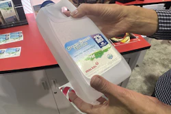
 Nesquik packaging BEFORE the redesign
Says Nick Leebert, Associate Creative Director, Chase Design Group, “We were asked to modernize Nesquik in a way that captures the energy and spirit of the brand, while not feeling childish. That required communicating the evolution of the brand and its core values of positivity and optimism, while also creating greater segmentation among its offerings.”
Design team uses simplification strategy
The design team identified key brand assets: Quiky as the brand icon, the core yellow/blue color combination, and the character of the logo. To make the brand presence more unique and stand out on shelf, they applied a simplification strategy that focused on Quiky and the color yellow.
“The packaging had too many elements and non-ownable assets with multiple gradients, drop shadows, and overlays as well as multiple fonts lacking a clear communication hierarchy,” notes Leebert.
Read related articles on the redesign of iconic CPG brand packaging from Packaging World:
Diet Coke Refresh Blends Iconic Past with Bold Future
The Power of Iconic Package Design
U.K. Energy Drink Design Gets Revitalizing Change
The Curious Case of the Disappearing Maiden—Land O’Lakes Rebrands, Skirts Controversy
Morton Salt Package Gets Sleek, Ergonomic New Design
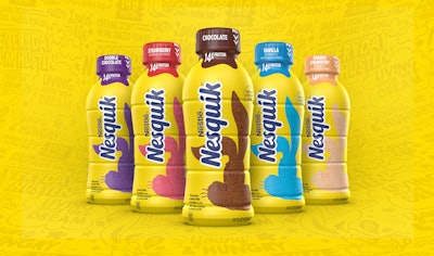
Chase transformed Quiky into an iconic asset using a defined silhouette that still maintains the whimsical nature of the character. Defining Quiky to a limited number of iconic poses for brand recognition also made him easier to apply consistently on and off the packaging. Chase simplified the logo with optimized letterforms, while emphasizing the bold yellow, which serves as a beacon for the brand.
Color coding distinguishes the five core flavored milk selections, while a banner across the middle of the bottle and a different communication hierarchy identify the three Protein Power offerings.
Says Neil Sadler, Head of Design USA, Nestlé, “The Chase Design Group team helped us evolve Nesquik into a bold, brave, and modern challenger brand that will increase its appeal to consumers of all ages and accelerate our RTD brand growth.” PW