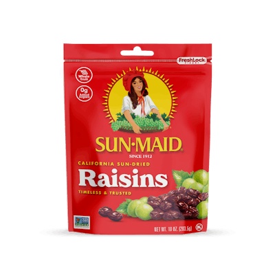
Fresno, Calif.-based Sun-Maid Growers of California has been selling raisins and other whole fruits on the promise of natural, wholesome goodness since 1912.
In 2019, it introduced its first advertising in a decade, produced by food-and-beverage marketing specialist quench. The project prompted considerations to modernize Sun-Maid’s packaging, which had not changed since the 1970s.
Consumer feedback helped validate that a Sun-Maid redesign was in order and indicated fondness for the brand’s nostalgic design. Therefore, it was important to preserve that quality while making changes that allowed it to appear timeless.
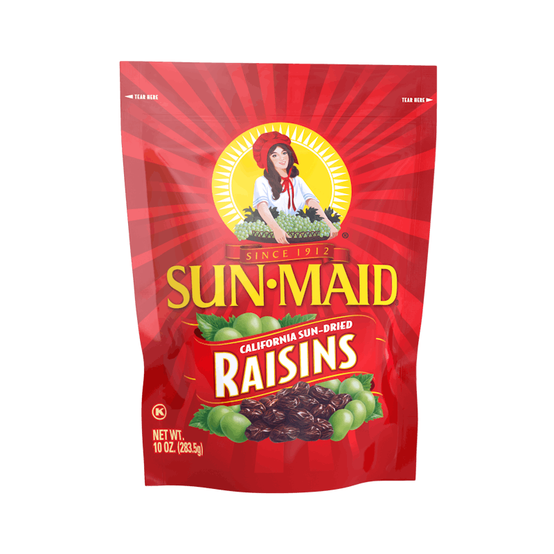 Sun-Maid Raisins 10-oz bag BEFORE the redesign
“Our work needed to be an evolution, as opposed to a revolution,” says quench Creative Director Keith Seaman. “We were sensitive to customers whose feelings were expressed in comments such as, ‘Changing this package would be like taking the stars off of the American flag.’”
Maintaining the integrity of the iconic little red box was key. The agency gave Sun-Maid’s female mascot more space and detail on the packages, and made the sun rays around her illustration stand out more. The image pops as a result.
In addition, the Sun-Made redesign calls out key product differentiation, functional benefits, and appetite appeal that millennials want in food products. These include copy such as “0g of added sugar,” “made with whole fruit,” and influential Non-GMO Project verification on the front of the packaging.
Says Seaman, “We needed a consistent look and feel across all SKUs. The system we developed produces a clean read and look that applies to current products but can also play nicely with new product innovations.”
The look quench created gives the brand a strong, unified identity and provides each product’s details, such as the fruit type or whether it is organic or flavored. It also presents the most important information in a bold, modern font.
The updated packaging for Sun-Maid snacks will continue to roll out nationally through 2020. PW