In the world of freeze-dried dog food, Heckova! is making a bold entrance with branding that’s hard for pet parents—and their dogs—to miss. With the help of Favorite Child, part of Betty, a Quad agency, Heckova! was designed to balance premium appeal with an energetic, dog-loving personality, while ensuring the packaging stands out in big-box retailers like Costco.
“It all started with a branding workshop, grounded in audience research to define the vision for the brand,” says Tricia Warren, group account director at Favorite Child. “Before getting to a name, we wanted to land on the ‘brand foundation,’ understanding who the audience is, why they exist, and how they do what they do.”
Once it set the foundation, the team explored naming conventions across the pet food category. “The category names typically come from a very functional space, so we explored ways to sidestep that,” Warren explains. “After vetting various names in this crowded space, we landed on Heckova! It’s an emotive, evocative name that we knew would stand out.”
The name was also influenced by how dog owners talk about their pets. “We tuned into the social phenomenon of dog-speak known as ‘doggolingo’ and discovered that ‘heck’ is the only curse word dogs know and use,” says Warren.
 | Read this related article, “Milk-Bone Rebrand Affirms That ‘Life’s More Fun with a Dog’” |
John Pawlowski, VP of Marketing for Heckova!, clarifies that while Favorite Child helped the company land on the name, the insight came from the first time he took his springer spaniel, Bandit, off-leash at a dog park. “As he zoomed around the other dogs, another pet parent told me that I have ‘a heck of a fast dog,’” he says. “The insight stuck that we all have a heck of a dog we know is special for one reason or another.”
When it came to the design of the packaging, from the start, Favorite Child knew it needed to create graphics that worked in both warehouse-style retail and online marketplaces. “We consider the retail environment and shopping experience in every brand and product package we create,” Warren says. “In this case, knowing we were starting out with Costco, we needed to understand what works there: Simplicity and clear, descriptive flavor cues at a great price.”
The design also needed to balance those considerations with what a start-up brand needs: “a point of differentiation that stands out with a memorable and unique message and design,” Warren explains.
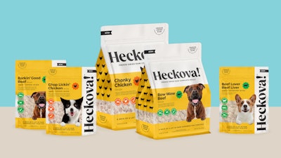
The solution was a vertical logo placement that maximizes brand visibility while ensuring the product’s key information is easy to read. Turning the logo vertical also helped establish a larger footprint for the brand name. Meanwhile, the flavor, benefits, and use-case descriptors are positioned top left. As a result, they are emphasized by their placement instead of their prominence.
The color choices for Heckova!’s packaging were informed by both consumer research and scientific considerations. The design team analyzed the competitive landscape to identify gaps in the market and ultimately selected yellow as the dominant brand color. Interestingly, their research also revealed that dogs have dichromatic vision—or the equivalent of red-green color blindness in humans—meaning they primarily see shades of yellow and blue while perceiving reds and greens as muted tones. Warren explains that this insight played a role in choosing yellow, black, and white as the primary brand colors, with additional hues such as green for beef and orange for chicken to differentiate flavors.
She also shares that the choice of color palette has led to unexpected feedback from pet owners: “We have had numerous comments from consumers and fans who believe their dog can identify the package and gets excited the moment they see it.”
In selecting other elements of the design, the team considered how it could convey a premium feel to match the high-end positioning of freeze-dried pet food, while still making the design feel fun and engaging. The team coined the term “Playfully Premium” to guide their design choices.
| | Read this related article, “Walmart Brand Leans in to ‘Humanization’ of Pets” |
This is evidenced by the design of the logo, which uses a custom serif font with an exclamation mark. According to Warren, the custom-serif logo conveys a more established and confident premium brand, while the exclamation point brings it back down to earth by adding “an emphatic, dog-inspired, playful energy.”
The product photography and iconography also steer away from common pet-food visuals. “We kept away from the ‘show dogs’ on-pack as there’s plenty of that already in market and we feel like the ‘every dog’ has more Heckova! qualities,” explains Pawlowski.
Heckova! launched in the spring of 2023, with its first on-shelf experience at a regional Costco later that summer. It is now available on the Heckova! brand site and Target.com, with more retail partnerships planned. There are 14 food and treat SKUs altogether, “with more on the way!,” Pawlowski confirms. PW