In September, D2C company Wild Alaskan, a purveyor of wild-caught, sustainably sourced seafood, completed the rollout of its new product packaging. Cliff Borress, executive creative director, explains how design was used to convey the specialness of Alaska and educate consumers on ‘the best fish on the planet.’
Packaging World:
Why did you update Wild Alaskan’s packaging graphics?
Cliff Borress:
 Cliff Borress, Executive Creative Director, Wild Alaskan Company. Photo courtesy of Wild Alaskan Company.
We take seafood labeling very seriously. Most seafood in America is fraudulently identified, and this is something Wild Alaskan takes head on. All the fish we sell is from Alaska; it’s all processed within the U.S., so it’s really trusted. What’s interesting about the role of packaging within the seafood space is that most consumers are confused by what they’re buying, and it’s not their fault. Mislabeling and ambiguity in purchasing seafood has had the downstream effect on consumers not entirely knowing what they’re eating or where it’s from. So you have people asking for whitefish or asking for salmon, but what kind of whitefish and what kind of salmon?
 | Read this related article, "Five Secrets to Award-Winning CPG Package Designs” |
We want to correct this issue for seafood consumers—people should know what they are buying! As a company selling really high-quality, trusted seafood, we wanted to make sure we are not only providing what we say but actually educating consumers and helping them understand the choices they’re making and where their food is from.
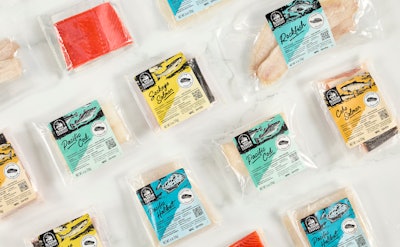
On our packaging, we properly identify and celebrate all the individual species of seafood that come from Alaska. On each of the packs, we introduced these very accurate and beautiful illustrations [of the species]. We are not over-engineering this education, but providing subtleties so people can start to understand that all these fish are different—it’s not just whitefish. That starts to translate to the way people approach cooking and make purchasing decisions. It’s important to know cooking all fish is not the same. Also, in terms of sourcing, there is an enormous difference between Wild Alaskan Pacific halibut or Pacific cod and generic store-bought tilapia or Atlantic cod.
 To convey the feeling of Alaska, the design team incorporated the Alaska State colors of yellow/gold and blue, as well as used an illustration of a sockeye on the box. Photo courtesy of Wild Alaskan Company.
How are you conveying the specialness of Alaska on your packaging?
When it came to the idea of feeling more Alaska, we wanted the box itself to exemplify Alaska. There are a couple of ways we did this. We’ve incorporated the Alaska State colors, so we have yellow/gold and blue showing up throughout our branding. We love the idea that this box is showing up all over the country, and it just shouts Alaska. Whether you’re in Miami or New York or wherever, you have this little gift from Alaska, which is really special.
Another way we did this was with an illustration of sockeye on the front of the box. Sockeye is a meaningful species; its history, its life, its spirituality, and its vitality are so important to our founder’s background and the livelihood of Alaska. Sockeye is this amazing fish that travels thousands of miles from where it was spawned and out to the ocean and then back to its natal rivers to re-spawn. It’s just incredible—the sockeye’s energy represents so much to Wild Alaskan. So we brought that onto the front of our box to celebrate it.
We also worked with a local Alaskan artist to do a beautiful map rendering of the state of Alaska on the inside of the box. Within this map, we identified key regions where Wild Alaskan sources seafood. When you look at this map, you can start to understand the different bodies of water where the fish you have in your box are from.
Overall, the box feels almost like a love letter from Alaska. It has this really intimate, beautiful artwork that when a member brings it into their house, we want them to know they are connected to Alaska and to a wider community.
 The company logo uses a font that resembles hand-cut lettering similar to the trail signs carved out of wood that are found in Alaskan forests. Photo courtesy of Wild Alaskan Company.
Were the typeface and logo redesigned as well?
Yes. Again, going back to the roots of Alaska, one thing that really stood out to us about lettering is that so much in Alaska is handmade. It’s very ad hoc and built with the resources you have. So we have this somewhat hand-cut lettering style that we adapted into a typeface, and that’s used throughout the packaging and logo. One thing that’s very notable when you go to Alaska and you’re hiking is that there are these trail signs hand carved out of wood. We were inspired by that. It’s really beautiful.
Have you received feedback from your members?
Overall, the packaging has been pretty well received. I think members feel the excitement of the packaging. We have a lot of photos of members with our packaging, just showcasing it in their homes. A lot of our members have experiences in Alaska, and the more we celebrate it on our packaging, the more we’re hearing from our members about those experiences. So people are telling us about their trips to Alaska—fishing there and their time living there—and I can’t help but feel like the packaging has a little bit of a hand in that. PW