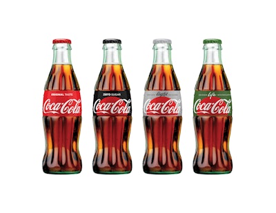
In a move that will extend the The Coca-Cola Company’s One Brand global marketing strategy to packaging, the company has launched new graphics that use one visual identity system featuring Coca-Cola Red as a unifying color across the trademark.
The Red Disc, the signature element of the new Taste the Feeling global creative campaign launched in January, will now appear prominently on packaging. Further underscoring the company’s commitment to provide choice, the new packaging is designed to enable consumers to choose the Coca-Cola that best suits their taste, lifestyle, and diet.
To clearly identify each product, the signature color is featured throughout the packs— black for Zero, silver for Light/Diet, and green for Life. The new graphics will also include the unique product name and benefits on front of pack to help consumers make an informed choice:
- Coca-Cola Original Taste (or Classic in select markets)
- Coca-Cola Light/Diet: Crisp Taste, No Calories
- Coca-Cola Zero: Zero Sugar
- Coca-Cola Life: Less Sugar, With Stevia Leaf Extract
“Packaging is our most visible and valuable asset,” says Marcos de Quinto, Chief Marketing Officer, The Coca-Cola Company. “The Coca-Cola Red Disc has become a signature element of the brand, synonymous with great taste, uplift, and refreshment. By applying it to our packaging in such a bold way, we are taking the next step towards full adoption of the One Brand strategy, uniting the Coca-Cola family under one visual identity and making it even easier for consumers to choose their Coca-Cola with or without calories, with or without caffeine.”
The new packaging graphics were revealed at an event in mid-April to celebrate the roll out of the One Brand approach in Mexico. New packaging will be available in stores in Mexico the first week of May. Similar versions of the Red Disc graphics will roll out into additional markets around the world throughout 2016 and into 2017.
“The unification of the brands through design marks the first time in our 130-year history that the iconic Coca-Cola visual identity has been shared across products in such a prominent way,” says James Sommerville, Vice President Global Design, The Coca-Cola Company. “When applied across packaging, retail, equipment, and experiential, this new approach becomes a global design language that utilizes a historical brand icon to present the range of Coca-Cola products available today in a contemporary and simple way.”