Pepsi, Fanta Consider Digital Space in Spate of Soda Facelifts
Pepsi and Fanta’s respective new visual identities are optimized for both analog, physical spaces—like packaging—and for the online and digital worlds.
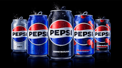
Pepsi has new livery, but retains it's characteristic globe logo design.
In late March, Pepsi finally unveiled a new logo and visual identity that’s been years in the making. For a brand that had been known for periodically switching up its vibe, it had gone all of 14 years since launching its last iteration. Even so, Pepsi didn’t rush to make the switch. Mauro Porcini, senior vice president, chief design officer, PepsiCo, had recognized a need for new injection of energy a few years back, but the brand carefully timed the rollout to coincide Pepsi’s 125th anniversary in 2023. Porcini and his team say their goal was to build and strengthen visual distinction through the bold type, energetic palette, and a unified logomark.
“The logo design was finalized in the summer of 2021 and from then we started to work on the full visual identity system and execution across touchpoints. But this was a labor of love that started years before that summer, and we’re so thrilled to finally share it with the world,” Porcini told Packaging World. “We wanted to create a new logo and visual identity that connects future generations with our brand’s heritage and feels unapologetically current and undeniably Pepsi. It was also important to us that our new visual identity allows for more seamless and creative collaboration with partners and customers and more versatility to engage fans in the places they shop, dine, work and play. It’s also optimized for today’s digital world, from stadium screens to the metaverse.”
The redesign was developed by PepsiCo Design and Innovation, the company’s in-house creative force that manages 40-plus brands. Given the scale of the project, design agency Mrs&Mr., among other external designers and typographers, partnered with Pepsi to supporting the in-house design team.
It’s always a challenge for long-tenured brands considering package and visual redesigns to thread the needle between updating and refreshing the visual cues, and maintaining the generations of brand equity by retaining the more iconic elements of the identity.
So, what elements of the original design are new, which elements were retained, and why? Porcini notes that Pepsi has a familiar visual heritage, and it was important for he and his team to pay homage to the past, but also to bring a contemporary edge. The color palette, signature typography, and dynamic pulse are entirely new elements, meant to represent the current and future era of Pepsi and allow more flexibility to move between today’s physical and digital worlds. But the iconic globe theme of the logo remains, and in fact hearkens back to earlier iterations of Pepsi globe logos.
“As a brand that interacts with millions of people every day around the world, updating a visual identity is a large-scale endeavor that takes time. That said, we’re very excited about how the new design will show up in the world. The bold, clean, and iconic visual identity will help improve shelf navigation and brand recall, turning transactions into brand-building moments,” Porcini says. “As always, we have a sharp focus on consistently putting our best designs in the market and ensuring we don’t dilute our brand impact or visual distinction. We’re strategically working with our local markets on rollout timing so that we are continuing to build on our brand equity and properly establish familiarity. We are very confident that this redesign will continue to positively propel our brand into the future.”
A key update is the addition of black to the color palette. This is a color-coded reference to Pepsi Zero Sugar, a huge area of focus and a growth driver. It also creates a striking contrast with the new electric blue. The visual identity also incorporates what it calls a “pulse.” Best represented digitally as a moving, .gif-style format, this effect adds a living, breathing design asset that allows Pepsi to flex and customize its look to any setting, platform, or partnership to reach customers in new ways. So far, the rollout and feedback has been all positive.
“Prior to the announcement, we conducted research globally and received a positive response. Specifically, people applauded the attractive color palette, distinctiveness, and overall modern look,” Porcini says. “And now we’ve been thrilled to see how the news has resonated with Pepsi fans around the globe—and even trended on Twitter.”
Fanta unifies design, clarifies flavors
In April, Coca-Cola brand Fanta announced its first ever global brand identity. Designers say the concept encourages playfulness, with bright, bold designs that punch through the routine of everyday life.
“We wanted to portray a brand that values spontaneous play and the benefit it brings. By shifting our focus to reflect an attitude, we were able to revitalize Fanta’s brand assets and reclaim ‘play’ as something that people of all ages can embrace and benefit from,” says Rapha Abreu, global vice president of design at The Coca-Cola Company.
Both virtually (digital spaces) and in real life (on the packaging and other physical spaces), the new, more cohesive visual identity emphasizes fun. The brand color system is comprised of unique, identifiable colors that correspond with specific flavors, like raspberry or cherry. The graphic system, inspired by the new dynamic logo that incorporates .gif-style motion in digital spaces, helps Fanta reinforce playfulness. Created in partnership with Brazilian illustrator Lucas Wakamatsu, illustrations and photography serve to bring a “Pop of Fun-ta” to life by emphasizing the aesthetic of mixed media, layering, imperfection, and storytelling, to create a distinctive point-of-view intended to cut through visual clutter.
“We were really inspired by the idea of bringing playfulness to consumers of all ages when we started to ideate around how to bring the brand’s purpose to the masses. By thinking what this meant for the brand’s expression, attitude, and actions, we were able to build a distinctive brand identity that signaled Fanta’s commitment to fun at every level—from real life to digital,” says Lisa Smith, executive creative director Global, Jones Knowles Ritchie, brand identity and packaging agency who collaborated with Fanta on the project. The legacy logo contained a depiction of an orange, and this appeared even on other flavors like grape and strawberry. By removing the orange, each flavor now carries its own respective juicy, cartoonish fruit signifiers.
Previously, Fanta’s brand identity and packaging system existed in different executions across markets. Now, the Fanta brand will begin to be unified around the world, raising it to sit consistently alongside other iconic brands by The Coca-Cola Company, such as Coca-Cola and Sprite.
One consideration for the brand was its logo, which until this redesign had incorporated an orange as text background, with a stem and a leaf draped across the typography. While this orange-laden logo was Fanta’s only logo, orange wasn’t Fanta’s only flavor. A logo depicting an orange had the potential to confuse consumers selecting other flavors, like pineapple or lime. The new logo retains the brand equity in look and feel but eschews the direct connection to an orange. Each flavor—orange included—uses fun, juicy, cartoonish depictions of the fruit associated with it.
The brand redesign was led by the Coca-Cola Global Design and Jones Knowles Ritchie, with contributions from Relative in packaging guidelines and imagery, Gretel in digital motion identity, and Colophon in typography, among others.
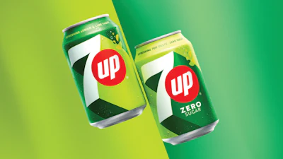
New Get Up, Same 7UP
In February, 7UP announced a packaging redesign of its own. It’s rolling out international marketing campaigns, introducing a new tagline with “New Get Up, Same 7UP,” and coining a phrase in “Upliftment to the everyday.”
“The new 7UP features the brand’s signature punchy green, but with added citrus hues and distinct high-contrast lines that portray a feeling of upward energy,” Porcini says.
The fresh visual identity system, which marks the first major overhaul in over seven years, maintains 7UP’s iconic signature green coloring, with added “zesty” citrus tones. The new design will be visible on 7UP and 7UP Zero Sugar bottles and cans. 7UP’s new visual identity system began roll out worldwide in March 2023, starting with Bangladesh, China, Egypt, India, Ireland, Latin America, Pakistan, Saudi Arabia, the UK, and all European markets.
We’ve done the legwork to identify and vet experienced packaging and processing consultants you can contact directly for your next project. Decades of combined experience in packaging line engineering, machinery selection, package and materials development, and food processing operations.