Perspective: Soda Brand Redesigns Reflect a Cultural Shift
In the pantheon of big brands that have made indelible visual imprints on the national consciousness, Coke and Pepsi have to rank at or near the top. Evolution of their look and design both anticipates and reflects larger cultural changes.
I’m old enough (just barely) to remember the cola wars of the 1980s and the arms race that spawned the likes of New Coke, Pepsi Clear, and a host of other evolutionary dead ends. Maybe that’s why it caught my attention when a flurry of soda brands—the flagship Pepsi soda brand itself alongside several other PepsiCo and Coca-Cola Company brands—recently unveiled new visual identities and logos. In isolation, these redesigns wouldn’t be unusual. What struck me was the cluster of them in spring 2023, with Fanta and 7UP joining Pepsi in changing their respective brand livery (click here for more details on those changes). This recent string of design updates comes on the heels of Coca-Cola and Sprite both adopting black script logos on-pack to signify Zero Sugar, and Sprite switching to clear bottles, at the end of 2022.
Was this spate of facelifts just a coincidence, or was there some sort of invisible hand behind it? I asked this question of Daryl Weber, brand strategy consultant with brand agency Major7, Coca-Cola Company alumnus, and author of the 2016 book “Brand Seduction.”
“I think there is a cluster of change happening right now,” he says. “My hunch is that these things do generally come in waves because they are both reflecting culture, and leading culture. A brand’s positioning and its ads are usually a reflection of the aspirations of people at a moment in time. As the culture shifts, brands will try to evolve to keep up with those changing dynamics.”
The pandemic might have precipitated the greatest cultural shift in 100 years, so his observation certainly tracks. Some of the trend lines in late 2019 may have already been pointing to where we are now—a digitally proficient populace doing much of our shopping online and more of our work from home—but the pandemic gave culture a push, and the pace of change accelerated before settling into our “new normal.”
Through the early pandemic years, roughly 2020 through now, Weber thinks a lot of brands publicly laid low, tried to soldier through, and kept most visual elements the same. According to several media outlets that track culture and design, visual branding that targeted our sense of nostalgia actually got a boost during the depths of the pandemic, as people turned to familiarity and homespun comfort during stressful times.
“But now it feels like the world is moving on. We’ve come out of it, and we’re feeling maybe there’s a new energy in the culture right now,” Weber says. “I think the brands are now reflecting that, sort of a new phase we’re entering in culture. They’re making sure they are feeling modern and fresh and relevant to the feeling that’s going on in culture.”
The fingerprints of the highly digital pandemic era are all over the new logo and visual identities currently being launched. The logos aren’t strictly static—Pepsi especially focused on motion, with moving, .gif-style digital logos in its quiver of new brandmarks and logos. Fanta, too, unveiled a mixed-media ecosystem of Lucas Wakamatsu illustrations and Tim Marsella photographs that act almost like stop-motion clips.
While their existence is noteworthy, these digital brand marks exist entirely online or on a screen. There isn’t a practical application for them on the analog packaging itself, whether that’s a multipack carton, a label on a PET bottle, or a printed aluminum can. And it’s on these analog packaging spaces, familiar in a retail setting, that Weber says brands must be careful not to go too far afield from the visual identity that consumers recognize. He references an infamous 2009 carton packaging redesign of Tropicana.
“They did a very modern new package, and it was unrecognizable to consumers. Their sales tanked right after they launched these into supermarkets, so they quickly reverted to the original packaging and it was widely seen as a huge mistake,” Weber says. “It has become a case study in going too far from what consumers know and love about you.”
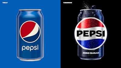
Pepsi’s latest redesign is bold in the sense that it’s a major departure from the logo and design associated with it for the past 14 years. But even with changes in typeface and color, the globe-shaped logo remains, providing visual continuity from the previous identity to the new one. Even a vibrant challenger brand like Pepsi, known for reinventing itself every so often, realizes the value of on-pack brand equity, and won’t throw the baby out with the bathwater. PW
We’ve done the legwork to identify and vet experienced packaging and processing consultants you can contact directly for your next project. Decades of combined experience in packaging line engineering, machinery selection, package and materials development, and food processing operations.
Where innovation meets sustainability. Join the leading forum for packaging recycling professionals, featuring cutting-edge solutions, expert insights, and the connections you need to advance the circular economy. Secure your spot today.