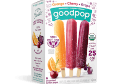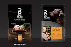
Over the course of their career, packaging designers are constantly challenged to strike the delicate balance between differentiation and uniformity. They walk this tightrope every time they design or redesign a range of products or a sub-brand (as Diet Coke is to Coca-Cola). These products must, to varying degrees, tell their own story, but to preserve brand identity and recognition, they need do this while maintaining alignment with each other. This balancing act is achieved predominantly though a strong and well-established brand architecture.
Exploring the family tree
We sometimes think of brand architecture like a family tree, with several related sub-brands or variants attached to it. Despite some variation in appearance, they can be traced back to a single point of origin, the “parent’ brand,” with a visible structure holding them together like tree roots.
 | Read this related article to learn how PepsiCo created a unique brand world for its new Gatorade Water sub-brand. |
There are several ways packaging designers can achieve visual cohesion, either across a range of products or between a parent brand and its sub-brands, while combining elements that draw attention to their differences. While we would have to write a book to capture the depth and nuance of the multifaceted strategies our teams create to achieve this for our clients, we have picked a few examples to give just a flavor of what is possible.
The central holding device
A device commonly used to create cohesion across a collection of products is the central holding device, which contains key content (e.g., the logo, product name and variant, and instructions). Different background patterns or colors may be used to show that each product has a distinctive flavor profile, main benefit, or key ingredient, because the central holding device is the same, not only in color but in shape and position. And because it presents the same information in the same way across multiple pack fronts, it establishes a visual cohesion that ties everything together.
 Giant Eagle’s Market District brand features a white plate as a central holding device to create a unifying architecture across the range.
When we redesigned Giant Eagle’s Market District brand, which comprises a collection of products sourced for their quality and distinctiveness, we utilized a white plate as a central holding device to create a unifying architecture across the range and at the same time allowing space for points of differentiation, including whimsical illustrations that flexed from product to product, reflecting their character and personality. It’s important to point out that there must be a consistent visual language to maintain overall cohesion—and this includes the style and “feel” of the imagery used on pack. No element of a packaging design should be considered in isolation but holistically, as part of a whole.
Dynamic design elements
Some of the most intriguing and innovative examples of designers effectively unifying ranges of different products concern the clever use of certain elements of design architecture. An example is Lowes’ Sta-Green, a range of high-performing lawncare and garden products. When we helped the retailer refresh Sta-Green’s visual identity, differentiation between products was essential for navigability due to the sheer number of products, which spanned several segments. Brand colors and photography were used strategically to differentiate between them and communicate intended usage and expected results, while a consistent green-arrow design element was positioned to point dynamically across each pack front, creating visual cohesion across the range.
 For Lowes’ Sta-Green redesign, brand colors and photography were used strategically to differentiate between products, while a consistent green-arrow design element was positioned to point dynamically across each pack front.
Color itself is a powerful design cue, influencing consumer perception of a product, from its taste and flavor to its health and sustainability credentials. Certain colors have even become synonymous with flavors (red for ready salted) and brands (purple for Cadbury), demonstrating their power to convey information without using a single word.
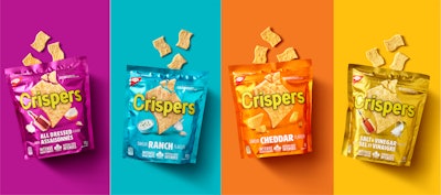
Color can also be used to great effect when it comes to differentiating products, while other elements, such as on-pack photography, typography, and logo positioning can tie everything together. When we worked with Mondelēz on its redesign of Crispers, for example, we used vibrant block colors were used to denote flavor profiles, while a centrally positioned hero image and logo created a cohesive and easily identifiable range.
Language and tone of voice
What you say matters, but so does how you say it. While visual elements such as color, typography, and imagery are vital, language and tone of voice are equally important. Implementing a distinctive tone of voice through the language you use can help build a memorable personality that consumers can easily recognize. It acts as an invisible thread that ties the range together. It is also important for highlighting what makes the range unique or appealing, whether that’s the brand’s focus on quality or its fun, youthful persona. From the luxurious and indulgent to the fresh and vibrant, on-pack language is a powerful differentiator.
A word on brand guidelines
Carefully crafted brand guidelines are essential for any brand. Not only do they establish a brand’s visual and verbal expression, but they also outline its strategy, from target audience to positioning and personality. Brand guidelines should be at the heart of any design project, whether that’s rolling out a new sub-brand, extending a brand into a new category, or redesigning an entire product range. PW
Mike Skrzelowski is senior creative director for global brand design firm Equator.
 | Read this related article, “PepsiCo’s Rockstar Brand Visually Aligns On-Pack Designs Across Portfolio” |


