Established in 2007, The Tomato Stall is a grower and producer of specialty tomatoes and tomato-inspired artisanal products based on the Isle of Wight. Its products—such as Oak Roasted Balsamic oil, ketchup, relish, and Chili Jam, among others—are are sold in farm shops and delis throughout the U.K. as well as at farmers markets. Because of The Tomato Stall’s unique location on the Isle of Wight, the company says every tomato gets more sunshine, which contributes to its products’ distinct flavor.
Recently, the company realized its brand lacked an identity that conveyed the quality of its products and its ability as an established grower and producer to meet the needs of big supermarkets. In order to reposition itself to appeal to sophisticated “foodies,” The Tomato Stall worked with creative agency Designers Anonymous to undertake a complete rebrand.
“For this project, we dug deep,” says Designers Anonymous. “Reading the company’s roots helped us tell the story and increase understanding, to clarify the brand and its provenance.”
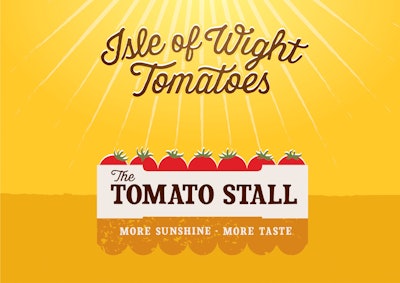
Among the changes to the packaging graphics, the brand name is now featured more predominantly on the packs “to give the brand more confidence and presence on the shelves.” The Isle of Wight descriptor is integrated with vine-inspired typography, while an illustration of rays of sunshine casts a shadow over a crate brimming with sun-soaked tomatoes. The tagline, “More Sunshine. More Taste,” rests in the shadow (which references the shape of a market awning) to help complete the story.
To highlight the Isle of Wight messaging and to give the packaging a more premium look and feel, the label is die-cut. In addition, Designers Anonymous explains, the neon colors of the previous designs have been replaced with a moreappropriate,rich, earthy color palette that adds taste appeal and helps consumers better shop the range.
“Weincorporated further discoveryon the back of pack, where the tomato vines illustrate that The Tomato Stall is both the grower and producer,” adds the creative agency. “We also revitalized the signature bumblebee to communicate The Tomato Stall’s green credentials. In addition, we crafted custom fonts and graphics that evoke themeticulouscare that is evident in everything The Tomato Stall does. Clever copy—‘Ketchup with our latest news’ and ‘Heard it through the tomato vine’—encourage consumers to further engage with the brand.”