Aiming to become the “Nike of Wellness,” CBD brand beam was launched in 2018 to fill the gap that then existed between CBD products that were very medicinal and those that infused CBD into candy.
The direct-to-consumer company was founded by Matt Lombardi and Kevin Moran after they trained for the Boston Marathon together. Says Lombardi, “The brand was built with the mission of being a better CBD brand consisting of products made from organic hemp with zero additives. We were searching for remedies to aid in recovery, sleep, and mental health and had a difficult time finding products that met our personal wellness standards. We then banded together to create better CBD products that are effective, natural, and non-toxic.”
Beam’s first fans included A-list athletes such as race car driver Danica Patrick and professional golfer Billy Horschel. But with the pandemic came a huge surge in interest from a range of consumers. “Since the onset of COVID-19, beam has seen a 100% increase in sales as many consumers were experiencing anxiety, stress, and losing sleep, which beam specifically makes products for,” Moran shares. “We launched our focus capsules in September, and they sold out in less than 24 hours as this has been a time where concentration has been put to the ultimate test.”
See: Despite Confusion Over CBD, Sales Projected to Grow
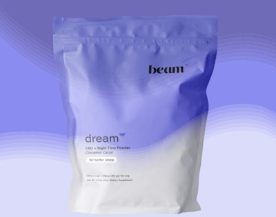
With the growth in popularity of its products, beam undertook a rebrand with brand-building agency Smith&Saint. This included dividing the beam product line into four categories, redesigning its website for a more convenient and navigable D2C experience, and designing new packaging graphics and colorways, with an eye toward future expansion into retail.
Beam offers eight products plus a sample pack in capsule, topical, oil, and powder forms. They are packed in jars, sachets, pouches, or dropper bottles, depending on the product. With the rebranding, beam’s SKUs now fall into one of four categories, or the “beam 4”: recovery, sleep, balance, and focus. With the previous packaging, the coloring was focused primarily on beam’s signature blue color and used solid blocks of color. With the redesign, each category has its own color with a calming gradient across the package. Recovery is yellow, sleep is purple, balance is blue, and focus is green.
“Friendly, approachable and clear: These three adjectives are what drove this rebrand, with the colors, the icons, and the copy,” says Lombardi. “The refreshed color palette was to be vibrant, reflecting the new energy we’re introducing (and re-introducing) with our product lineup. The icons are simple and tell the ingredient story without overcomplicating what’s already complicated. And the voice of our copy aims to be like a friend walking you through something new, eliminating the noise. It was all about being a breath of fresh air, making something perceived to be complicated quite simple.”
See: CBD Line Uses NFC for Consumer Trust, Education
Adds Moran, “Our packaging reflects the unique passion from a unique group of people who know who beam is. beam products will differentiate themselves from competitors on the shelf because of that solid identity. We feel that when you know what you’re about, and you know what your audience is about, it helps you speak the same language. In this case, that comes as a visual language that appeals to those who are eager to cut through the noise and get straight to the point around CBD. This philosophy led to colorful, digestible package design that simplifies and de-complicates information but yet is full of energy and movement that’s uncommon in the space. When it feels good to look at a product, it feels good to try it.”
Beam products are sold online on its website for prices ranging from $29 for “the fixer” five-day sample pack to $95 for a 60-capsule jar of dream capsules. “We believe that consumers are mostly looking for quality, safety, and effectiveness when it comes to CBD and would prefer to spend a little more money on products that meet that criteria versus spending less on products that aren’t natural,” says Lombardi.
The new packaging was introduced in September 2020 and was designed, along with the beam site, to adhere to big box retailer preferences, as the company is looking to eventually be sold at mass retailers like Target. Shares Moran, since the redesign, “customers have shared that they love the new look and feel it’s brighter and more refreshed.”
