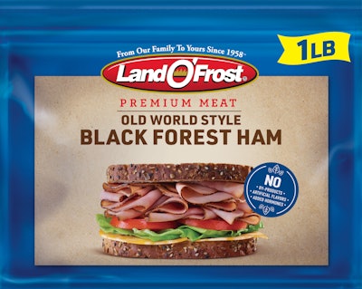
With new full-color, mouthwatering sandwich photography prominently displayed on each package, the brand is going all in on taste and freshness to win over consumers.
The revamp of Land O’Frost Premium Meat takes the brand from a design dating back to the product’s 1990 inception and brings it to current day with clean, eye-catching upgrades, including crisp sandwich photography and easy to understand ingredient call outs. This is the first significant design change for the brand since its inception. Land O’Frost Premium Meat locks in freshness with a double-zip pouch, contains no added hormones, by-products or artificial flavors, and is gluten-free. The new packaging communicates these key category differentiators and will hit store shelves in July.
“After 30 years of delivering healthy and affordable lunchmeat to consumers, we’re excited to display the new Premium packaging at the Annual Meat Conference in early March and celebrate our flagship brand,” says Mark Miller, Vice President of Marketing and Innovation for Land O’Frost. “Consumers continue to seek protein in their everyday diets. It’s important for Land O’Frost to keep up with that demand and make it easy for busy families to choose tasty, healthy, and quality products. With 83% household penetration, lunchmeat is a staple on American grocery lists. We are ushering in a new decade of growth for the lunchmeat category and the Land O’Frost Premium brand.”
Land O’Frost is already the leader in the lunchmeat pouch category, and the brand is listening carefully to consumer wants and needs to maintain that top position. Research shows the new packaging will help products fly off shelves even faster, as consumers noticed the brand within the first four seconds at the shelf in preliminary test panels.
“We wanted to keep the brand’s loyal customers while attracting new audiences with a contemporary brand story. Through rigorous consumer research we were able to understand what was possible for the design,” said Richard Palmer, creative director for Little Big Brands, the design firm behind the revamp. “We found that clear communication of quality and visual appetite appeal were critical areas for improvement. The new design addresses both quality and taste while harkening back to the brand’s visual heritage with artisanal cues and Land O’Frost’s core equity blue color.”