As part of an ongoing partnership with Havana Club, Pearlfisher London has re-envisioned the visual identity for Havana Club 3 Años rum to better align it with the brand’s vision, strategy, and Cuban heritage. This is the second bottle redesign to launch, following the reveal of the new identity and bottle structure for Havana Club 7.
Havana Club 3 Años, an aged white rum, is grounded in traditions of casual outdoor socializing and city life.
“Tasked with moving away from a distressed brand aesthetic which, in the context of Cuba, had become cliché, we rooted the Havana Club 3 brand world in the concept of ‘the human touch,’ seeking to capture the dynamism, creativity, and passion of Cuba and the authenticity of its people,” says Yael Alaton, Strategy Director at Pearlfisher.
To ensure that the true spirit of what it means to be Cuban was captured at every stage of the design, the Pearlfisher team traveled to Havana to work with local artists and illustrators.
“To bring the raw creativity of Cuban people, as well as the brand principles of collaboration and unpretentious craftsmanship to life, each element of the brand world was cut, stuck, drawn, hand-painted, or screen-printed in collaboration with Cuban artists,” says Jon Vallance, Design Director at Pearlfisher.
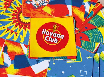
The visual identity is a vibrant collection of graphic assets that convey the expressive culture of Havana: visceral, layered, and chaotic, yet perpetually energized by the spirit and creativity of Cuban people. According to Pearlfisher, designed to exist in harmony with one another, the assets are joyful, visually arresting, and enrich brand communication with a distinctive style that marries crafted graphics and Cuban street life photography to create a cohesive and compelling whole.
The backdrop to the brand world—tiles in varying textures and tones of yellow—were inspired by the eclectic tiles found throughout Havana, while 17 screen-printed graphics depicting icons of Cuban culture make up the visual language from which brand environments and product packaging stem. The Havana Club 3 Años logo has been reimagined through hand painting—an emblem of the brand’s commitment to artistry— while three custom, hand-painted fonts have been digitally realized to ensure the presence of the human touch in all written material.
Notes Pearlfisher, layered with texture, bold hints of color, and naïve design details that highlight the energy of imperfection, the Havana Club 3 Años brand world is—like Havana itself—an exciting sensory experience that places the heritage of Cuba and the history of Havana Club in the context of the modern consumer.
Says David Experton, Brand Director of Delivery at Havana Club International, “We did not want a brand world of strict guidelines, and the new design system crafted
by Pearlfisher and our Cuban artists for Havana Club 3 Años has perfectly delivered on our objective to create a platform for creativity for our market teams, empowering them to bring the brand to life around the world within a common framework.”