I’ve often wondered: How many times are consumers disappointed every day by products that don’t live up to their hype? Slick advertising and equally slick package design often fail the consumer. These products may sell initially, but consumers can be fooled once, not twice. If brands use marketing tools like packaging to oversell their products and make promises they can’t keep, it will ultimately destroy their credibility and take them down quickly—especially now with social media.
Ask yourself: How many brands have violated consumers’ trust in the past few years? How many times have you purchased a product yourself and felt disillusioned, cheated, or duped? Enough said.
It’s more important than ever to tell the truth; to be transparent and honest and to deliver more than promised. Consumers are delighted when their expectations are rewarded—and exceeded—when purchasing a branded product. So how can packaging be optimized to bring the brand to consumers’ attention, sell them, and deliver more than expected, earning their affirmation? That really is the question.
Truthful brand packaging doesn’t attempt to make more of the product than it really is or overstate the brand promise, so it can be a powerful tool to build consumer relationships. But that doesn’t mean packaging can’t be so compellingly designed, that it focuses consumers’ attention on the brand to the exclusion of all others on the shelf, either. There’s way too much homogeneity in category packaging for the most part. So package design should be strong and transparent at the same time.
Packaging design that doesn’t overdo
There are great examples of packaging that deliver brands in this manner. Theo Chocolate is one. Its recently refreshed package design stands out from competitors’ chocolate bars in a big way. A white background breaks the mold in this category. The new brand identity is literally dripping with chocolate thanks to an inventive font; the letter “O” in Theo becomes a cacao bean. Brilliant. The use of orange and yellow to ground the brand identity is attention-getting. Using a “line of dripping chocolate” behind a single visual that segments varieties for consumers tells them what they need to know at a glance. Chocolate dripping from a chili, mint leaf, or slice of orange, looks absolutely luscious.
Verbal brand communication is minimal. “Organic fair trade” is important and appears prominently. “70% dark chocolate” ensures a deeply satisfying experience without having to say so. On the bottom left-hand side of the package, consumers are exhorted to “Enjoy” by a brand-specific, happy face emoticon. Below the emoticon, the USDA-certified Organic seal, the non-GMO certified seal, and the Fair for Life seal appear—all significant and important to brand fans as well as to prospective consumers who care about these issues. It’s quite apparent that this is unique category packaging. It speaks to consumers on many levels and promises enjoyment, but it doesn’t overdo. It entices and allows consumers to experience the quality and enjoyment the brand promises for themselves.
Does that mean packaging has to be minimalistic? No, it doesn’t. What it does mean, recalling that consumers scan retail shelves in just a few seconds, is that critical information has to be relayed via visual and verbal brand communication in a well-designed, succinct manner. That doesn’t only apply to new brands but to classic brands, as well. Dr. Scholl’s offers a great example. The footwear and foot-care product brand has contemporized with refreshed package design over the years. When the company recently decided to launch a new Active Series of replacement insoles for athletes, it had to communicate features and benefits at a glance.
The package design shows the insole through a “window,” intelligently delineating the impact points of the foot that runners and athletes are concerned about: the ball, arch, and heel. This “Triple Zone Protection,” as it is referred to, “helps relieve and prevent pain from shin splints, runner's knee, and plantar fasciitis.” This is simple, effective brand communication. Athletes know they have to protect their feet from the impact of running and jumping with proper footwear. They also know that athletic shoe supports don’t last for long, so replacement insoles make perfect sense. How important is it to them to prevent pain and minimize injuries?
This is packaging that doesn’t overdo; it does deliver brand communication succinctly, using visual and verbal cues well. Consumers who have long experience with the Dr. Scholl’s brand will trust that these new athletic insoles will deliver. Active and athletically inclined consumers who haven’t experienced the brand will likely be tempted to purchase the product. Since the Dr. Scholl’s brand has consistently delivered with its products in the past, chances are good that first-time consumers of this product will be impressed and become brand adherents.
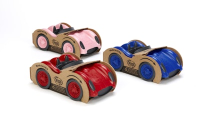
When it comes to toy and entertainment brands, manufacturers have primarily relied on punches of color and strong imagery to make emotional connections with their audience. That’s what makes a brand like Green Toys’ packaging so remarkable. It’s the antithesis of typical toy packaging; pared down, simple, but effective in communicating its core brand values. Packaging is made from 100% recyclable corrugated box material and printed with soy inks. It’s minimal and hones to the shape of the toys or uses cut-outs that allow the toys to be exposed and touched, which kids love.
American-made cars and trucks, kitchen sets, outdoor sets, blocks, and building sets in primary colors entice young children. All of these toys are made in the U.S. from safe, BPA-free, 100% recycled milk jugs that can be cleaned in the dishwasher. No twist ties, plastic, or cellophane films are included in this packaging. Every concept is deliberate and tells the brand story. Green Toys is a unique brand and stands out as such on the shelf. It reassures but doesn’t overreach.
Isn’t it great when packaging is a clear stand-out on the shelf? When it’s refreshingly honest and down to earth? When it delivers the brand and its values transparently? Best of all, when it exceeds consumer expectations? This is what builds brand equity.
Ted Mininni is President of Design Force, Inc., a package and licensing program design consultancy to the consumer product and entertainment industries. He can be reached at 856/810-2277. Mininni blogs about package and licensing program design at www.designforceinc.com.