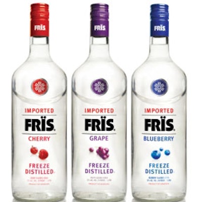
Leveraging the rising demand for lower-priced vodka, Pernod Ricard saw an opportunity to introduce an extended offering of flavored vodka (including cherry, grape, and blueberry), and took the opportunity to optimize the existing package design for FRÏS.
Pernod Ricard turned to the New York office of Dragon Rouge, which created a stylized snowflake as the new icon for the brand. The snowflake embodies the companies proprietary freeze-distillation process) and optimizes the design for the new SKUs. Sophisticated typeface, photorealistic illustrations saturated with color, and color-coded medallions and caps help differentiate among the three new vodka flavors while also presenting an overall clean and masculine look.
“FRÏS has a distinctly Danish ‘functional’ feel,” explains Marcus Hewitt, Dragon Rouge chief creative officer. “While adding clear flavor cues, we wanted to build on this equity without diluting the ‘no-nonsense’ image. A bonus for us was the chance to create an iconic mark to communicate the distillation process. The six-pointed graphic snowflake represents the six-stage distillation process. Sometimes, you just get lucky!”
Adds Ian Crystal, brand director for FRÏS: “The growth in the standard segment for vodka also presents a huge portfolio opportunity for Pernod Ricard. With FRÏS, we have an already established fast-growing brand to capitalize on this opportunity. The packaging refresh and launch of three new flavors provide the perfect springboard to ensure continuity of double-digit growth in this area for the next several years.”
FRÏS flavored vodkas will be available in 1.75-L, 1.0-L, and 750-mL sizes. National trade and online advertising will support the launch.
Introduced in the U.S. in 1989, FRÏS vodka is the culmination of a 500-year-old tradition of vodka making. Danish master distiller Knut Mygund created the brand. Knut Mygund discovered the process of “freeze” distillation, allowing impurities to be filtered easily from the liquid spirit. Pernod Ricard later acquired FRÏS.