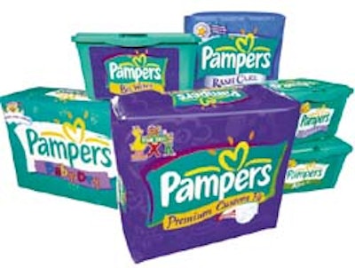
Intended to be more engaging for mothers and their babies, the graphics include the proprietary heart icon and familiar teal color. “LPK created a style strategy that goes beyond the diaper packaging,” Tom Dierking, P&G’s global design manager, says. “The new brand identity communicates Pampers as a more inclusive, genuine brand that promotes mothers and babies growing and learning together.” LPK created the six-color, gravure-printed package with a more casual and contemporary logotype to create a genuine sense of warmth and vitality. The newly redesigned Pampers rolled out into North American stores this fall.
Companies in this article