Wild Tonic’s Packaging Goes from Boring to Bee-utiful
Unique Jun-style kombucha brand Wild Tonic updates its packaging graphics to focus on the heart of the brand: honey, bees, Sedona, and Jun in general.
Jan 6, 2023
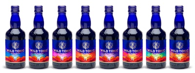
Wild Tonic packaging AFTER the redesign.
Sedona, Ariz.-based Wild Tonic occupies a unique space in the kombucha category. Rather than being fermented with cane sugar like traditional kombucha, the non-alcoholic, Jun-style kombucha uses honey, which is said to result in a smoother, lighter flavor and a better-for-you beverage. With the aim of delivering a “farm to bottle” experience, Wild Tonic infuses its kombucha with organic fruits, herbs, and botanicals, many of which are grown locally among Sedona’s red rocks. According to the brand, Wild Tonic is the only Jun kombucha nationally and is among the top 50 brands in the kombucha market.
However, despite its distinctive product positioning and premium, locally grown ingredients, Wild Tonic Director of Sales & Marketing Jessi Gerth says that before the recent redesign of the graphics for its packaging, which started with its slim can and expanded to its blue glass bottle, the can was so boring, “it totally got lost on shelf.” She adds, “You could literally stand in front of the set and still not see it.”
Wild Tonic packaging BEFORE the redesign.What the previous packaging lacked, says Gerth, was vision and design. “It’s hard to pinpoint a single element [of the design that lacked shelf appeal], we were just itching to change all of it,” she says. “It felt like, as a group, we are such quirky and fun people, and the labels weren’t serving that. It didn’t feel like us. The blue glass bottle was magical, but the cans and the labels lacked that magical element that felt inherently us.”
The initial starting point for the redesign—a collaboration with digital marketing and ad agency HOOK that began in 2022—was a mood board compiled four years previously by Gerth that she says was inspired by “beer cans and cool local breweries with landscapes and energy.”
According to Brady Waggoner, creative director at HOOK, the agency’s task was to put Gerth’s design inspiration to paper and create a refreshed look for the brand overall. Before embarking on the redesign, HOOK surveyed stakeholders and reviewed consumer research in the category. It then set up brand messaging, with a primary focus on kombucha versus Jun. “We used this information to convey what’s in the can and what the differentiators are—for example, taste, mouth feel, pure ingredients, etc.,” he says. “As far as the competitive landscape, while we identified what consumers like about Wild Tonic, we also zeroed in on aspects that traditional kombucha fans like and dislike about competitors’ products.
“This all funneled into our designs and concepts of what was true to the heart of the brand: honey, bees, Sedona, and Jun in general.”
What was retained of the existing packaging was its shapely, blue glass bottle, which Trish Ward, associate creative director at HOOK, says is a huge standout in the kombucha market. The typography remained much the same as well. As for the changes to the design, one of the most alluring elements is a new logo that features a gold honeybee.
Explains Ward, “We kept a similar sans-serif font to the one in the original logo, keeping the typography simple. We always remind each other, there’s only one punchline in a joke, and if you have a logo that is mystical and super intricate with sacred geometry, the lettering that comes with it must be more subdued and simple. We created that balance with the new Wild Tonic logo.”
The logo is designed and positioned on the label against a deep blue background to look like a constellation, under which is a gorgeously colored illustration of the Sedona mountains. “We wanted to create a constellation using the Sedona Cathedral Rocks and the bee as a symbol of our differentiation using honey,” explains Waggoner. “Through all of this, the personality of the brand was born ... . It is a queen-bee, mystical, Mother Earth-vibe that represents the core leadership of the brand today, an energy that no other kombucha brand has. It’s more than just a package, it sets the stage for the future of the brand, where it lives, and who is behind the brand. It’s truly authentic.”
Shares Ward, a tagline in the design, “Bee Wild,” provides a nod to both the wild honey and the wellness aspects of Wild Tonic’s ingredients. “Bee Wild as a tagline, serves as an inspirational message to the consumer to drink better while feeling better—and hopefully to behave in a new and pronounced way,” she says. “All in all, we believe the product, the package, the design theory, and the elements are all working together to inspire the consumer to be different, better, wild.”
The labels are converted by Precision Label, which uses a metallic paper for both the can and bottle to create a gold foil effect for the logo and brand name. The label is printed in six colors, consisting of four-color process plus violet and orange, which Waggoner says helped the brand to meet the saturated orange colors and vibrant purples and blues in the background of the label and the Sedona mountain illustration. “This addition of two complementary colors to our traditional four-color print process created a pop, sheen, and quality that couldn’t have been achieved in any other way,” he says. “It pulled the night sky with the sunset together in a beautiful way.”
Wild Tonic is sold in a range of retail outlets, including Sprouts, Natural Grocers, Whole Foods, Wegmans, Safeway, The Fresh Market, Erewhon, and other major retailers. Its glass bottle and slim can for eight flavors with the new label landed on shelves in December 2022. Says Gerth, “It was such a highlight of my career and exceeded my expectations on every level. While it’s too soon to comment on consumer response to the new design, we expect our fans will be as enamored with it as we are.”
Robots that see variations, adjust grip pressure automatically, accept plain-English commands, and predict their own maintenance. Discover how AI is transforming packaging operations.
Looking for engineering services? Our curated list features 100+ companies specializing in civil, process, structural, and electrical engineering. Many also offer construction, design, and architecture services. Download to access company names, markets served, key services, contact information, and more!
 Wild Tonic packaging BEFORE the redesign.