Pair Eyewear began in 2017 as a children’s brand with a unique vision: to offer affordable, high-quality eyewear that could be customized through the addition of snap-on Top Frames, available in a range of colors, styles, and patterns. With frames priced at just $60, including prescription lenses, and Top Frames available from $25 to $30, it offered greater inclusion and creativity than provided by more expensive, mainstream eyewear brands.
 Pair Eyewear offers glasses that can be customized through the addition of snap-on Top Frames, available in a range of colors, styles, and patterns.
“Prior to the brand refresh, our packaging reflected our original, children’s-centric brand identity,” shares Pair Eyewear Vice President of Marketing Grant Goldman. “As our customer base evolved, there was a clear need for updating our brand image. What’s more, our original packaging did not fully accommodate new frames, accessories, and other products we were in the process of launching.”
 | Read about another packaging redesign, this one for Starbucks whole bean coffees. |
Enter creative company Mrs&Mr, which was tasked with evolving away from the more child-forward, kid-centric design system to a more grown-up system, but without losing the sense of joyfulness and fun that had always been a part of the brand. Shares Daniel Wadia, chief strategy officer of Mrs&Mr, “The challenge was evolving the brand from being joyful, bright, and effervescent for kids into something that could be joyful, bright, and effervescent for adults, as well.”
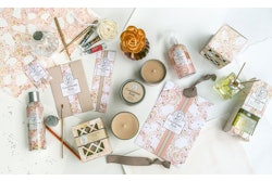
 Patterned backgrounds featuring bold designs resembling fabric swatches can be used alone as a frame for an image, or combined to create a stacking effect.
“Engaging with Pair’s customers, through their own community on Facebook, was really helpful, because it was almost like watching a live focus group happening in real time. And that resulted in a wealth of information and insight that helped to inform the rebrand.”
 The new illustration style was designed to transcend demographics and age groups and resonate with men, women, and children.
Another core element of the rebrand was the use of illustration—a nod to Pair’s heritage as a children’s brand—but sophisticated illustration that could transcend demographics and age groups, something that would resonate with men, women, and children.
Another strategy of the design was to make it approachable and accessible. “Pair Eyewear is not trying to position itself as an exclusive brand,” says Wadia. “On the contrary, it’s designed to be incredibly inclusive, all the way to that price point. So the typography we selected and the entire graphic system was really intentionally designed to be inviting, welcoming and, to an extent, inclusive in a category that can oftentimes feel a little bit exclusive and standoffish, a little bit overly elevated.”
 The rebrand includes every Pair touchpoint.
The style guide for the rebrand—which includes all customer touchpoints—includes a selection of bold typefaces, swatches, colors, doodles, patterns, and designs that can be combined to create a custom Pair look. Patterned backgrounds featuring bold designs resembling fabric swatches can be used alone as a frame for an image, or combined to create a stacking effect.
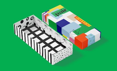
 Pair is a D2C company, mailing its products in a shipper that also is decorated with the new branding.
Pair Eyewear’s selection of products is available exclusively on its website and includes 1,000-plus Top Frame options, including limited-edition monthly drops—November’s comprised Holiday, New Year’s, Carnival, and Harvest designs—and licensed designs from brands such as DC and Marvel comics, Coca-Cola, the NBA, Harry Potter, and Sesame Street, among others.
| | Read this related package design story on Seventh Generation’s largest rebrand ever. |