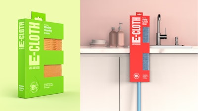
E-Cloth, a Boston-based brand of premium, eco-friendly reusable microfiber cleaning cloths, has introduced a new brand positioning and look created by Pearlfisher. Using only water, E-Cloth products trap, hold, and eliminate dirt, and, according to the company, are proven to kill 99% of bacteria where cotton cloths and chemical products kill only 66%.
According to Pearlfisher, E-Cloth’s new identity cuts through the jargon of a confusing and crowded category with extreme simplify, an idea that is born out of the product itself. A transformative brand expression—a packaging structure that takes the form of an upper-case “E” places a bold and single-minded emphasis on the brand’s hitherto and most underutilized brand asset.
See it Live at PACK EXPO Connects Nov. 9-13: Multi-purpose Labeling from Contract Packagers to muli-shaped products, by Universal Labeling Systems, Inc. Preview the Showroom Here.
Ashleigh Steinhobel, Senior Strategist for Pearlfisher, says, “We know that people are trying to be more conscious and considered when choosing their cleaning products, but we’re still overloaded with options, have cleaning cupboards full of plastic bottles, and an approach that sees us still overly reliant on chemicals, or actually, just moving the dirt around.

See more by Pearlfisher: WW package redesign ‘Full of life’
See more by Pearlfisher: RTD cocktail and pack design follow the rule of thirds
Explains Rich Wilson, Design Director for Pearlfisher, “Across the range, we’ve used the brand’s ‘E’ wordmark as a strong hook that visually manifests into a distinctive packaging format. It also verbally manifests into an ownable language that defines and spells out E-Cloth’s many and varied qualities: ‘easy,’ ‘efficient,’ ‘environmental,’ and ‘enduring.’ This language is used on- and off-pack across the brand’s website, social media channels, and advertising campaigns to communicate the brand’s point of difference in a highly saturated market.”
Marketing Manager for E-Cloth, Anthony Vann, says, “Our new, modern identity and innovative packaging design is ready to sit pride of place on people’s shelves. Pearlfisher has done an excellent job of making E-Cloth stand out and in communicating the brand’s USP [unique selling proposition] of being a more desirable and sustainable way of cleaning.”
The new-look E-Cloth is available in all major retailers as well as online.