When Jason Ulichnie joined St Louis-based grocery retailer Schnucks in July 2017 as Vice President, Own Brand, he and his team were tasked with lifting sales of the company’s own-brand products. The company knew increasing its offerings was a smart approach, but the biggest opportunity for improvement was ensuring the packaging strategy could communicate Schnucks’ values around quality, local produce, and heritage
“We had a very simple business challenge from my executive leadership of getting to 30% penetration in five years, and we were sitting just under 12%,” Ulichnie shares. “So how do you get there? Well, number one, we didn’t have enough own-brand products, so we realized that was an area where we could quickly impact change. Next, we knew we could look at ways to modernize our packaging design. The only way for us to get to 30% was to get customers to buy more own brands, and the only way to do that is to be much more competitive with the national brands, and design was one of the first things our team had to address.”
A bounty of brands, but not all successful
Founded in St. Louis in 1939, Schnuck Markets, Inc. is a third-generation, family-owned grocery retailer led by Chairman & CEO Todd Schnuck. The company operates 113 stores throughout the Midwest—dominating the St. Louis market—and employs more than 14,000 workers.
Schnucks offers an extensive portfolio of own-brand products that can be found in every department in the store. In categories where it can’t compete with national brands given the minimum volumes required—particularly baby and pet care, OTC, and health and beauty—it offers private-brand product lines from group purchasing operation Topco. These include Simply Done household products, TopCare for OTC and beauty care, Paws Happy Life products for pets, and Tippy Toes baby care and nutrition products, in addition to 10 other brands.
Read related articles from Packaging World magazine:
Store Brand Sales Grow Amidst Coronavirus Stock-Ups
Private-Brand Label Design Translated for Kombucha Line
Label Reflects Liqueur's Unique Origin Story
Jet.com Launches Uniquely J Private Brand Geared to Urban Millennials
Simplicity Sells Booths’ Own Brand Teas
But the linchpin of its own-brand portfolio is its namesake brand, Schnucks, which consists largely of food and beverage products and which “promises to deliver quality and taste that rivals (or beats) the leading national brand for a cost that is 20% to 30% cheaper,” says the company. It was this for brand, which makes up the bulk of Schnucks’ offerings, as well as its Culinaria brand of ultra-premium food products, that Ulichnie was tasked with bringing in a fresh, new strategy.
When starting the project, Ulichnie was met with a variety of package designs, the newest effort being a very minimalistic, cross-category line look with a white package, for the Schnucks brand. “It was a mix of outdated designs with the new white design, and then a mix of old designs from the past 15 years that had been a little neglected,” he says. “While the white package had good breakthrough, it was kind of past its time. It didn’t have the design horsepower of many of the national brands. And, as you know, for an own brand to be truly successful, you’ve got to rival the national brands.”
A custom packaging strategy befitting Schnucks
The concept of private-label products has come a long way in the last decade, evolving from a generic approach to an “own-brand” strategy, with those retailers adopting the latter having the most success. That’s according to Michael Duffy, Global Creative Director for Equator Design, the creative consultancy responsible for designing the new packaging for Schnucks and Culinaria.
“Private [and] label to me are two dirty words, or at least label is,” says Duffy. “It’s what a lot retailers have. Then you have private brands, and then it goes even further to own brand, which has even more equity. The private brand is obviously behaving like a brand, not like a label. And own brand is when a retailer wants to take that private-brand mentality further and make it more ownable to them, more custom to them.”
Duffy shares that when he came to the U.S. from his home country of the U.K. 11 years ago, “looking at what was on-shelf at supermarkets, you could throw a stone in any direction, and you would hit a pack that needed a good design.” He adds, “What was difficult was convincing retailers of the value of good design and the fact that they needed it.
“When you see it now, the opposite has happened, where the bar has definitely been raised, and there are a lot more private brands on-shelf than private labels, especially in the big retailers. Now, because that bar is raised, supermarkets need to concentrate on their own-brand approach to make it something more custom, something that feels more personal to them and their shoppers.”
And that’s exactly what Ulichnie aspired to in restaging the Schnucks brand. “He wanted his team to create a brand that connected emotionally with the customer, not just functionally,” explains Duffy. “Building brand equity was the key opportunity for growth.”
“He wanted not just to compare with national brands, he wanted to be more attractive than them. He wanted his team to build an allegiance and a loyalty, ramp up that equity. And really, like any good private brand, you want your customer to buy it because they want to, not because they have to because it’s cheaper. You want them to buy it because the quality is either better than or equal to the national brand.
“That’s what Schnucks really wanted. The company wanted a strategy born out of appropriateness to the heritage of the customer and the values of the retailer. But then they also wanted something that had a real wow factor and would stop you in the aisles and make you choose Schnucks first.”
But as Duffy warns, design can only work for you once. “Because if the product isn’t good enough, you’re not going to buy it again, even if the design is great,” he says.
With this in mind, Ulichnie and his team began evaluating each category by pulling product off the shelf and reformulating where needed.
After reformulation came redesign, with separate strategies for Schnucks and for Culinaria, and within the Schnucks brand, a unique approach for every category.
Category-dependent designs
Culinaria is Schnucks’ “affordable indulgence” line. It includes roughly 145 items throughout the store that are made from “the highest-quality ingredients” and contain no artificial flavors or colors. A legacy brand, Culinaria had been around for 10 years or so when Schnucks own-brand team got their hands on it. “We had a some work to do to determine our identity in this space,” Ulichnie says.
 Schnucks’ Culinaria ‘affordable indulgence’ line of 145 items uses a consistent, cross-category design strategy to create an identity and build the brand throughout the store.
In contrast, every category in the Schnucks brand portfolio gets its own exclusive look. “That has been a design strategy that was new to Schnucks,” Ulichnie relates. “It was not something I had used before at any of the other retailers I’ve been at. Thank goodness for Equator, because they’re good. They can’t fall back on a line look and design standards, they’re essentially redesigning every category, one category at a time.”
Says Duffy, “He told me he didn’t want a line look, and he didn’t want something where everything looked the same—that’s not the way the own-brand team created designs anyway. The team didn’t want pizza to look like snacks, or cookies, or ice cream. It had to look amazing.”
 One design element both Ulichnie and Equator agreed should be consistent across all categories though was the Schnucks’ logo, a bright red dot with the Schnucks’ logotype and the copy, “Since 1939,” inside.
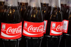
When it comes to the design strategy for each category, the direction taken depends on the products’ positioning in relation to the national brand equivalent. Where a Schnucks category is strong, it doesn’t need to take design cues from the NBE. Where it’s weak and growing, or where it will never be able to compete—for example, a Schnucks cola product competing with Coca-Cola—the design needs to align more closely with the NBE. “And then there’s everything in-between,” says Ulichnie.
The ‘green wall’
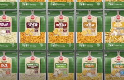
The best example of a category where the packaging design diverges from that of the national brand because the product is so strong is Schnucks cheese. This was also the first category to be redesigned because it was among those Ulichnie calls “needle movers”—big categories that sway consumers to start to trust the brand more and that drive more sales and profits for the company. Because of its high quality, the cheese didn’t have to be reformulated, but was expanded from 70 to 130 SKUs, resulting in a “selection that rivals any cheese shop,” says Schnucks.
The redesign was one Equator had presented to Schnucks’ during their creative pitch, and it was so on point, it was rolled right out on shelves without any changes.
Explains Duffy, the existing packaging was very “private label-esque” in white. “When red and white are done in the wrong way, it just looks like extreme value,” he says. So, color was the first consideration.
Given that cheese takes up such a large amount of real estate in the refrigerated section, it results in a massive block, so “own brand goes up pretty hard against the national brand,” Duffy explains. Equator advised Ulichnie not to match the color of the national brands—e.g., Kraft blue or Sargento red. “If you were to go after blue, you’re basically just increasing the brand block of the national brand. You’re going to get lost in a sea of Kraft,” Duffy explains.
 Part of Schnucks' cheese line, Parmesan in rigid containers got the same design treatment as its shredded cheese.
To further help the brand stand out, Equator came up with a cheese-board concept that provides maximum appetite appeal. The packaging features photography of a cheese board dressed with hunks or slices of cheese, in a very delicatessen manner. When the packages are hung on pegs—with the peg poking through the hole in the top of the board—“it looks like hundreds of cheese boards, and when you touch them, they wobble,” Duffy says. “It brings ‘a smile in the mind.’ If you can have a smile in the mind on top of brilliant design, that makes it all the more memorable, and you end up doing a better job than the national brand.”
Another category where Duffy says they did a better job than the NBE was ice cream. Whereas, he says, national brands depend on photography of mashed potatoes (which won’t melt under studio lights) on bizarre backgrounds that are Photoshopped together, Equator shoots real ice cream on a real background, surrounded by real ingredients, in its in-house studio. “If it looks like a real bowl of ice cream you are far more likely to buy into it than if it looks like some weird over-Photoshopped mint leaves just stuck on top, with strawberries floating around,” Duffy says.
 Equator photographed real ice cream on a vintage scooper to bring realism to the graphics. Background colors differentiate flavors, while a red rim on the lid ties the line together.
If you can’t beat ’em…
As mentioned, in areas where national brands are particularly strong because they evoke trust in the quality, straying from category color cues will backfire—even if the quality of the own-brand product is better. “So, if you were to do cream cheese, and you don’t use silver, consumers aren’t going to believe it’s as good as Philadelphia,” Duffy explains. “Or if you do Oreos, and you use an orange bag for your regular, everyday Oreo, instead of blue, then those sales are going to tank as well.”
As mentioned earlier, it’s the same challenge when trying to compete with Coca-Cola. “If you don’t use red, you might as well not even put it on the shelf,” Duffy advises. You also want to protect national brands such as Coca-Cola that bring in big profits.
For the carbonated soft drink category, Schnucks took two approaches: 1.) it used the color logic of established brands and tied the line together with a unique illustration style, and 2.) it operated in areas where the national brands don’t play, i.e., flavors like peach, grape, and orange.
“So in soda, it’s about protecting the big stuff, which is Coke and diet, and the way you win against the brand is with all your flavored sodas,” says Ulichnie.
Equator’s graphic design for the soda line is described by Duffy as “really poppy and really iconic,” with the St. Louis arch—a nod to Schnucks’ heritage—incorporated as part of each variety name. “They sit together as a beautiful set,” he says, “and sales have been phenomenal.”
Design investment returned tenfold
Since Ulichnie and his team started the process of growing Schnucks’ own-brand business in 2017, the company has launched 3,000 products in new packaging designs, which is on track with a goal of 1,000 new products per year. Many of these have been reformulated or are completely new. In sparkling water, a category where Schnucks previously had no product, the retailer launched a line of six SKUS in a “brilliant, simple design from Equator,” Ulichnie says.
 Schnucks’ carbonated soft drinks take their color cues from the national brands, with ‘poppy,’ ‘iconic’ illustrations bringing the line together.
In addition, since the project began, Schnucks’ own-brand sales have increased from 12% to 18%, or 600 basis points. “We drive a lot more profit than a national brand, and so anything we’ve invested in design has shown gains,” says Ulichnie.
“This is the case study of all case studies—it’s one of our team’s proudest achievements,” Ulichnie says. For the project’s success, he credits his staff at Schnucks as well as Michael Duffy, Jen Gaeto, Senior Creative & Strategy Director - North America, and Charlie Kuoni, Account Director, from Equator.
 One way Schnucks has found to compete with national carbonated soft drink brands is by offering options that they don’t—namely assorted fruit flavors.
Ulichnie also emphasizes how important the buy-in from his colleagues across Schnucks has been. “There is no way for an own-brand program to be successful without buy-in from every department head in Merchandising,” he says. “We’re lucky enough to work with what I feel is the greatest merchandising leadership team in the business. None of this is possible without their support.”
Currently Schnucks and Equator are focusing on “filling out the shelf,” Ulichnie says, working on more obscure product categories such as barbecue sauce and similar items. “Remember though, the goal that was laid upon us was 30% penetration, and we’re only halfway there,” he adds.
Looking to the future, Ulichnie says the call to action is to take Schnucks’ own brand to the next level. “In the next two years, we are focused on the proven strategies thaat will move the needle further and take our company where we need to be. Then maybe at that point, we can put the mission accomplished banner up and see what’s next.”