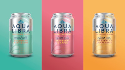
U.K. soft drinks company Britvic has partnered with brand-led creative agency BrandOpus to create a new identity and packaging design for its Aqua Libra sparkling water. Brivic undertook the rebrand to drive category growth and increase market share by extending the brand’s appeal to the mainstream carbonated soft drink market.
Read other articles on package redesigns from Packaging World:
Salmon with a Smile: Fish Brand’s Bold Personality Captured in Redesign
Packaging is the Vehicle in Dogwalkers’ Brand Journey
Rum Label Artwork Inspired by Mayan Legends
Tampico Graphics Get Some Punch with Redesig
Following its heyday in the 1980s as a non-alcohol alternative, Aqua Libra was relaunched in 2018 to compete in the burgeoning infused sparkling water category. And while the category has seen a 50% consumption increase in the last decade, Britvic believes there is still plenty of potential—especially when considering the relative size of the U.S. market.
Says Francois-Marie Menoret, Senior Brand Manager Aqua Libra, Britvic, “Consumers are looking for better-for-you alternatives, but not enough are aware of the options out there in the market. Our objective was to make our brand more distinctive and recognizable whilst ensuring that consumers could identify it as a drink that would give them all of the enjoyment of a can of fizz without the compromise.”
At the heart of the new brand identity is the fountain—a piece of existing iconography that has been reimagined as a symbol of the brand’s “freedom to enjoy” attitude.
 Aqua Libra BEFORE the redesign
On-pack and across the brand world, the re-energized design replaces traditional rigid and ordered patterns with free-flowing, unstructured elements, presenting a more expressive feel. Adds Munro, “We wanted to find a way to deliver on natural without compromising on taste and enjoyment cues—the pastel color palette and fresh design cues have helped us find the right balance.”
The rebrand was be rolled out across the U.K. market beginning in mid-April. Says Menoret, “We’re confident the new rebrand will help the brand to attract new audiences and to reinstate its place as an iconic brand.”