Green Thumb Industries (GTI) is a Chicago-based cannabis cultivator, processor, and dispensary operator, national in scope, that is dedicated to providing dignified access to safe and effective cannabis while giving back to the communities it serves. The company produces all-things cannabis offering brands in all the usual cannabis niches, including recreational edibles, vape cartridges, and pre-rolls, alongside the raw flower. It also operates retail locations for dispensing for medical and adult-use purposes.
In an industry that’s known for upstart brands founded by career changers or cannabis hobbyists seeking to go pro and stake a claim in the “Green Rush,” GTI stands out. It operates like any other CPG or food and beverage brand owner. In fact, the leadership structure is replete with CPG brand owner and retail expats, each with years of supply chain, logistics, and packaging experience. Such considerations can be perceived as mysterious dark arts to more novice would-be brand operators.
 Within each redesigned Dogwalkers’ tin, five small pre-rolls are nested into a paperboard insert folded into a five-pocket chevron pattern. Text underneath the lid reinforces the brand positioning.
So as states slowly but inevitably lean toward legalizing the cannabis trade, and licenses for commerce become available, GTI plans to be there with the infrastructure to apply a mature, professional approach. It treats its brands in the same way you’d expect a P&G or Mondelēz to treat theirs.
“The approach has always been the CPG strategy,” says David Bleicher, Brand Manager at GTI. “As cannabis becomes more commoditized, what consumers will gravitate toward in the future, and what will allow us to hold value, is the brand, the authenticity, and the story. That obviously entails the packaging and all communication platforms that go with it.”
Dogwalkers’ origin story
One such brand benefitting from GTI’s professional brand-owner touch is Dogwalkers, also one of its first licensed brands. Dogwalkers was established in 2016 in Illinois to offer unique, small-format cannabis pre-rolls to consumers who value authenticity and convenience. Dogwalkers has since expanded to four states, rapidly earning customer loyalty as a result of the brand’s consistent quality and ongoing donation partnerships with deserving animal shelters.
Leisurely strolls with his dog Bailey inspired GTI’s founder to launch the Dogwalkers brand. Most pre-rolls available at the time averaged 1 g to 1.5 g, representing a sizable time and effort commitment for users—particularly light, occasional users. GTI sought a smaller size of pre-roll that might only last the length of one walk around the block with the dog.
With Dogwalkers, GTI launched a considerably downsized 0.35-g pre-roll format, called a Mini Dog, sold in five packs. GTI also launched larger—but still not onerously big—0.75-g Big Dogs, sold as singles.
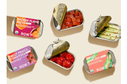
Primary packaging consisted of five Mini Dogs in a hinged, tin-plated steel container, similar to the one used by the Altoids brand of mints. Big Dogs were packaged as singles in a plastic “J-tube”-style tube with a screw-top closure. Graphics for the original Dogwalkers tin pack were lighthearted and bright, with a white background on the top plate and a large, blue “D” and “W” logo communicating the Dogwalkers brand name (See photo on page 37).
Sit, stay, and play packs
The brand’s pre-rolls come in three varieties, each designed to provide a different cannabis experience that ranges from tranquil to euphoric. In the original pack, an art element—a color-coded silhouette depicting a dog either sitting, staying, or playing—communicated which variety each pack contained. A sitting dog indicated Indica flower, meant for calmer experiences. A standing dog communicated “stay” denoting a mid-range Sativa-Indica flower hybrid. A boisterous, tail-wagging dog at “play” represented a Sativa-dominant blend, which lends itself to more active, euphoric experiences.
Each tin included a paper insert telling the walk-around-the-block origin story and alluding to dog shelters with which the brand is involved. Secondary packaging consisted of a similarly printed opaque white flexible pouch with child-resistant and tamper-evident properties. As a whole, this package treatment and brand position were quite serviceable in their first iteration.
Impetus for a rebrand, packaging change
The most common approach for pre-roll manufacturers is to use what’s called the shake or trim portion of the cannabis flower. These are portions of the plant that are cut away from the more valuable bud or flowering portion. Generally, the trimmed buds are reserved for separate, individual sales as a whole flower product.
But when Bleicher took over as Dogwalkers’ brand manager in 2018, he recognized that GTI manufacturers were allocating premium, popcorn-sized buds for pre-rolls. Not to mention, each pre-roll was hand-packed by a skilled artisan. These realizations suggested to him that the bright whimsy of a cartoon dog on a cheerful blue-on-white design wasn’t sufficiently conveying the premium quality of the main ingredient.
That’s why in 2019, the Dogwalkers brand underwent a comprehensive rebrand to elevate the packaging, logos, and communication pillars to further establish the brand as a leader in the cannabis and CPG space.
 A child-resistant paperboard carton saves space in transport and in retail compared to the incumbent pouch pack. Color coding throughout allows these primary/secondary packaging systems to be universal enough to work in many different markets. Market specific-informational labels, also following the color convention, are added within each market, and color prevents mixups as to variety.
“We chose to rebrand the various elements of the Dogwalkers portfolio in order to better reflect a commitment to crafting premium, full flower pre-rolls while acknowledging the rich history of this authentic and timeless cannabis product category,” Bleicher says. “Dogwalkers sets itself apart from the pack through its tireless commitment to quality and humble respect for products made with a human touch.”
Research surrounding a potential package rebrand began by reaching out to patient care specialists (PCSs) throughout Illinois (recreational cannabis became legal in the state in 2020, but still required a medical script during the rebrand) to see what elements they had been missing. It turned out that the pre-roll category as a whole carries vintage and ritual elements that aren’t shared by edibles or vapes.
“In addition to premium quality, I wanted to communicate that vintage, timeless, classic vibe that the pre-roll category enjoys,” Bleicher says.
Unique realities of cannabis
Given the fragmented, state-by-state nature of cannabis regulation, GTI and Dogwalkers wanted to create a universal container design that would scale into new markets and allow for bulk ordering.
“A new package design had to be something that we believed would be compliant in as many states as possible, so the full packaged component is flexible enough to go into other markets as we expand,” Bleicher says. “Then the only piece that theoretically would be specific to each market would be state-specific information on a pressure-sensitive informational label.”
Bleicher was also cognizant of the brightly colored dog silhouettes on the original tin packs—in the wrong person’s eyes, such a treatment could be perceived as cartoonish, thus a compliance concern as regs tighten up. Still, Dogwalkers had a lot of brand capital tied up in dogs, so the balancing act was to find a way to incorporate the canine parallels and origin story in a mature way that conserved the titular theme.
 Dogwalkers’ previous pack design was simple and bright. However, the brightly colored dog silhouettes on them could be perceived as cartoonish, thus a compliance concern as regs tighten up.
New package design
Working with Chicago boutique brand agency Highdive, Bleicher arrived at an all-new color scheme for the brand. It relies on deep forest green and aged metallic gold colors reminiscent of the classic Gilded-Age pairing of gold and green felt. The aim was to convey a vintage motif and to suggest timelessness and ritual.
The primary package remains a hinged tin container for the five-pack Mini Dog format. The body of the tin uses the weathered gold color, and the lid uses the dark green background with branding text embossed in the tin in gold. In addition to the brand name and description, an “Established” date reinforces the classic, historical theme. New to this version of the pack, the tin carries a paperboard insert folded into a five-pocket chevron pattern. This serves to provide each of the five pre-rolls a designated spot, holding each in place.
“One of the things that’s been so critical in all of our packaging is making sure the presentation is premium. When a consumer opens up whatever it is that they receive from GTI, it needs to look pristine, clean, and full,” Bleicher says. “The insert was a way to better organize pre-rolls in the tin to make sure they’re not rolling around, they’re saying clean, and they’re staying separated.”
Each tin contains a color-coded, circular “button” indicating the sit, stay, or play variety. The reoccurring and reinforced color coding on this button plays an important role in the entire package system, and not only for the end consumer, but more on that later.
Switch from pouch to carton
Secondary packaging represented more than just a cosmetic departure from the previous packaging iteration. Dogwalkers eschewed the pouch in favor of a child-resistant paperboard carton to help save space in transport and in retail.
“The pouch took up a little bit more room than we’d like and was a little awkward,” Bleicher says. “That impacts us and our dispensary partners since we’re trying to stack as many units as possible in our approved shipping vans to go to dispensaries. Room is very tight, specifically in markets where you have to keep product in lockboxes. And dispensaries often need to keep product in a vault, so space is limited. We wanted to have a secondary package that was as compact and easy to stack as possible.”
There wasn’t a stock or off-the-shelf child-resistant carton that was small enough to hold the tin as snugly and compactly as Bleicher would have liked, so he worked with agency High Dive alongside packaging supply manufacturer Sunshine Enclosures, which also manufactured the tin, to arrive at a custom carton solution.
The child-resistant (via a proprietary interlocking flap mechanism) 1400g paperboard carton is printed in two colors, die-cut four-up, and erected by Sunshine Enclosures. The thickness of the paperboard not only conveys weight and quality, but it also allows for debossing. The cartoon dogs are gone, but more nuanced, subtle debossed dog shapes, with no ink fill, carry on the brand legacy in a way that won’t risk an accusation of marketing to children.
Billboard space for a state-specific p-s informational label is reserved on the back of the carton.
Giveaway sticker serves logistical function
Onto the bottom-edge flap of each carton, Sunshine Enclosures applies a peelable sticker giveaway. Each sticker contains a randomized fact about dogs, and the end consumer is encouraged to slap the sticker on their computer, water bottle, or bike. Not only is this extremely on-trend—so many new outdoors product brands are doing some form of this—but it also serves a logistical purpose in matching the sit, stay, play variety indicator button on the tin enclosed within.
But we already said each carton will receive an informational label. Why couldn’t that label accomplish the color coding?
The answer is it could and does. But bear in mind, the pre-rolls themselves cannot be transported over state lines. That means the nearly completed packages, lacking only the pre-roll content and state-specific warning labels, are delivered to GTI’s facilities in Illinois, Nevada, Maryland, and soon, Massachusetts (the runout location for the previous format’s packaging stock, new format rollout in March 2020), where they will be hand packed. While the cartons themselves are universal, the labels are specific to each market and subject to change. As such, these labels must be hand applied at each GTI location.
The sticker giveaway, however, doesn’t contain any state-specific information. It’s as universal as the tin within the carton. So, it can be applied at the supplier, Sunshine Enclosures, and sent into any market.
To an operator at a GTI facility, it still functions as a clear, color-reinforced link between the variety (sit, stay, or play) of pre-roll going into each tin, the carton the tin is going into, and the state-specific informational label to be applied. Now, GTI could have Sunshine Enclosures print this color coding directly onto the carton without the state-specific information. But the giveaway dog fact sticker is fun and, in dog parlance, scratches the itch of maintaining an unbroken color-coded chain of indicators describing the product within.
“For instance, Sativa [play] correlates with yellow,” Bleicher says. “So we know when we put a Sativa product into the tin, there’s going to be a yellow button on that tin and a yellow giveaway sticker on the bottom of the carton that’s going to match the tin. Once the tin is filled and the carton closed, an operator applying the informational label can match the yellow giveaway sticker with the yellow on the label.
“The last piece applied at GTI is a tamper-evident label. This label also has the sit, stay, or play categorization. All of this allows that secondary package delivered to us to be completely universal to all markets.”
As seen at dispensaries
Single-variety cartons are packed by hand into 20-unit retail-ready paperboard shipper cases, also by Sunshine Enclosures. These cases are printed and designed as an extension of Dogwalkers’ branding, and of course, carry color-coded messaging in the sit, stay, play convention. The ability to display the Dogwalkers pre-roll packs in-store varies state by state, but for those that are allowed to do so, a perforation makes the case display-ready. And that’s the point at which the consumers’ journey with Dogwalkers begins.
“Dogwalkers provide consistent, convenient, high-quality products that deliver a euphoric break in the day,” Bleicher says. “And they are presented in discreet, convenient packaging that allows consumers to take Dogwalkers wherever their journey takes them.” PW