The best package designs communicate so effectively on a sensual and emotional level that a consumer can’t help but pick them up. The package lends the product inside a special beauty all its own. In the process, consumers are drawn to the product because the packaging makes them feel as if it’s just for them.
Virginia Postrel, author of the Substance of Style, calls this relationship between the consumer and the package the “aesthetic imperative.” She says that a new emphasis on aesthetic value is reshaping commerce, culture, and consciousness. In package design, she says, this trend is bringing about a shift toward packaging that:
• Communicates through the senses, creating reactions without words.
• Shows rather than tells and delights rather than instructs.
• Has immediate emotional effects, rather than cognitive effects. “You just feel it.”
The consumer feels pleasure and out of that pleasure comes meaning, Postrel explains. “I like that” becomes “I’m like that.”
“The point is not what style you use, it’s that style you use,” she says. “Take something functional and through design, create pleasure through which consumers can derive meaning.”
Following are four packages, from different product categories, that reflect the “aesthetic imperative” thinking that Postrel speaks of, in the quest to increase brand sales.
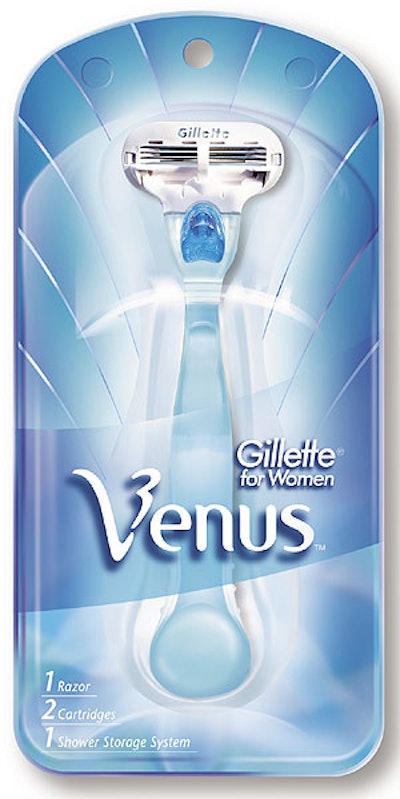
1. Venus owns a position
Mary Ann Pesce, president of the Gillette Co.’s Personal Care Group, believes that the marketing strategy behind any great brand should respect the brand’s consumers, understand their aspirations, and give them what they want.
Pesce should know. She has been a driving force behind the launch and growth of Venus, Gillette’s shaving system for women. The brand has achieved 26% annual growth and exceeded $500 million in sales.
Superior performance is fundamental to any successful product. But the right packaging, Pesce says, is essential to transforming a product into a brand and creating a compelling and ownable position in the market. Gillette gained these insights through extensive discussions with women. Where men treat shaving as a simple daily ritual, women view it as a process of discovery that, Pesce says, “could resonate with every woman and make her feel her best.”
This “revelation of the beauty within” shaped the branding platform for Venus, with packaging color and graphics communicating an exhilaration of transformation and personal empowerment, Pesce says.
That branding platform creates an ownable difference in the crowded shaving products aisle, where Venus’ branding message stands in stark contrast to competing products whose packaging communicates the “daily ritual” message.
This point of difference is what retailers, particularly those who do volume business, want in order to create “shelf turn” and increase sales. An ownable position is possible for any product, but “you have to see it in your eyes,” Pesce says. “Every step of the way, you have to justify it financially. If you do that, any manager who is a good consumer will at least try it.”
2. Sheba builds touch equity
Marketers use the term “touch equity” to describe the power of tactile packaging as a purchase motivator. They are tapping its potential in health and beauty products and, more recently, in grocery aisles. Often, the tactics are packages with soft-touch resins, matte finishes, and special inks that create grainy textures.
But in pet food, Masterfoods USA uses sensory illusion to create touch equity. Consumers are drawn to touch the “fishnet” that appears to bundle two six-count multipacks of the Fishnets sub-brand of Sheba cat food. In reality, the black net is a pattern that’s flexographically printed on Crystal Flexpack™ proprietary-blend polyolefin shrink film from Exopack. The film’s high clarity and puncture resistance can provide the no-label look on a variety of packages. On the Fishnets package, the film creates the fishnet illusion, says Erin Ferraiuolo, spokesperson for Masterfoods.
The plastic tubs are bundled upright in the tray. That stacking pattern enables the aluminum lids to act as a billboard for the Sheba parent brand as the single-serve tubs peer out from over a die-cut ocean “wave” pattern on the tray.
Ferraiuolo says the marketing department, working with the packaging development and product development departments, created an item that invites touch and builds on the brand’s equity. The fishnet pattern on the film, illustrations of animated sea creatures, and the wave-pattern die cut on the tray supports the “fresh catch of the day” message for the two seafood varieties of cat food marketed under the Fishnets sub-brand.
“The packaging materials, in conjunction with the graphical selection, creates a multi-pack that builds equity for the brand,” Ferraiuolo says.
3. Lean Cuisine: Simple is the new better
A growing body of research suggests that as consumers scan shelves of packages in the store, they filter out everything except the most meaningful messages that make them say, “I’m like that.” They bypass complex and overly detailed brand messages, which dictate a prescriptive meaning, leaving little for the consumer to personalize them.
“The most successful brands are finding they connect with their core enthusiasts when they use an effective visual shorthand,” says Rob Wallace, managing partner at Wallace Church Associates, a brand identity consultancy in New York City. “The key strategy shared by these successful brands is that their messages, their identities, and their entire communications architectures are, quite simply, simple.”
Wallace offers Nestlé’s Lean Cuisine as an example. The brand of prepared frozen dinners uses a distinctive palette of colors, succulent product photography, icons, and lots of “white space” to communicate one message—tasty and healthful eating—on its cartons.
Through a recent redesign, packaging for Lean Cuisine eliminates non-essential messages and moves secondary claims to the back and side panels. This approach encourages consumers to bring their own personal interpretations to the brand, explains Amanda Bach, packaging communication design manager at Nestlé Prepared Foods Co.
“Simplifying the Lean Cuisine identity allowed us to recapture the brand’s equities, drive shelf impact and, by color coding, helped enhance shopability,” Bach observes. “This new, simpler, cleaner design will help consumers reconnect with the brand on an emotional level.”
4. Bosch maximizes the shrinking ‘stage’
In the battle for sales, retailers are rethinking how they stage products in order to maximize every square foot of shelf space. In some categories, that approach has reduced the number of linear feet either year round or made seasonal adjustments in shelf allocation.
In other categories, less space is being designated for point-of-purchase communications. Power tools are a case in point, especially in home centers.
Robert Bosch Co. faced this challenge when introducing its Impactor cordless fastening driver. The drill’s proprietary power mechanism broadens the tool’s range of applications. The drill also generates more torque and is suitable for more jobs than similar tools in its class, says Jeff Wilkinson, director of cordless initiatives at Bosch. Yet the Impactor is also smaller and lighter, and it delivers less strain on the user.
Bosch wanted to communicate these benefits to professionals and serious do-it-yourself consumers.
Working with package designers at The Bailey Group, Bosch maximized its small piece of shelf space by creating what Wilkinson describes as “on-tool P-O-P” (point-of-purchase). It takes the form of a 12-pt c/2/s board with a two-sided 1.3-mL gloss lamination, printed offset in four processed colors. “Detailing was done to the die design so the P-O-P would fit snug to the tool,” Wilkinson says.
The P-O-P card optimizes the recognizable Bosch power tool brand presentation and colors with concise copy and the tagline “Maximum Results, Minimal Effort.” The card also supports the ease-of-use product benefits with three photos showing the product in action.