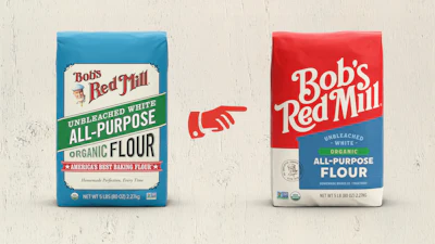
Bob’s Red Mill recently unveiled a total brand design overhaul intended to ease the consumer shopping experience. The updated packaging features a simpler and bolder logo, a custom typeface, and an updated color palette with color families.
While no changes were made to the packaging structure, the design updates place a greater emphasis on dietary callouts such as Gluten Free and Organic. According to Bob’s Red Mill, the hierarchy is cleaner and more cohesive across the entire portfolio.
Core flours will debut in the new packaging September 2026 with a full rollout running through 2027. The company says this transition period is designed to minimize food waste by allowing existing inventory to sell through naturally. However, it doesn’t anticipate issues with brand coherence because the updated packaging retains core visual elements.
“We believe brand coherence will remain strong throughout the transition because we intentionally preserved many of the visual and emotional elements consumers already associate with Bob’s Red Mill,” says Margret Brown, creative director at Bob’s Red Mill. “The mill imagery, warm color palette, handcrafted feel, and overall sense of warmth and place are all still central to the brand.”
A refresh rooted in heritage
According to Brown, visual design changes also provide a new avenue to incorporate the company’s heritage. She says the custom "Red Mill" typeface, inspired by the hand-painted signage found around the original mill, offers what a licensed type couldn’t—warmth.
“It helps create a more distinctive and cohesive identity across packaging and brand touchpoints while reinforcing the warmth, authenticity, and human character that consumers associate with Bob’s Red Mill,” Brown says.
Other tradition-based cues include a wraparound mill illustration inspired by the original Red Mill where the company began in 1978 and a Seal of Quality featuring founder Bob Moore at the center.
Designed for easier shopping
But the design change goes beyond aesthetics. With more than 200 products spanning multiple grocery aisles, the company says updated visuals will increase on-shelf recognition.
The addition of color families, drawn from the original Red Mill and grains, is intended to create clear product shopping categories in addition to creating a scalable system for the future. According to Brown, the color architecture is designed to work across 200+ SKUs, balancing consistency with enough flexibility to support innovation and future growth.
Improved shelf visibility was validated by focus groups and eye tracking studies on key products. In focus groups, the company found the design reduced search time by nearly half. Brown says eyes were more clearly going from brand to product type to image. “We found that the new design simplified and focused the browsing pattern so that people were more easily able to spot our packages and identify the product name and type,” she explains.
The company says its goal is that increased shelf visibility will be accompanied by increased household penetration. Currently the company is in 17% of households (23.5 million), and hopes to pass 20% with the refresh. Households currently purchase two products per year, which Brown says the company wants to increase to three.
Modernizing after nearly 50 years
After nearly 50 years, Brown says the timing of a 2026 refresh aligns with the brand’s desire to modernize while remaining committed to its mission to bring people together through homemade food.
“This is more than a new look—it’s our story, made easier to share,” says Daniel Barba, VP of marketing at Bob’s Red Mill. “We think our consumers will love our new look, knowing we are still, simply, unmistakably Bob’s Red Mill.”