Can the owner of an iconic brand successfully give a newer line of products their own distinctive visual identities while also reflecting key visual equities of the “mother” brand?
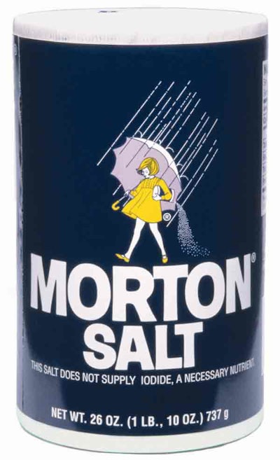
Morton International thinks so, and it has begun refreshing the package designs for its stable of specialty salts, which have been on the market for several years. This is a tall order that the Chicago-based company—historically not one for frequent packaging changes—is pursuing carefully. Why? The company’s flagship Morton Salt is one of the nation’s most trusted brands. Its dark blue-labeled, cylindrical basic table salt package is a staple in many kitchen pantries, and Morton doesn’t want consumers to lose identity with the core brand.But specialty products seem to be where the growth is in household salt, a category where overall sales are flat.
“People are not cooking as much as they did. They’re eating out more often,” says Earl Thorne, director of brand development. “But products such as kosher salts and sea salts are growing in interest among the ‘foodies,’ the people who watch cooking programs on TV and who have dinner parties and are weekend chefs.”
Although Morton’s periodic introductions of new salts have stirred interest in a new clientele of younger consumers for the brand, they have also created marketing challenges, Thorne adds. “We did each product piecemeal. We weren’t overly sensitive to the implications of doing so. And we found that people were not aware of the newer products or, more disturbingly, were not aware the products were associated with Morton.”
Morton identified the packaging for these products as a culprit. Periodic product introductions meant that each new product was packaged in containers or cartons with a variety of different looks. The specialty salts lacked cohesion, and visual disparity makes the aisle’s generally small packages even more difficult to shop.
One of the Morton brand management team’s first steps in correcting these flaws was to take stock of Morton visual brand equities. The company called on Kornick-Lindsay (www.kornicklindsay.com), a design innovation and development firm in Chicago, to spearhead the effort.
Umbrella identity
Among the initial moves was reviewing Morton’s visual identity. The team identified how “umbrella brands,” where the flagship brand dominates, solve branding issues. “The challenge in developing an umbrella brand identity is determining what is the family’s identity vs. the individual product identities,” says Joe Kornick, principal at Kornick-Lindsay. “Getting that balance right is the trickiest part of design for this type of product.”
Morton’s Thorne adds, “If you make a change in the design, you don’t want to lose existing customer base in the transition.”
A centerpiece of the new design strategy was leveraging the strong visual equity in the brand’s “umbrella girl” animated character. Kornick recommended integrating the umbrella girl and the Morton name into a single visual element. This new “stamp” became the cornerstone of the refreshed design. The stamp helped set the stage for another objective in redesigning the specialty salt packages—tying the products to Morton but leaving enough room on the package to distinguish between each specialty salt and make the communication clear and simple to shoppers.
“You can look at a design and think it’s great, but then you can put it on a shelf and realize it doesn’t have shelf impact,” Thorne says.
Test for synergy
With that thought in mind, the creative team invited Morton’s brand management team to Kornick-Lindsay’s office in Chicago to view and respond to the design alternatives and evaluate them for their ability to break through the clutter and create synergy between the various Morton product offerings.
Morton’s branding team had to consider that the spice aisle is dominated by very small packages in which products within a brand family are often stocked separately from each other. Compounding consumer confusion is that retailers are squeezing the aisle by stocking more brands.
Many of the new products making their way into the spice aisle are specialty salts. Product manufacturers are marketing them under either of two banners: gourmet or healthful. Either way, retailers love specialty salts because they increase the “ring” at checkout. For example, Morton’s workhorse basic table salt container retails for about 50 cents for a 26-oz cylinder while its Nature’s Seasons Seasoning Salt fetches nearly $3 for a 4-oz container.
In addition to asking for Morton managers’ feedback on design alternatives, the creative team conducted its own category audit. This was an ongoing step in the two-year process of redesigning the packages, as new products on the market were added into the analysis.
A key conclusion was that Morton needed to build the brand and individual product communication for its specialty salts around a visual hierarchy. The umbrella girl stamp is the predominant element, centered on each carton or container. A border rule frames each package front. The new design makes individual product names more prominent on each package, and the number of fonts has been significantly reduced to enhance visual continuity across the product family.
Designs for many of the new packages take this visual hierarchy a step further. They introduce an illustration that reflects the end use for each product, such as popped kernels gracing the bottom portion of the label on containers of Popcorn Salt.
Each of these visual elements, combined with silk-screening and other printing processes in three to eight colors, raises Morton’s category profile with consumers. They give the high-end salt line a sense of quality that helps shoppers to justify the price-value relationship while also providing enough design flexibility to allow the each product’s brand “personality” to shine through, Thorne explains.
These visual elements also provide the consistency that connects the line as Morton products. This is especially important in a crowded aisle such as spices, with many small packages, Thorne says. The commonalities of the design enable Morton products to be identified more easily, even though they are often stocked apart from each other.
The materials used in the new specialty salt packaging haven’t changed. The cylinders use a variety of materials and suppliers. For example, the low-density polyethylene Sea Salt containers are packed and imported from an overseas contract packager. Silgan Plastics (www.silgan.com) provides the polypropylene Garlic Salt containers. The Popcorn Salt cylinders are wrapped paperboard stock, produced in-house. The clay-coated newsback folding cartons are from Southern Standard Cartons (www.thestandardgroup.com).
The new designs are being introduced gradually on store shelves, Thorne says. The first of the new packages arrived in some retail stores three or four months ago and the last of the new designs may be another year away. But already, Thorne says, the refreshed packaging is creating stronger visual associations for consumers between Morton and its widening presence in the spice aisle.