From the consumer’s point of view, assessed through research.
That insight comes from Ted Mininni, president and creative director at Design Force, a Marlton, NJ, design and brand strategy firm. Mininni tells Shelf Impact! that once the marketing department has effectively carried out this research, design can begin on the brand extension. The core equities of the brand and sub-brand—an extension of the parent brand but with its own visual identifiers—must be retained, using a visual system of segmentation. This can be done through one or more of the following five methods:
1. Color. Variations in color from package to package help distinguish one segment from another.
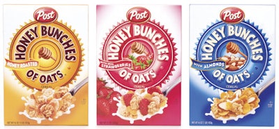
2. Architectural device. This is a common element engineered into the package design architecture that allows for a color, pattern, or textural change to distinguish one segment from another. An example of an excellent use of this technique is Post’s high-volume Honey Bunches of Oats cereal line.
3. Typography. A strong typographic segmentation system can work if it’s prominent on the packaging and works in conjunction with the brand and sub-brand.
4. Iconography. This technique can be quite effective in segmenting a product line. It is particularly prevalent in global packaging.
5. Package design architecture stylization. This tool differentiates segments that target specific demographic groups. Mattel uses it well in its classic Barbie line of dolls.
Read more about Mininni’s tactics at www.packworld.com/go/w158.