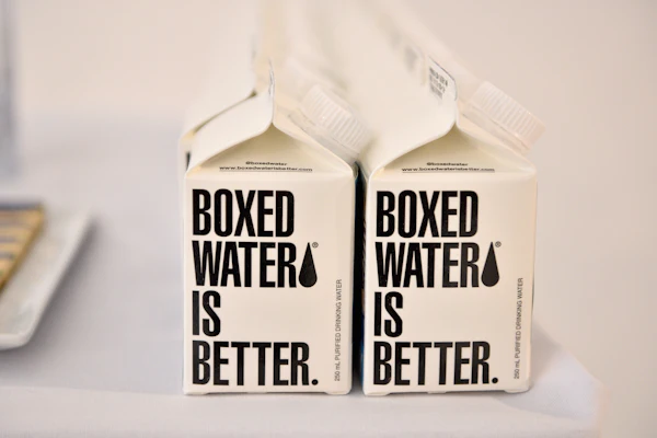
A grocery store represents an opportunity for in-person research and discovery of current, redesigned, or new-to-market consumer goods and their packaging designs in particular. Branded and private label products, shelf space, competition, shelf scheme, POPs, end caps, promotions, and even the placement of price stickers are all learnings that continuously frame my context of packaging design. This research provides evidence of the ever-changing decisions and challenges brand owners, marketers, and retailers make to bring a brand to the consumer.
But for myself and a growing number of other consumers, the in-person grocery shopping experience may one day be a thing of the past. Online grocery shopping is becoming ever more attractive partly because consumers find themselves facing a greater number of time constraints. Nor are they wild about the frustrating battle of navigating a physical market. Toss in the fact that they’re newly comfortable operating in the digital world and they like the free delivery that’s often part of the online experience and suddenly making a trip to the supermarket is less appealing than ever before.
Conducting research in the online and virtual space provides evidence of challenges that need to be addressed by packaging designers. In this online space, most products are initially viewed at thumbnail size or smaller. In the current online grocery market environment, brands compete for visibility in a different way, and shelf placement means very little. Rather than a virtual grocery store, most online retailers display the products in a grid or list view. The organizational format follows what online fashion retailers have been using for years. It’s far less experiential and significantly different than walking down an aisle in a brick-and-mortar store. Needless to say, brand packaging designers face a new set of challenges if they hope to produce work that will stand out and capture attention in this online environment.
CPGs that seek to thrive in the on-line grocery would be well served by simplicity. If a brand is using imagery, it should be scaled appropriately, The image of the primary display panel (PDP) should be front facing, and since many online marketers place violators over the top left corner of the PDP, there should be careful consideration of where the brand identity lives. In this space, empty real estate on a PDP and imagery that is too small to read causes brand communication failure. Visual hierarchy, color, shape, and patterns have significant impact on a packaging design at a quarter inch scale. At this size, secondary copy and product descriptors appear as a jumbled image. Packaging designs in the online realm need to pop at thumbnail size. Simplicity of design and essential visuals and information help in this regard.
Color, shapes, and symbols play an increasingly important role in our visual decoding of the world around us. From emojis to apps to games, we see how the digital designers simplify things for ease of viewing and communicating. Consumer brands live in the digital space in a myriad of ways.
I frequently give my students a smartphone assignment in which they’re asked to photograph their designs, at different phases in the design process, and assess their visual impact in the Collections and Moments size of the phone’s pictures folder. Equally the design is assessed for impact in brand-sponsored phone ads, Instagram, and other apps. They are challenged to determine what creates the high-contrast visual stimulation, whether the brand identity is recognizable and memorable, and if the thumbnail-size packaging design projects a meaningful, memorable distinction and/or differentiation. With product placement and competition being less predictable online and the three-dimensional physicality of the brand having little value, packaging designs are beauty shots. Color and shape recognition have an increasingly valuable role and brand benefits and features are less easily communicated. Capturing attention, communicating brand value, and connecting with the consumer on an emotional and memorable level in this digital environment bring many design challenges.
Packaging designs in the virtual marketplace will need a set of assessment tools. Tesco’s expanding virtual markets (www.stylus.com/qcvdnh) and its “click and collect” options turn an online, utilitarian shopping trip into a sensory and experiential adventure. In both the virtual and the brick-and-mortar spaces, CPGs compete from both brand equity and value perspectives. But in the physical store, retailer marketing of sponsored products and product promotions are a significant differentiating factor. Brand equity and brand recognition affect shopping behavior in real, online, or virtual worlds. But without human physical contact and full-scale viewing of packaging design in the traditional competitive shelf set, the brand impact is altered. That’s why designing for all of the different ways in which a packaging design will be viewed is essential.
As the online grocery shopping environment expands, I am excited to explore how packaging designs will compete at thumbnail size.
Marianne R. Klimchuk ([email protected]) is Associate Chairperson, Associate Professor, Packaging Design Dept., Fashion Institute of Technology.