Regardless of how great a product you have or how brilliant a marketing campaign, if your package is not seen on shelf, it will not be purchased. In today’s cluttered shopping environments, the competition for your consumers’ attention is extraordinary. Successful packaging that cuts through the clutter relies strongly on smart use of color, graphic devices, structure, and merchandising techniques and displays.
As consumers navigate store aisles nowadays, they are barraged with a cacophony of visual clutter, the likes of which was unimaginable just a few years ago.
There was a time when visual clutter was irrelevant. Back at the start of the 20th century, customers would walk into their local store and ask the grocer for products. Then, in the 1940s, with the introduction of the supermarket, consumers’ purchase behavior shifted from asking for it to looking for it—scanning the aisles, on their own, seeking various products. And, in time, seeking specific, trusted brands.
Over the years, as brands and products proliferated, supermarket aisles became increasingly crowded to the point where, today, a conventional supermarket carries an average of 15ꯠ items. In superstores, the consumer confronts even more shelves and searches for her product of choice among 25ꯠ items.
From a marketer’s standpoint, there’s a useful way to think about these numbers. How much time does the average consumer devote to your product during her typical shopping trip?
To take a reasonable and conservative approach, let’s consider the traditional supermarket of 15ꯠ items. And to be fairly generous, let’s say the average shopper can completely overlook half of these on any given shopping trip. So that leaves 7귔 items.
Estimates for the length of the average shopping trip range from 20 to 40 minutes, depending on how many children, if any, are in tow and their ages. So let’s split the difference and use 30 minutes, or 1꼀 seconds. If we divide the 1꼀 seconds of the typical shopping trip by the 7귔 items that are visible, that means that each item is viewed for only .24 seconds, on average. So, your brand must be seen and stimulate some degree of interest in less than three-tenths of a second. Is it any wonder that the failure rate for new products is 80% or more?
Of course, there are those who sing the praises of online shopping and expect that it will cause supermarkets to go the way of the buggy whip. While online shopping has its place, I also believe that traditional shopping venues are here to stay—in one form or another, as consumers really do want to shop for things in person. And the statistics bear me out as median average store size has increased from 35ꯠ sq. ft. in 1994 to 45ꯠ sq. ft. in 2004. And supermarket sales have increased more than 48%, from $292 billion in 1993 to $432.8 billion in 2003.
So what’s a marketer to do? Is there any hope of any given product being seen on shelf in today’s incredibly crowded store environments?
While there is no “magic bullet,” some tactics can help increase sales. Ultimately, the goal is to develop design elements that become visual equities—visual triggers of instant brand recognition.
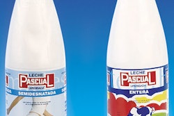
The first, and most effective element is color. If a brand can own a color in consumers’ minds, that is, have consumers automatically think of their brand when a given color is seen, then that brand will easily stand out on shelf.
Some examples include Uncle Ben’s use of orange, Colgate’s red, Arm & Hammer yellow, Progresso’s blue, Advil’s teal, Evian’s pink, and Fructis’ green. In some cases, a certain combination of colors creates a brand impression, as with Crayola’s highly recognizable green and yellow.
Sometimes, a brand can truly own a color, in a legal sense, but only if there is no inherent reason to use that color because of the nature of the product. Examples include Kodak’s use of yellow for film and Owens-Corning’s pink for fiberglass insulation. However, the courts are reluctant to limit competition and will not easily grant trademark protection for color. And brands cannot own a color that has some inherent meaning for the product. So Del Monte cannot, for example, own green for vegetables.
It is important, though, to consider appropriateness and implied meaning of a color. To create a brand of ginger ale that stands out on shelf, you might package it in a blue can. This would differentiate it from all green ginger ale cans. The problem is that consumers wouldn’t know it is ginger ale. They would probably mistaken it for a club soda and pass it by when shopping for ginger ale.
That is not to say that you must be a slave to what seems to be a category-driven color choice. When Pillsbury needed to compete better against Egg-O in frozen breakfast foods, conventional wisdom suggested that packaging for products in this category should be yellow. This color selection would reflect the egg-based nature of the products and represent early morning sunshine.
The problem was that Egg-O’s yellow dominated the freezer case and all other yellow packages blended right in. However, Pillsbury saw an opportunity by owning the color blue. Pillsbury’s packaging creates a mini brand block within the sea of yellow. Blue is the perfect background color, sharply contrasting yellow and giving Pillsbury color differentiation from competitors.
However, with four or more brands in most categories, the number of appropriate colors that are available for your brand is limited. In addition, the more successful your brand is, the more likely that the store brand next to your product will copy your packaging color scheme.
So, an effective packaging differentiation strategy needs to transcend color. One option is to create a distinctive graphic element. This could be either part of the brand mark or a freestanding device.
Tide laundry detergent would be noticeable enough with its bright orange package. More importantly, it utilizes one of the best-known bull’s-eye brand mark devices ever created—one that is easily recognized at great distances and which creates great visibility for Tide.
Similarly, the Arm & Hammer brand supplements its yellow color with its bold logo of a circle containing an arm holding a sledgehammer.
For Bounty paper towels, the bull’s-eye graphic is simply a bold logo contained in a circular device. Hungry Jacks’ bold, arched logo is even stronger than its competitor’s, Aunt Jemima, even though Aunt Jemima uses a character icon, which is often quite effective at creating visual distinction.
Characters can articulate a brand message and help to increase the package’s “findability.” Some effective brand characters include the Gerber baby, Mr. Clean, Snap, Crackle and Pop, Tony the Tiger, Mr. Peanut, the Jolly Green Giant, the Dove bird, Cap’n Crunch, and the Pillsbury Dough Boy.
Beyond graphics, structural design can provide product usage benefits and help a package stand out on shelf.
Some package structures are an obvious and straightforward reflection of the brand name, as with Log Cabin and Mrs. Butterworth syrups. Carnation established a distinctive ergonomic shape for both its powder and liquid coffee creamer. However, competitors have copied these shapes. Yoplait yogurt owes a good deal of its success to the use of a distinctive, slender plastic cup container.
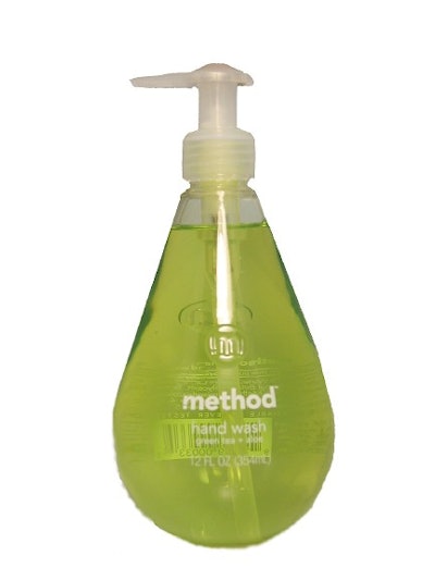
For Perrier, a new “gutsier looking” structure for its single-serve offering helps the brand compete against carbonated soft drinks. In household products, Method has transformed hand soap and laundry detergent with aesthetically pleasing packaging via industrial designer Karim Rashid.
Beyond packaging, brands can create proprietary merchandising displays to help break through clutter, as Campbell’s soup has recently done with its new gravity-feed in-shelf merchandising unit.
Of course, just knowing about all of these approaches doesn’t guarantee success. It helps to evaluate different options to determine which performs best.
Many measurement techniques are available to determine which design concept is most visible among competitive clutter, and one of them is called Insite™. In this technique, Dragon Rouge uses a photograph of an actual store section into which we digitally insert our design concepts. This allows us to see the billboarding effect created by multiple facings as well as the degree of standout among competitive packaging.
Additionally, research methodologies such as tachistoscope, or T-scope, can be employed. These enable the tester to flash a shelf scene for a limited, controlled amount of time. Eye-tracking is specialized research tool that allows the tester to trace where the eye looks first and how long it lingers on various parts of a package label or part of a store shelf.
Design options also can be evaluated using simulated shopping. While this method is costly, it provides the most life-like means of assessing different approaches.
Armed with these techniques and the means to evaluate the approaches you develop, you’re ready to go bust some clutter.
Jonathan Asher is president of the New York office of Dragon Rouge, LLC, a privately owned brand design firm with additional offices in Paris, London, Warsaw, and Hamburg. Contact him at [email protected] or 212.367.8800.