In the 1960s, sales of Tang powdered orange breakfast drink took off after the product became known as the drink of choice for astronauts during NASA’s first manned space flights. While this storied history may not resonate to the same degree with today’s consumers, Kraft Foods is hoping refreshed graphics and an updated strategy will convey the product’s pioneering spirit to a new generation of fans.
According to the New York office of international brand design agency Bulletproof, which created the refreshed package graphics around Tang’s new “Win Morning” strategy, Kraft Foods’ goal with the new design was twofold: “One, to reinstate Tang’s iconic status while giving it new relevance in store, and two, to visualize the Win Morning positioning in a breakthrough and relevant way.”
Iconic elements get reinvigorated
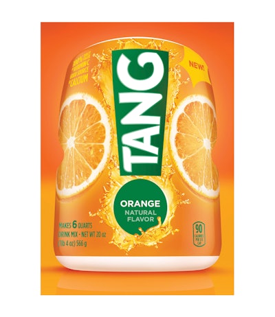
The new package design, introduced in early 2014, uses an existing packaging structure—a round, white, high-density polyethylene canister with a tucked-in waist and a cap that doubles as a measuring cup—for the 20-oz variety. The package is decorated with a full-body shrink-sleeve label.
Elements of the former package design that were retained include the Tang orange, which Bulletproof says is the most consistent equity over time, and the green and white brand mark, which provides a visual connector to past Tang designs.
An exclamation point, familiar to the brand’s heritage, is used to display the Tang brand mark, with the copy positioned vertically within the punctuation mark, and the words “Orange Natural Flavor” within the period. Explains Bulletproof, “The Tang Exclamation Mark provides an upward movement, which brings energy to the brand.” A splash of orange beverage surrounds the logo, which is repeated twice on the canister.
Two juicy orange slices are also prominently displayed on the package, promising a refreshing “tangy” taste experience.
On the back, along with preparation instructions, nutrition facts, and a barcode, a small sun graphic made from an orange slice is positioned along with the copy “Jump Start.” Additional verbiage advertises the product’s nutritional benefits, including “100% Daily Value Vitamin C per serving” and “a good source of calcium.”
Says Bulletproof’s New York creative director, “Having grown up loving Tang and drinking it as a young kid, this redesign was a thrilling opportunity to reinvigorate the brand for yet another generation of Tang fans. At the heart of the brand lies a rich heritage grounded in both its taste and its history as the drink of choice for astronauts and would-be astronauts everywhere. To best represent these fundamental brand truths, we considered a design architecture that delivered big-time flavor appeal and an optimistic spirit in equal measure. This standout design architecture is anchored by the Tang Exclamation Point, which dramatically cues the brand’s pioneering spirit and its ‘to the moon and back’ roots. To further elevate the flavor story, we added luscious fruit slices, making for undeniable Tang taste appeal.”
Another intentional aspect of the new design is its flexible architecture, which Bulletproof says can be adapted for new product launches, including the upcoming introduction of an Orange-Pineapple variant, also in a 20-oz canister. Graphics for the new variety replace one of the orange slices with a pineapple slice.
Mission accomplished
Viewing the new packaging stacked up against competitive products in the retail environment, Bulletproof’s New York creative director says the design agency is very pleased with the new look and attitude: “It breaks through with its own unique tone of voice and confidently signals a new mission for the brand—one designed to attract a new generation of fans.”
Adds the design firm’s strategy team, “From a strategic perspective, the ‘I can be anything’ brand essence was an incredibly strong starting point, which yielded a number of fruitful design platforms. While the competition between the platforms was fierce, we ultimately felt the ‘jump start your day’ design positioning best aligned with both the current equities and future focus of Tang, seamlessly connecting the sought-after morning occasion, the taste profile intrinsics, and the brand essence.”
Don’t miss this Tang commercial from 1966.
To see a spin + zoom 360° photo, click here.
