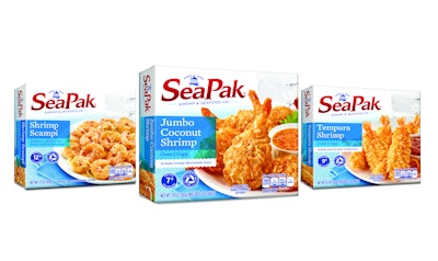
SeaPak Shrimp & Seafood Company has unveiled a new packaging design for its frozen specialty seafood products.The company worked with Voicebox Creative to redesign its logo and 30-plus product SKUs to better align the brand with its message of allowing busy families to “chillax” and escape the stress of meal time with nutritious, easy-to-prepare seafood from SeaPak.
“SeaPak’s insight and confidence to put the consumers’ lifestyle first in their brand messaging was key in our design process,” says Jacques Rossouw, Creative Director for Voicebox. “Designing for today’s consumer involves listening and observing how a brand’s story is seen, heard, and experienced in the market—something on which we as an agency pride ourselves—in order to deliver a package that has stopping power and communicates a compelling message to the consumer quickly and effectively.”
As to not confuse consumers, the refined look stays true to SeaPak’s classic image, but marries the brand’s iconic equities with that of the attributes it is communicating to new consumers looking for real food ingredients. Voicebox made the products the focal point of the packaging, inviting consumers to picture a relaxing, healthy, and easy meal made with SeaPak products. To separate SeaPak from others in the competitive frozen seafood section, Voicebox positioned the products on a nautical-themed white plank background with light blue accents. A more current font style was added as was the brand’s inception date, which further exemplifies the brand’s history of providing quality, great-tasting, responsibly sourced seafood for nearly 70 years.
“Voicebox’s substantial experience helping larger, well-established, high-quality brands refresh and reinvigorate their packaging made this process easy and fun,” says Kristen Beadon, Marketing Manager at SeaPak. “We are incredibly pleased that Voicebox’s new design allows SeaPak to break through the clutter of the freezer door and uphold and communicate our key brand benefits, and is flexible enough to apply to new product additions.”
The redesigned packaging hit shelves in January 2018 and includes classic fan favorites Popcorn Shrimp and Shrimp Scampi, new products like Pub Style Beer Battered Cod and Pub Style Beer Battered Crab Poppers as well as items in the SeaPak Selections product line such as Creamy Garlic Shrimp and Lemon Pepper Shrimp.