Fort Washington, PA-based Nutrisystem, a provider of weight loss products and services, prides itself on listening to its consumers. In the past couple of years, the company has significantly improved its line of food products to address changing consumer preferences. Among the improvements, Nutrisystem’s products are now free from artificial flavors, colors, and sweeteners, and more than 50% of its grains come from whole grains. In addition, it has improved the variety and taste of its food and has expanded its frozen business.
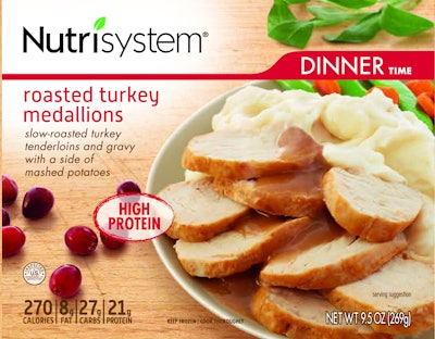
To reflect these changes, on Jan. 1, 2016—the start of “Diet Season 2016”—Nutrisystem unveiled new packaging graphics for the first time in a decade for its entire food portfolio, representing hundreds of SKUs.
“Our prior packaging was designed in a different time,” says Keira Krausz, Executive Vice President and Chief Marketing Officer at Nutrisystem. “It communicated meal occasion clearly, which is important since Nutrisystem is synonymous with simplicity. However, consumer tastes and perspectives have changed and will continue to change, and we needed to evolve and will continue to evolve with them.
“Whereas the previous packaging was perceived as corporate, the new packaging communicates freshness and taste appeal, and shows the consumer the nutritional benefits and ingredients via easy-to-read callouts and labeling.”
The design process was a collaboration between Nutrisystem and Southern Graphics Systems (SGS) and included several rounds of research to understand consumer needs as well as how Nutrisystem’s existing packaging was perceived on its own and against the competition. “We reviewed several designs before moving in one direction,” says Krausz. “We also showed the final design [to consumers] to understand how the new packaging would influence perception and purchase intent.”
Encompassing snack, breakfast, lunch, and dinner items, the new packaging is designed to reveal a “more contemporary, fresher, and healthier look for the brand,” Krausz explains. Each item features a color-coded bar that identifies meal occasion and includes Facts Up Front Labeling—an easy-to-understand nutritional label with callouts such as calories, fat, fiber, and protein—and a cleaner ingredient deck. Logos and fonts are part of the Nutrisystem brand standard, used on packaging, in television and print ads, and on the company website.
According to Krausz, consumers have embraced the new products and packaging: “In research, our products ranked number one in freshness, healthiness, taste perception, and purchase intent versus a range of competitors.
“Consumers are enjoying the new look of our products and find the nutritional label very easy to understand. They also appreciate knowing the benefits of each product and can simply identify the various meal occasions.”
Nutrisystem’s products are sold online and have also been available in Walmart stores across the country since 2013 in multi-meal kits. According to David Burton, Senior Vice President Operations & GM, Retail at Nutrisystem, in 2016 the company will have its largest-ever retail presence with an increase in store counts and more products on the shelves. “The strategy is to introduce some of the top-performing items from our direct business into the retail channel,” he explains.
