Packaging for the line is bold because it accents bright colors that appeal to teen girls and young women. It’s transparent because it focuses on the visual essence that attracts the target audience. Finally, the design is attention-grabbing yet discreet—a major plus for toning down the embarrassment factor as the package sits in the shopping cart, in a purse, or at home.
This last point was confirmed in several recent Shelf Impact! Package Design Workshops. When the packages were shown on-screen to attendees, the designs drew thumbs-up as an attention grabber, yet the audience didn’t immediately know what was inside the cartons.
U by Kotex is all about surprise and delight. Your mother’s feminine care products, in traditional pastel hues and floral patterns, this brand definitely is not. A new category direction
The result, Kimberly-Clark believes, is a visual positioning for U by Kotex that redefines the feminine products category. “The challenge in doing so was pinpointing the exact visual territory for the brand,” explains Gregg Lipman, managing partner at CBX, which created the design and branding. “The idea is to help girls and women feel empowered by providing them with opportunities to express themselves.” “She wants truth and honesty and high energy, with products that reflect her style and substance,” adds Jennifer Westemeyer, Kimberly-Clark brand design director. “Other products in the category hide the truth.”
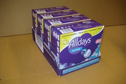
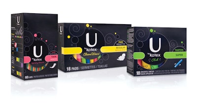
Bold designs, influenced by fashion and the fragrance aisle, give U by Kotex consumers both the delight and the discreetness they want from the 19 SKUs in the product line. The brand’s range of products—tampons, liners, and pads—is packaged in either SBS cartons or tins (Kimberly-Clark declined to identify the suppliers). The predominately black-colored cartons are offset-printed in six colors, plus a spot varnish that highlights the logo, product type and absorbency variety, and an illustration of the product. The illustration is a small, secondary element on the front panel’s visual hierarchy, positioned near a bottom corner.
“The box is like a little black dress,” Westemeyer says. “The different colors of the products are the ‘accessories.’ The swirls, the circles, and the color hits on the box are based on research of what’s relevant to young girls. They’re much more fashion-forward, individualistic, and have their own personal style, and they tend to be loud and obnoxious.”
Swirls on the carton include a die-cut window that enables shoppers to get a glimpse of the rainbow of colors inside each package when viewing a small section of the tampons, liners, or pads. “She can change the colors as her mood changes,” Westemeyer adds. “I feel like pink today. I feel like blue today.” The window also enables shoppers to easily gauge product thickness and size.
The surprise-and-delight factor of the design also extends to the festively decorated reusable tins, believed to be a first in feminine-care products. They’re visually bold—there are 56 different patterns for taking products on the go—yet discreet. There is no branding on the lid, but a small U by Kotex logo appears on the back of the tin.
The tins are screen-printed in five colors plus a matte varnish and spot gloss to highlight design details.
Extended branding opportunities
“They’re really an effective way of expanding the brand’s reach, as they can be merchandised in the feminine hygiene section, cosmetic aisles, checkout counters, and other sections of the store,” notes Rick Barrack, CBX chief creative officer. U by Kotex also leverages the back of each package for fun. Each package contains one of about 70 different myths/facts that appear on the back panel. Included are health facts, as well as playful facts to make girls feel better about themselves (“Fact: Black is especially slimming. Black tends to hide the shadows that other colors seem to highlight.”) while also learning about feminine health. The back panel also points users to the brand’s online community at www.ubykotex.com
By creating a graphic vocabulary that leverages color palettes and abstract patterns from the fashion world, U by Kotex has created packaging that is attention-grabbing on the shelf, yet discreet in the shopping cart, purse, or home. The result is a brand that teen-age girls and young women feel is just for them.