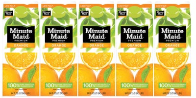
The Coca-Cola Co. has done just that, injecting consumer insights along the way, to contemporize its Minute Maid lineup of fruit juices with new packaging in a global rollout that has begun initially in the U.S.
The new design, across thousands of SKUs in multiple packaging formats, showcases high-quality, proprietary fruit photography and a green-leaf canopy to connote perceptions of naturalness and freshness that reflect the quality of the juice. Tom Farrell, design director for The Coca-Cola Co., which owns Minute Maid, says the new design evokes the experience of walking through an orchard.
“We found the best juice packaging has some unique, ownable way of presenting fruit,” Farrell says of Coca-Cola’s conclusions after doing a category audit.
With the audit results in hand, Coca-Cola’s internal design team members visited local markets. They observed how vendors display their fruit and court shopper attention. Next, the designers studied consumer behavior in the supermarket produce aisle. The design team decided to replicate those actions and feelings through visual cues on the new Minute Maid packaging.
The fruit is the “hero.” On orange juice cartons, premium photography displays exceptionally detailed fruit imagery that maximizes taste appeal, right down to the droplet oozing from an orange slice. Significantly, the fruit is arranged in a wedge shape to resemble a produce market’s product presentation. That decision creates a unified look on shelf when the oranges on the label link together to form an interlocking visual of whole fruit.
Similarly, new graphics for Minute Maid Lemonade and Punches include water ripples and floating fruit to reinforce delicious refreshment.
Contemporizing of Minute Maid’s packaging also extends to the logo. Changes include rounded rectangle corners and the nesting of the ‘n’ and ‘u’ in the Minute Maid brand name.
These changes complement the addition of what Farrell describes as a green “horizon line” atop the logo, he explains. “Introducing the green horizon line shows that the juice is connected to the land, that it’s a totally natural product that optimizes nature, and it connects us to farming.”