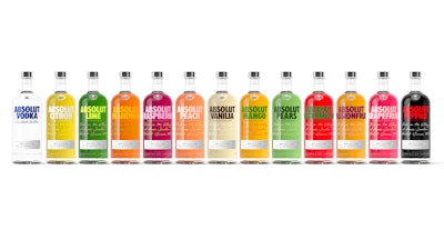
Prior to the redesign, Absolut’s flavors portfolio underwent several design iterations as varieties were launched. Most recently, the line used two distinct designs: One featured a frosted bottle; the other a clear bottle with flavor-related graphics.
 | Read about the packaging design refresh process for Absolut's original vodka product. |
“The previous packaging design was part of our journey to begin unifying the range through white logotypes and an artistic interpretation of the different flavors,” explains Elin Furelid, Head of Product Portfolio & Innovation for Absolut. “However, at the time, the frosted style was designed to convey the freshness of our citrus range that only consisted of two flavors, Citron and Mandrin. When we launched Lime and Grapefruit a few years later, the conflicting designs became confusing for consumers as despite all of our flavors being made the same way, with natural flavors and without adding any sugar, they appeared as separate. Our ambition for the redesign is to harmonize the look and feel of the range to help consumers find and explore it more easily.”
As Furelid explains, most of the design elements for the flavors range are based on those created recently for Absolut Vodka original, including the classic bottle shape, the silver cap, the embossing of “Country of Sweden” at the bottom, a new paper label on the front of the bottle, and a medallion bearing the image of company founder, L.O. Smith. In contrast to the previous flavors design, the new graphics focus heavily on the brand’s credentials.
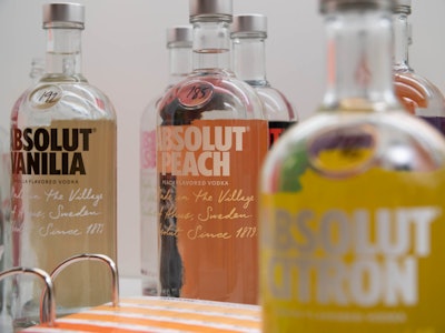 Unique to the flavors line is a large brushstroke of color on the back of the bottle that aligns with each flavor and helps consumers find, trial, and experiment with new flavors.
Unique to the flavors line is a large brushstroke of color on the back of the bottle that aligns with each flavor and helps consumers find, trial, and experiment with new flavors. “One of the most important things with this new design system is the combination of color and that they are true to the actual fruit,” says Furelid. With the refresh in packaging, Absolut also updated the flavor profiles and ABV levels for each variety to allow the natural flavors to come through in the final taste. The brand also introduced a new flavor, Absolut Passionfruit.
 | Read about the limited-edition ‘Absolut Movement’ bottle, designed to celebrate inclusivity. |
Furelid adds that brushstroke of color is also a nod to Absolut’s strong history of creating limited-edition bottles that use the packaging as a canvas for sharing big and bold ideas. “We have a long history of challenging the status quo and pushing boundaries—art and design plays a significant role in that,” she says. “We’re continually looking to reignite the bold and creative aspects in all our product offerings, from our first ever work with Andy Warhol in 1985 to the 550 artist partnerships that have taken place in the years since. The updated design and packaging of the flavors range is part of that continued ambition to develop Absolut’s unique design and taste, with curiosity, creativity, and collaboration at heart. This new design system helps to bring out the intensity and taste promise of the upgraded flavors in a better way than the previous design.”
The new, harmonized flavor line has begun to ship to markets globally and will continue to roll out, depending on current stock inventories.


