The Absolut Vodka brand is known for its commitment to art and design, having partnered with 550 artists on 800 original, limited-edition bottle designs since its first collaboration with Andy Warhol in 1986. Meanwhile, its flagship bottle has remained unchanged for more than 40 years. That is, until a design refresh nearly four years in the making, with the weighty project name Atlas, resulted in a new look for the brand that launched on shelves in September.
“At Absolut, we always strive for better,” says Elin Furelid, Global Head of Product Portfolio & Design, Absolut Vodka, The Absolut Company. “Our passion for our business, product, and brand means that we see the potential in everything we offer and are always asking ourselves how we can take Absolut Vodka one step further and into the future.”
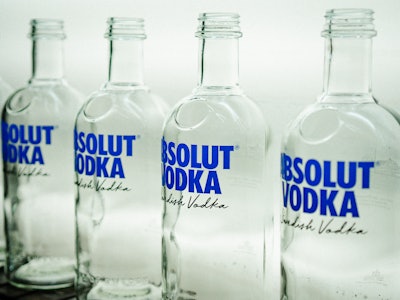
 One of the key changes to the design was increasing the legibility of the script to give a human touch to the bottle, while emphasizing that the brand is indeed a Swedish Vodka
“We used this thinking to distill the design to its fundamental components, updating it to pay homage to our credentials—provenance, heritage, and authenticity. We were keen to capture our rich quality story and make that clearer on the bottle, signposting to what makes our vodka unique.”
 | Read about Absolut's Comeback bottle, designed to encourage recycling and circularity. |
Absolut Vodka is produced and distilled in and around Åhus, Sweden, and is one of the few brands to produce everything within a 75-mile radius. Its community of farmers, distillers, and bottlers blend winter wheat with pristine water from a local well to create the vodka. Says the company, “Up to 10% of all wheat in Skåne [Skåne County, the southernmost county in Sweden] is purchased for Absolut Vodka, and the brand works with 400 farmers in Sweden, promoting sustainable farming techniques and values to ensure a sense of care for the local land and community.”
To tell one rounded story of its product, place, and people, Absolut evolved the bottle’s graphics to highlight the brand’s provenance, heritage, and authenticity, while retaining the iconic, lightweight bottle, the shape of which is based on an 18th century apothecary bottle. “One of the key changes was redesigning the legibility of the script to give a human touch to the bottle, while emphasizing that we are indeed a Swedish Vodka, produced and made in Åhus, Southern Sweden,” says Furelid. “As well as embossing the glass with ‘Country of Sweden’ and including text alongside an illustration of the original distillery, we wanted to enhance our provenance messaging while delivering a minimalistic, clear bottle to help convey our high quality.”
 On the back of the bottle is an illustration of the original distillery along with the text, "One Source. One Community. One Small Village in the South of Sweden."
Says Furelid, “We’re extremely proud of the new design and how it represents Absolut in the way it should be—as original now as when it was first launched.”
| | Read this story on Absolut's Movement limited-edition bottle, celebrating inclusivity. |