When icons carry the communications load
The panelists in Packaging World’s roundtable (see page 58) say that icons may be a central answer to communicating effectively in today’s cluttered retail environment. Two packages recently hitting store shelves make an icon the central graphic in a strategy to connect with shoppers.
An appeal to an avant-garde audience
Users of Mac computers are dedicated enthusiasts who form an avant-garde within the world of computer users. Microsoft has to appeal to this group with Microsoft Office: Mac. This brand brings the widespread features of Office software to Mac computers from Apple.
When marketing software to Mac users, Microsoft is among hundreds of third-party software developers that have to appeal to a cadre of Mac enthusiasts. Packaging has to stand out on cluttered store shelves and appeal to the mindset of prospective buyers.
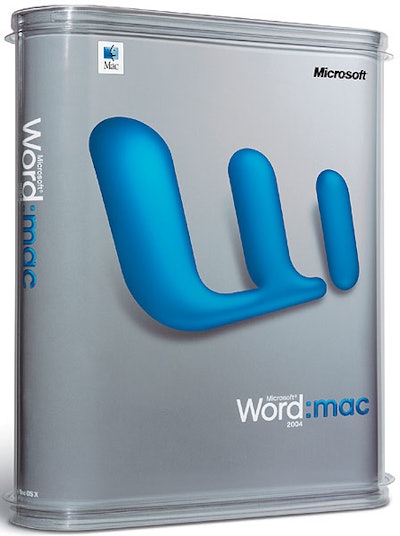
Packaging technique: Developed by the brand consultancy and design firm Landor Associates, the newest packaging for Microsoft Office: Mac combines both structure and graphics to deliver a unique appeal.
The graphic approach uses an icon symbolic of each version of the software to dominate the front panel of each package. A stylized “W” for Microsoft Word and a stylized “X” for Excel are among the graphics. A color coding system clearly differentiates each version.
The design “is driven off the need to speak to the Mac audience and relate to them,” explains Tan Le of Landor Associates. “This is a focused audience, and there is nothing superfluous in this design.”
However, the design also had to recognize the Microsoft brand to gain recognition in the marketplace. The icons help deliver the Microsoft connection. According to Le, the design uses icons developed for the previous edition of the software, creating a bridge to the earlier packaging.
The new package uses PET sheet thermoformed into a box with rounded corners. Shape is a tactic being used increasingly to differentiate brands, and the thermoform gives this package a distinct shape that stands out on store shelves.
The body is molded much like a clamshell, with the two halves folding together and snapping in place to form the body. Two thermoformed PET caps snap onto the ends of the body, creating the finished package. A thermoformed PET fixture holds the media with the software firmly in place; it slides into the formed PET carton.
Because the package is distributed worldwide, Microsoft’s Packaging Engineering and Management group, working with Landor, developed three suppliers in different countries to meet demand for the packages.
Within the plastic container, a paper sleeve fits tightly inside to provide the surface for the strikingly simple graphic approach. Because there are a number of sleeves to denote different versions of the software, graphics vary. Basically, they are printed four-color lithography with spot colors where required.
Being more than “just another sports drink”
The beverage market is crowded with hundreds of entries in the sports drink category alone. The Mercury Group, Danbury, CT, introduced its Mercury brand into the fray, and it needed to define itself in a different way.
Packaging technique: The solution was a combination of both powerful graphics and structural innovation.
From a graphic standpoint, the company opted for a strong icon of Mercury, playing on the mythological swiftness of the Roman god. The icon, which dominates labels on bottles, also tied into the company’s overall marketing program.
“We needed to create something new and different in the beverage industry,” says Billy Bishop of the Mercury Group. “This logo creates a mystery behind the brand. And, as part of the brand, it is a unique logo that allows us to be credible. We can put it on a bike jersey or on our other promotional items. That’s important when you have a limited advertising budget.”
Bishop ought to know how to develop a beverage brand. As part of the marketing team at South Beach Beverage, he helped propel the SoBe brand to national recognition before it was bought by PepsiCo, Inc. The Mercury brand was first introduced in Arizona and has since extended into targeted markets including Portland, OR, North Carolina, and parts of Mississippi.
From a technical standpoint, the Mercury Group also needed to preserve freshness in a plastic bottle. It opted for the Monosorb bottle from Graham Packaging to give it the shelf life it needed for the product. The injection stretch blow-molded PET bottle contains an oxygen absorber to extend shelf life.
Another technical factor was the use of an oriented polypropylene label as opposed to a glue-applied paper label. “Sometimes bottles are in ice chests and coolers and need a label that holds up in those conditions,” says Bishop.
The label is converted by Hammer Lithographic using film from ExxonMobil Chemical Co.
Paper Mate package sets new pen apart from crowd
Package shape is growing as a way to differentiate brands, and Sanford North America found a way to introduce shape in a category where the norm has been linear structures.
The company rolled out its new Paper Mate FlexGrip Elite pen in a crowded category where packaging design had been distilled down to sameness. Most pens were in blister cards with rectangular blisters. And many packages had type running vertically down the edge to provide maximum type size on narrow packages.
Against this backdrop, packaging for the FlexGrip Elite line had to say “new.” It also had to highlight the “soft touch” surface on the pen’s barrel along with an anti-microbial feature.
Packaging Technique: The line’s workhorse packaging are polyvinylchloride blister cards that hold two, three, or four pens. Packaging also includes PVC folding cartons that hold 12 or 15 pens. Package development was by Anthem Worldwide, a design firm with eight offices across North America.
On the structural side, Anthem designed the series of blister cards so that they displayed the pens in a subtle “fanned” array. To do that, blisters are fan-shaped and each cell within the blister orients one pen precisely.
That contrasts sharply with the majority of blister cards in the category, which are rectangles. Pens are displayed in a “straight up-and-down” array. “We have created a shape that is not common to the category,” explains Scott Crist, associate brand manager for Paper Mate. “It gives us a look we can own in the category.” That look, according to Tim Weiner, account manager at Anthem Design, also adds an elegant look to the pens and packaging.
The blister cards serve other functions, too. Each blister has a die-cut hole in its front center. Shoppers can touch the pens, experiencing the softness of the FlexGrip surface. To introduce the new FlexGrip Elite brand, each blister also has a medallion-like area molded into it. The area accepts a label with the logo and brand information.
For both the label and the blister card, a fifth color was used to achieve special graphic effects. On the label, the fifth color is a matched purple that adds elegance to the design. On the card, reflux blue brings out an “electric blue” that adds shelf impact.
The medallion allows the typography to run horizontally, contrasting to the vertical positioning standard in the category.
Paper Mate also has two different sizes of PVC carton. It illustrates the degree to which packagers need to meet retailer needs. One carton holds 12 pens, and it is joined by another carton that holds 15 pens. Paper Mate needed the extra size because one retailer wanted a promotion that offered shoppers the bonus of “12+3 free.”
